
Cocktails and Company Script: a loose brush script for casual, playful branding
Design style
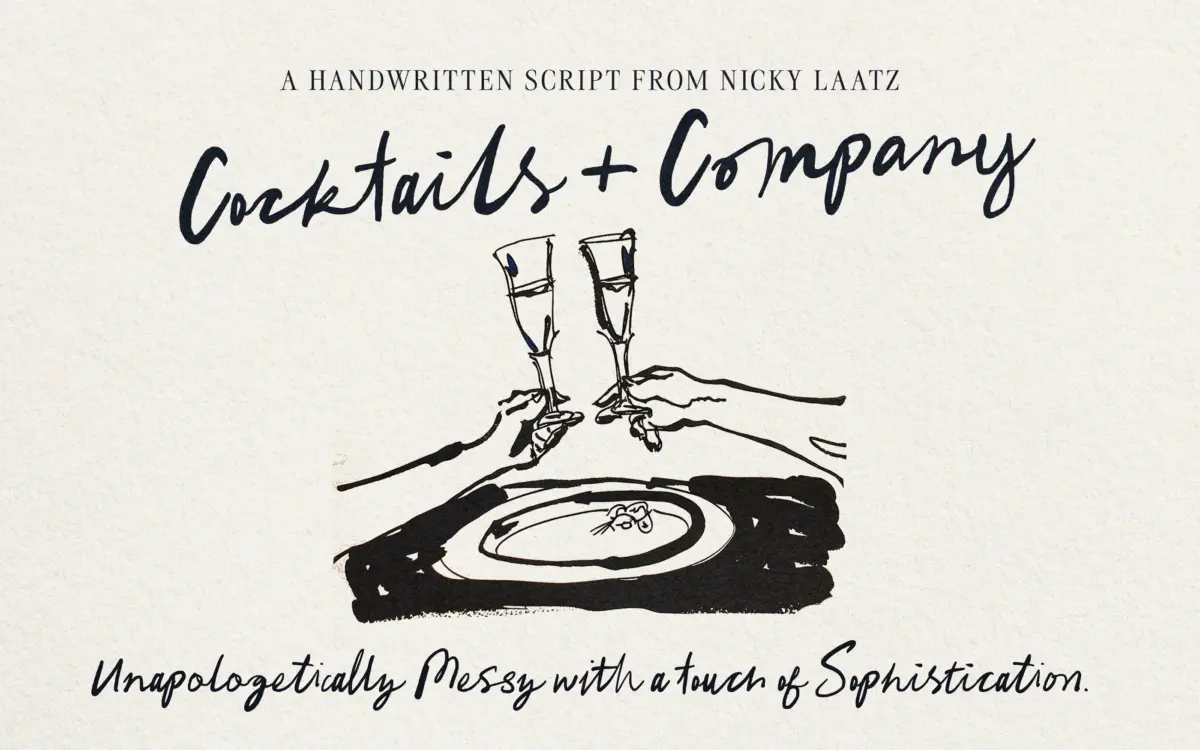
Cocktails and Company is a brush-based script that leans into imperfection. The strokes carry visible tooth and dry-brush breakup at the terminals, and the baseline wanders rather than sitting on a strict line. It reads as handwriting rather than lettering, which is the point: this isn’t a polished calligraphic script trying to look expensive, it’s a script trying to look like someone actually wrote it with a marker after a couple of drinks. The joins between letters are loose and irregular, with connecting strokes that thin and thicken unevenly. That messiness is the design’s whole personality, and it’s consistent throughout rather than applied as a one-off flourish.
Where it earns its ‘touch of sophistication’ claim is in the letter construction itself — the basic skeleton of each character is legible and reasonably restrained, even when the execution is scruffy. It’s not a novelty font pretending to be a script; the bones are sound underneath the texture.
Character set and features
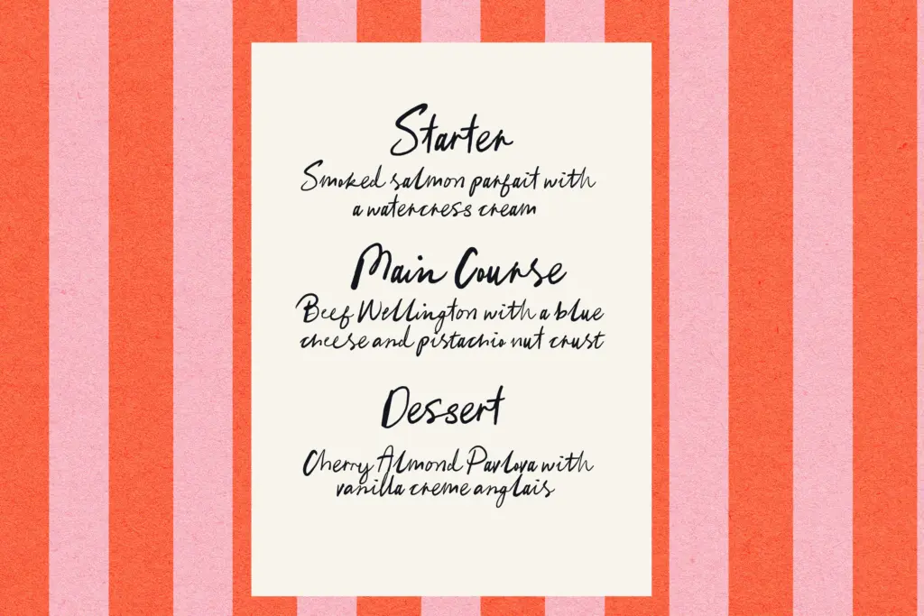
The font is built around OpenType ligatures, and this is not optional decoration — it’s structural to how the typeface functions. Turn ligatures off and you lose the natural-handwriting effect the whole design depends on; letter pairs and common combinations are drawn as joined units rather than assembled from isolated glyphs. Anyone setting this in software without OpenType support will need the PUA-encoded characters instead, which the designer has included as a workaround. That’s a sensible inclusion, but it also signals that this typeface wants a proper OpenType-aware environment to look right — Illustrator, InDesign, recent versions of most design software. Drop it into something that ignores ligatures and you’ll get a flatter, less convincing result.
Beyond the ligatures, expect the usual handwritten-script apparatus: alternates for common letters to break up repetition, and enough irregularity built into the base glyphs that words don’t look stamped from a single mould. There’s no indication of extended language support or a companion sans in the brief, so treat this as a single-style script rather than a full family.
Use cases
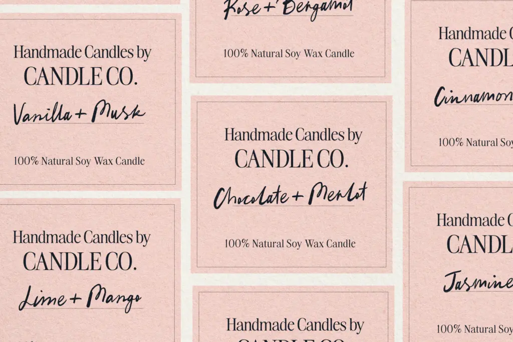
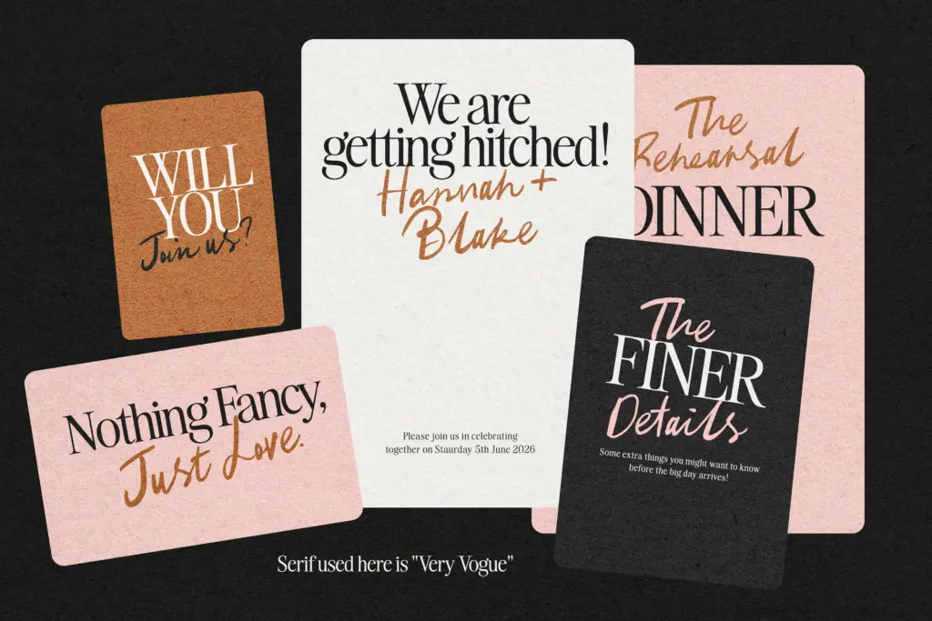
This is a casual-register typeface, and it knows it. It suits greeting cards, invitations with a relaxed tone, illustrative packaging, drinks and hospitality branding (the name isn’t subtle about that), and any print project that wants a hand-lettered feel without commissioning actual lettering. It works well as an accent — a word or short phrase — rather than as a workhorse for paragraphs; the looseness that makes it charming at large display sizes becomes a legibility tax once you ask it to run more than a few words.
It’s less suited to anything that needs restraint or formality. Luxury branding, editorial body text, or corporate identity work will find it too scruffy and too specific in mood. And because ligatures carry so much of the design’s character, it’s a poor fit for contexts where you can’t guarantee OpenType support — web use in particular needs checking, since browser and CSS ligature handling is inconsistent. Used within its lane — short, playful, hand-drawn-feeling headlines — it does exactly what it sets out to do.
What we liked, and what we didn’t
Strengths
- Consistent, convincing brush texture that doesn't feel like a generic script filter
- Ligature system genuinely simulates natural handwriting joins rather than just decorating them
- PUA encoding gives a fallback for software without OpenType ligature support
Trade-offs
- Legibility drops quickly at longer text lengths or smaller sizes
- Depends heavily on OpenType ligature support, so results vary across apps and web contexts
Cocktails and Company delivers exactly what it promises: a loose, brush-drawn script with genuine handwritten texture, built around ligatures that do most of the design's heavy lifting. It's best used sparingly, as a short headline or accent rather than a workhorse text face, and it needs an OpenType-aware environment to look its best.
Verdict

Tantype reviews typefaces in depth — every font is tested in real branding, editorial and screen layouts before a word gets written. 555+ fonts reviewed and counting.