
Le Maire: A Thin-Stroked Cursive Script for Quiet Branding Work
Design style
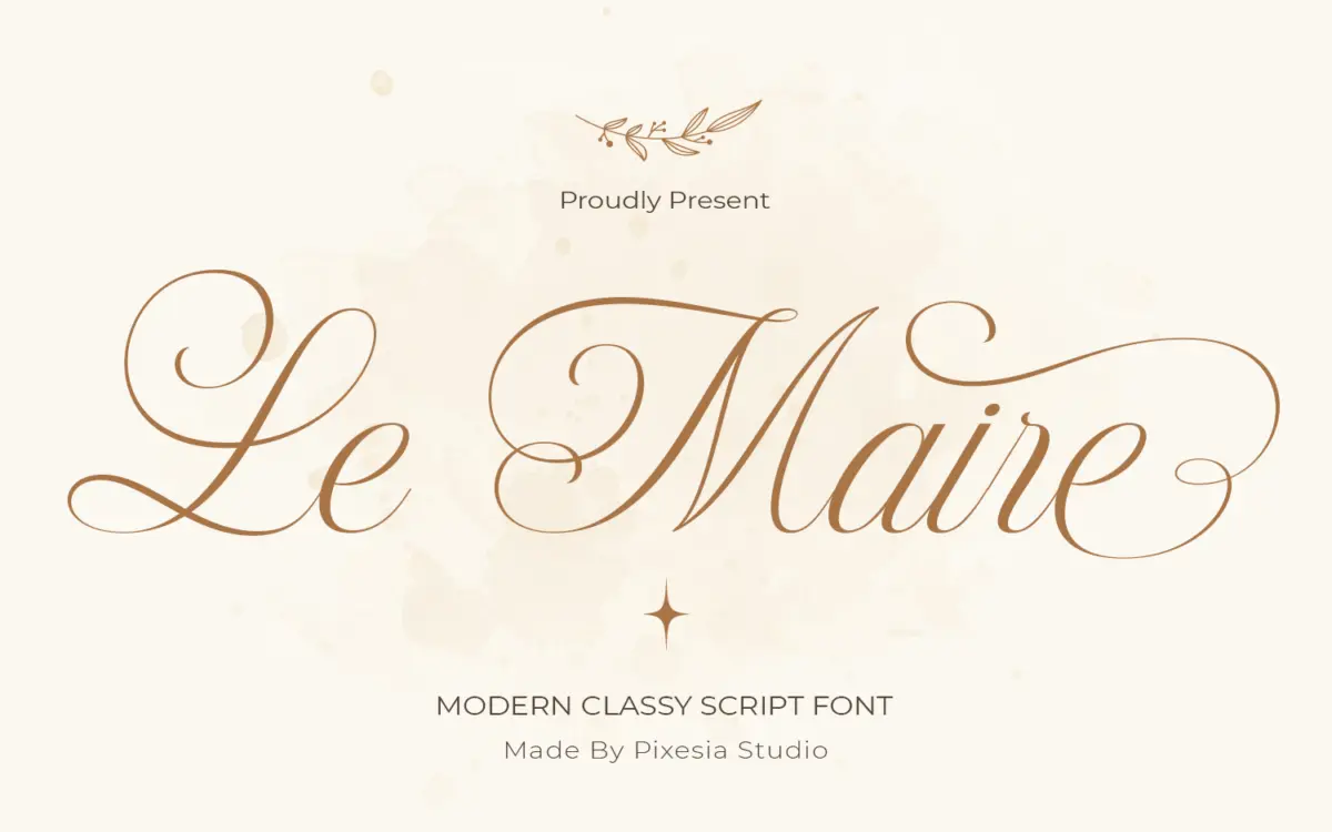
Le Maire sits in the crowded field of modern cursive scripts, distinguishing itself mainly through restraint. The strokes are thin and kept at a consistent weight rather than swinging through heavy contrast, which gives the face a lighter, more monoline feel than the calligraphic scripts it references. Letters lean forward with an easy, unforced slant, and joins between characters are smooth without the exaggerated loops that crowd a lot of scripts in this category.
The overall impression is quiet rather than showy. Where many wedding-adjacent scripts pile on flourish to signal romance, Le Maire pulls back, favouring cleaner exits and shorter connecting strokes. That restraint is the point: it reads as considered rather than decorative, closer to handwriting refined for print than a calligraphy pastiche. It won’t suit anyone looking for maximalist swash work, but for a script that needs to feel composed rather than exuberant, the discipline pays off.
Character set and features
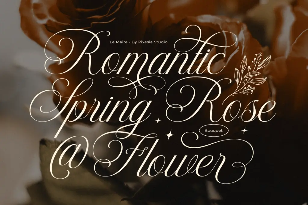
The font ships with a full set of uppercase and lowercase letters, numerals, and punctuation, plus stylistic alternates and ligatures for smoothing over awkward letter pairings — a necessity in any connected script, since default joins rarely handle every combination gracefully. PUA encoding means the alternates and ligatures are reachable without a glyph panel, which matters if you’re working in software that doesn’t expose OpenType features easily.
The thin stroke weight is worth flagging as both a feature and a limitation. It photographs well in large formats and holds its elegance at headline size, but at small sizes the hairlines start to lose definition, particularly in print or on lower-resolution screens. This isn’t a script built for body copy or fine print — treat it as a display and accent face, not a workhorse text font.
Language support isn’t detailed in the material provided, so if you’re setting non-English copy, check the glyph list before committing to a layout that depends on accented characters.
Use cases
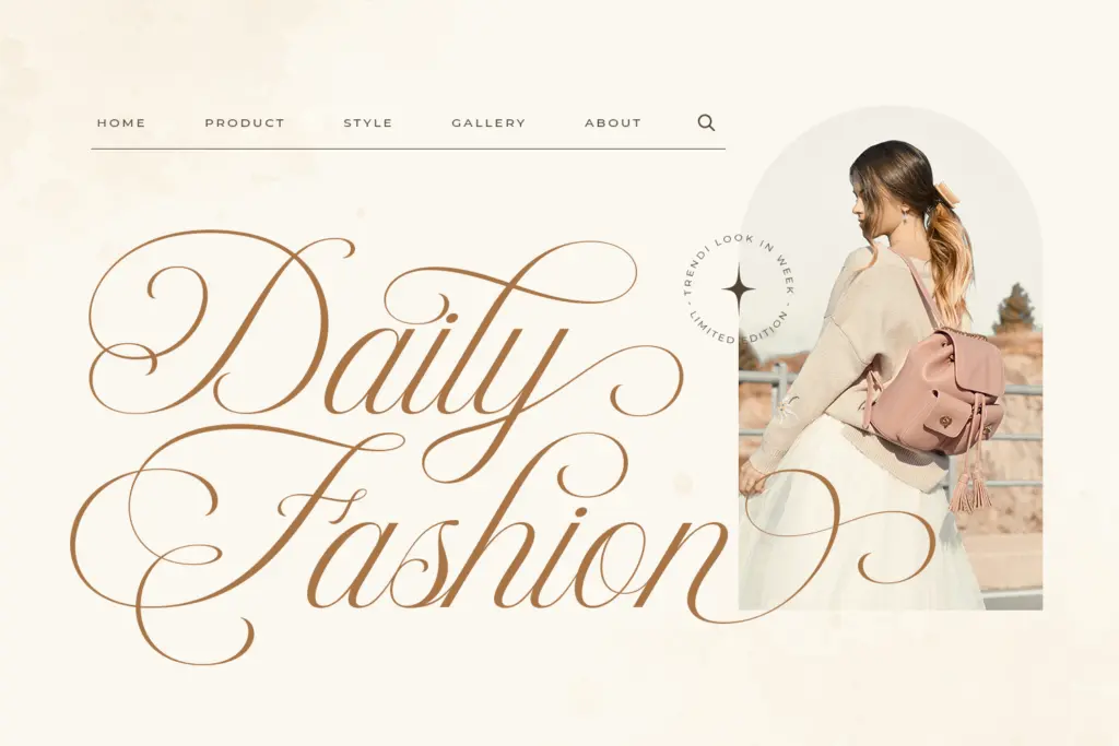
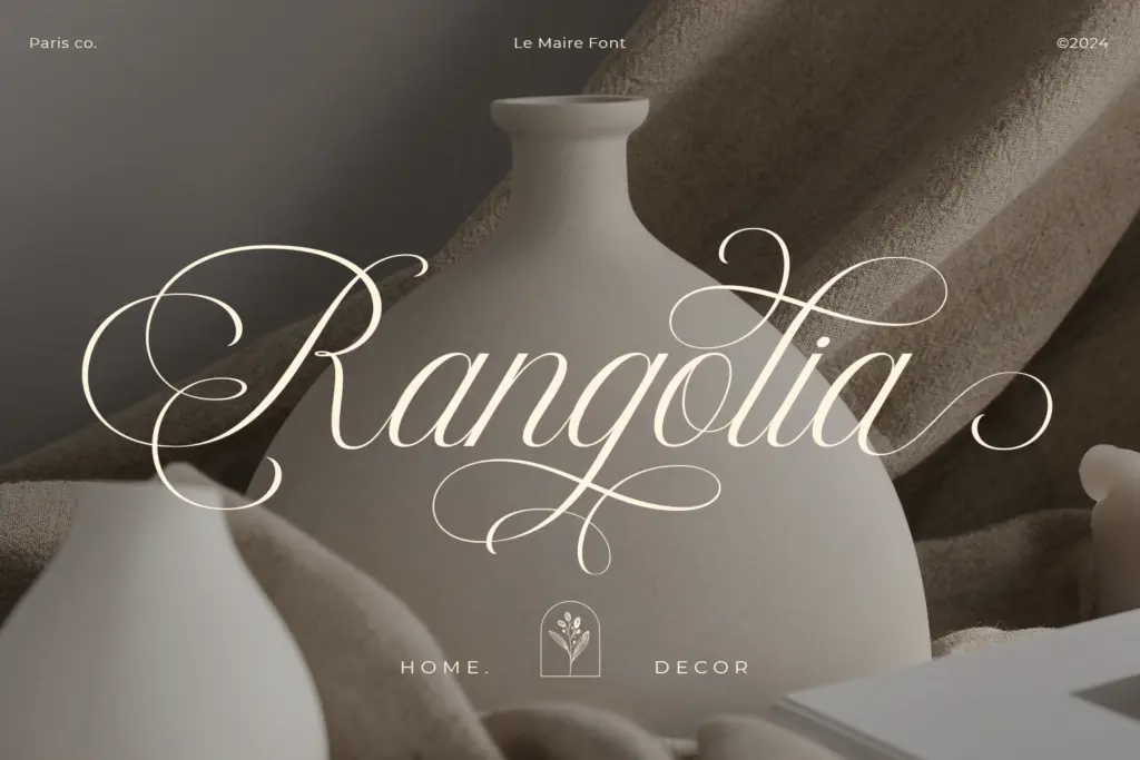
Le Maire’s natural home is branding and logotype work where a script needs to signal polish without shouting — beauty and skincare labelling, boutique packaging, stationery, and the kind of wedding invitation that’s going for understated rather than ornate. It pairs well with a plain sans or a light serif as a secondary typeface, since its thinness needs contrast in weight to avoid disappearing next to bolder text.
It also works for short-form editorial use: pull quotes, signature-style lockups, watermark text on photography, or a single line on a product mockup. Where it will struggle is anywhere the type needs to hold up small — captions, dense social graphics, or multi-line paragraphs — because the thin strokes and connected letterforms lose clarity quickly below a certain size.
In short: a script for accents and headlines, not for extended reading, and best used where a light touch is the actual brief rather than an afterthought.
What we liked, and what we didn’t
Strengths
- Consistent thin strokes give it a composed, minimalist look distinct from flourish-heavy scripts
- Ligatures and stylistic alternates handle awkward letter joins without extra design work
- PUA encoding makes alternates accessible without digging through a glyph panel
Trade-offs
- Thin strokes lose definition at small sizes, limiting it to display and headline use
- No stated multilingual support, so non-English projects need a glyph check first
Le Maire is a competent, quietly elegant script best used for logotypes, packaging, and headline moments rather than body text. Its thin, consistent strokes give it a composed look at large sizes but limit its usefulness anywhere small or dense. A solid, if unremarkable, addition to the modern-script category.
Verdict

Tantype reviews typefaces in depth — every font is tested in real branding, editorial and screen layouts before a word gets written. 555+ fonts reviewed and counting.