
Gimme Extra Bold Sans Serif: a chunky retro headline face for short bursts of type
Design style
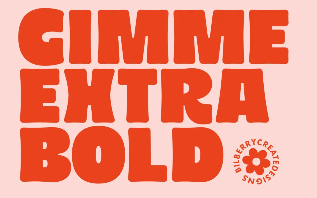
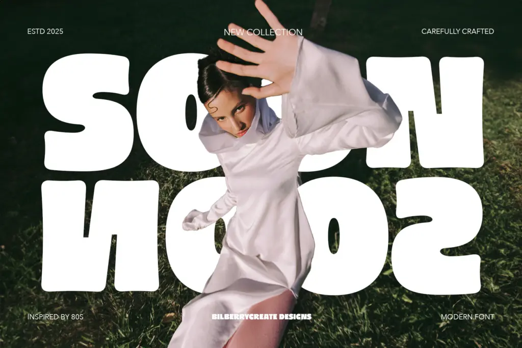
Gimme Extra Bold Sans Serif is built around a single idea: mass. The strokes are thick relative to the counters, giving each letter a squat, planted look that leans on a loose 1970s–80s groove aesthetic rather than anything strictly geometric. Curves are rounded rather than sharp, terminals are blunt, and the overall rhythm is bouncy rather than mechanical — this is a display face with a personality, not a workhorse sans built for paragraphs.
There’s an intentional roughness to the drawing. Letters don’t sit on a rigid grid the way a corporate sans would; some curves bulge a little more than others, some verticals lean fractionally off true. That looseness is the point — it reads as hand-finished and casual, closer to hand-lettered signage or retro packaging type than to a systematic typeface family. If you want something that photographs well as a single word on a poster, this delivers that texture.
Character set and features
The seller notes multilingual support, which suggests coverage beyond basic Latin, though the brief doesn’t spell out exactly which languages or diacritics are included — worth checking before committing to a project with accented text. The font ships in OTF, TTF and WOFF, covering desktop design work and basic web use without extra conversion.
There’s no mention of a lowercase set distinct from the caps in style, multiple weights, italics, alternates or ligatures. As far as the brief goes, this reads as a single-weight, single-style face — you get the one voice, at full volume, and that’s it. That’s fine for what it’s built to do, but it means no built-in way to create hierarchy or contrast within a layout using the family alone; you’ll need a second typeface for supporting text.
Use cases
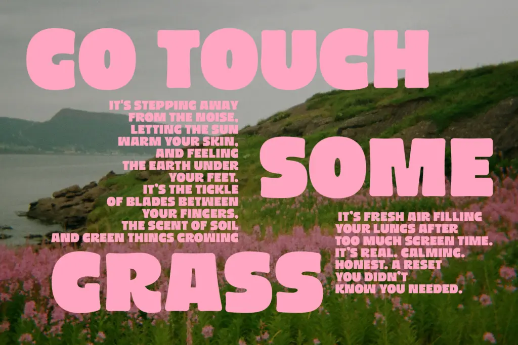
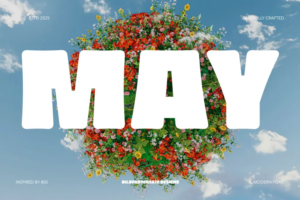
This is a face for short words set large: logotypes, headline treatments, badge and sticker lettering, party invitations, packaging call-outs. The retro-groovy character makes it a natural fit for birthday and celebration graphics, nostalgic branding, or any project that wants a warm, slightly imperfect handmade feel rather than a slick corporate one. It photographs well blown up on merchandise — mugs, tote bags, T-shirt prints — where its bold weight holds up under print processes that would eat a thinner face.
It is not built for body copy. At small sizes the thick strokes and tight counters will close up, especially in print or on lower-resolution screens, so keep it to a handful of words per use. It also won’t do quiet or minimal — everything set in it reads loud, so it suits playful, retro-leaning brands better than restrained or luxury ones. Pair it with a plain, neutral sans or serif for supporting text and let this carry the headline alone.
What we liked, and what we didn’t
Strengths
- Confident, chunky letterforms with a distinct 70s/80s groove character
- Blunt terminals and rounded curves give it a warm, hand-finished feel
- Works well blown up large on merchandise and packaging where bold weight survives printing
Trade-offs
- Single weight only, so there's no built-in way to build hierarchy within the family
- Thick strokes and tight counters make it unreliable at small sizes
Gimme Extra Bold Sans Serif is a loud, single-purpose display face with a genuine retro character, good for headlines, badges and party graphics. It has no range beyond that one voice — no weights, no italics, no small-size legibility — so it needs a plain companion font for anything else in the layout.
Verdict

Tantype reviews typefaces in depth — every font is tested in real branding, editorial and screen layouts before a word gets written. 555+ fonts reviewed and counting.