
Besotted Wedding Calligraphy: a swash-heavy script for invitation suites
Design style
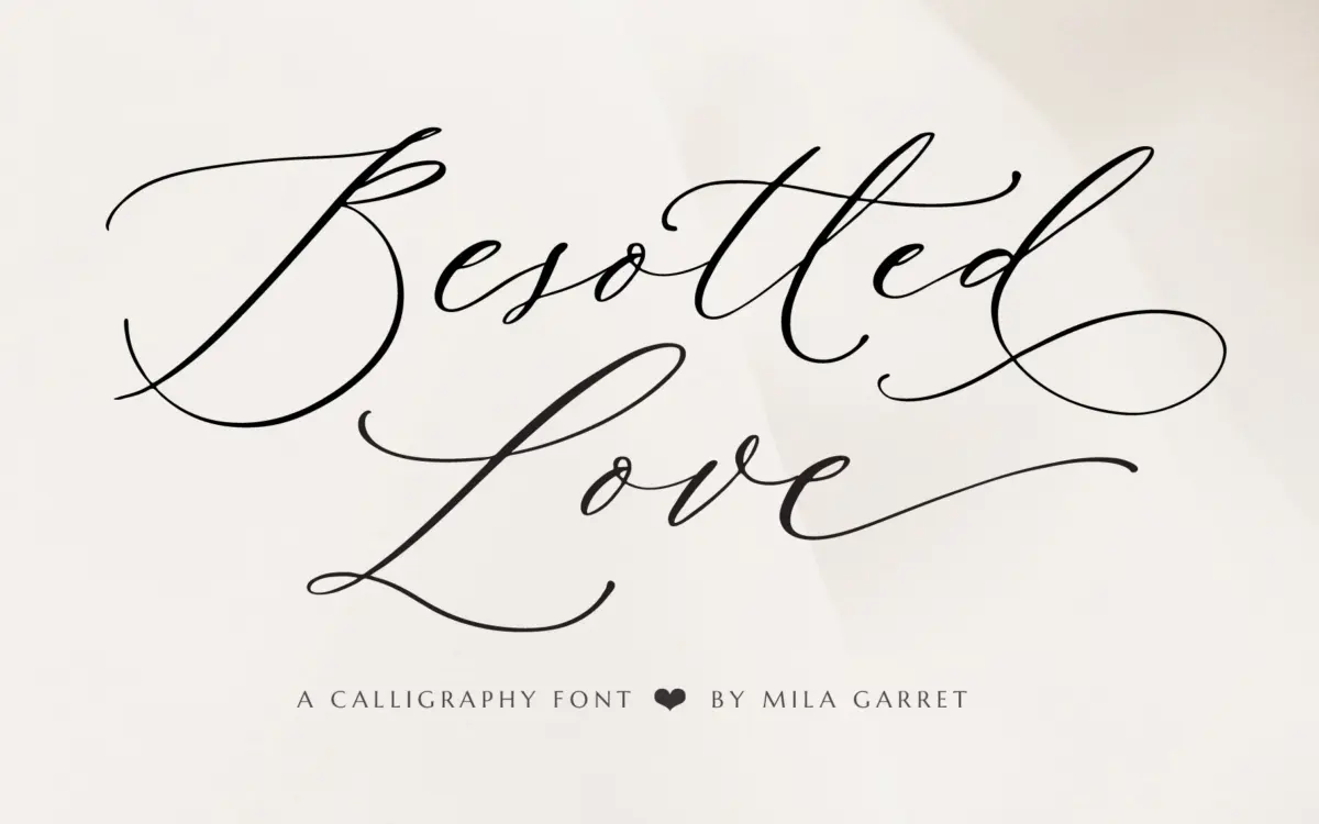
Besotted Wedding Calligraphy sits squarely in the pointed-brush lineage that dominates the wedding-stationery market: connected lowercase, a moderate forward slant, and thin-to-thick stroke contrast meant to read as if it were pulled with a flat brush rather than a pointed pen. The letterforms are tidy rather than loose. Where a lot of calligraphy fonts lean into visible ink pooling or irregular baseline wobble to fake spontaneity, this one keeps its baseline disciplined and its curves even, which makes it easier to set in long strings without the eye tripping over inconsistencies.
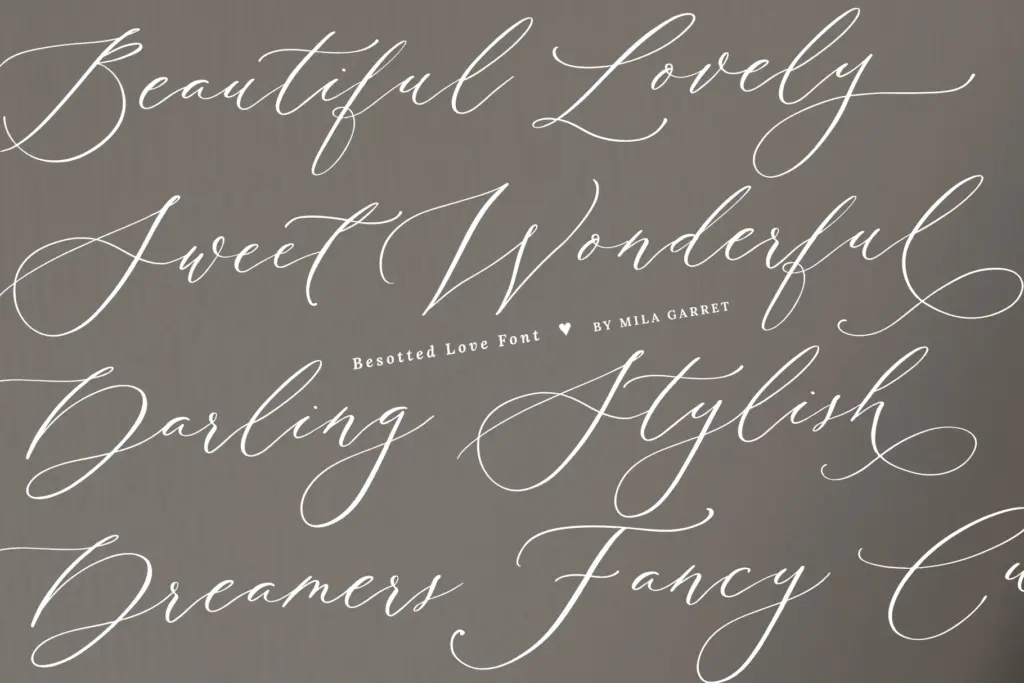
The uppercase is where the personality lives. The swash capitals are built for word-initial use — big looping entry strokes on letters like B, W, and L that need generous margin space and a light hand with kerning. Left on default settings the swashes will collide with adjacent letters in a lot of pairings, so this is a font that rewards someone willing to go in and manually adjust spacing rather than just typing a name and calling it done.
Character set and features
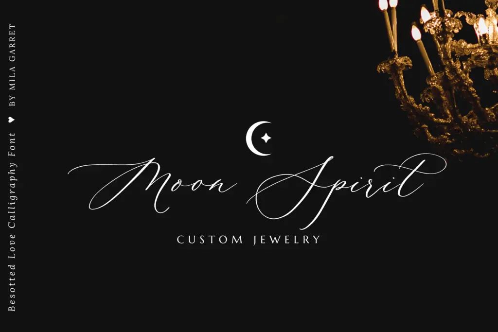
The package covers the full standard alphabet and punctuation, plus four separate swash sets: beginning swash capitals, beginning swash lowercase, ending swash lowercase, and a run of stylistic alternates. That’s a meaningfully deeper character set than the single-swash-alphabet scripts common at this price point, and it’s the difference between a font that can only do one flourish and one that can vary the flourish depending on whether a word starts, ends, or sits mid-line.
The PUA encoding is the practical detail worth flagging. Because the swash and alternate glyphs are mapped to the Private Use Area, they show up automatically wherever you type without needing OpenType feature support — useful for anyone working in apps like Canva or basic word processors that don’t expose stylistic-alternate menus. Designers working in Illustrator or InDesign lose nothing by this; they can still access the glyphs panel directly, they just don’t need to.
Multilingual support extends to the accented Latin characters used across most Western and Central European languages, along with a handful of currency symbols. There’s no indication of extended Central/Eastern European diacritics beyond š and ž, so anyone setting Polish, Czech, or Turkic-language text should check specific character coverage before committing.
Use cases
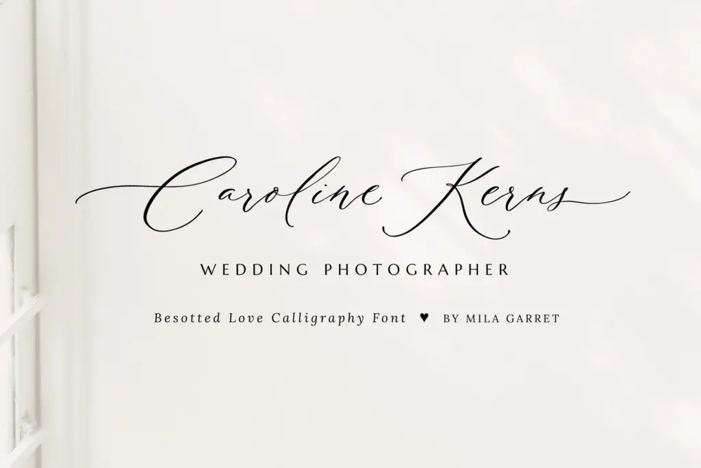
This is a font built for a narrow, well-defined job: wedding names, monograms, save-the-dates, invitation headers, and the kind of one-or-two-word branding lockups that photographers and small studios use on business cards. It performs best set large, at display sizes, where the contrast and swash detail actually register — shrink it down to body-copy sizes and the connected lowercase strokes thin out and lose definition.
It is not a font for running text, and it will fight anyone trying to use it for paragraph-length website copy, which the seller’s own website-font claim overstates. Pair it with a plain sans or a simple serif for supporting text; use it alone only for the headline moment.
What we liked, and what we didn’t
Strengths
- Four separate swash sets give real variation between word-initial, word-final, and mid-word letters
- PUA encoding means the extra glyphs work automatically in apps without OpenType feature panels
- Disciplined, even baseline makes long name-strings easier to set than looser calligraphy scripts
Trade-offs
- Swash capitals need manual kerning adjustment or they collide with neighbouring letters
- Legibility drops sharply below display sizes, so it's unsuited to body text or small print despite the website-font tag
Besotted Wedding Calligraphy is a competent, well-built swash script that does exactly what wedding stationery needs it to do, provided you're setting a name or a headline rather than a paragraph. The deep swash character set and PUA encoding make it more flexible than most single-alternate scripts at this level, but it needs manual kerning attention and it isn't the multi-purpose website font the listing suggests.
Verdict

Tantype reviews typefaces in depth — every font is tested in real branding, editorial and screen layouts before a word gets written. 555+ fonts reviewed and counting.