
Gathering Calligraphy Wedding Script: a handwritten script for invitations and delicate branding
Design style
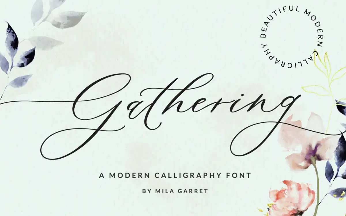
Gathering Calligraphy Wedding Script sits in the crowded field of modern brush-style wedding scripts, but it leans more toward pointed-pen calligraphy than the loose, felt-tip scrawl that dominates this category. Strokes swell and thin in a way that mimics a flexible nib, with entry strokes that taper to a fine point before widening into the body of each letter. The joins between letters are close and slightly overlapping, which gives words a connected, flowing look rather than a series of isolated marks.
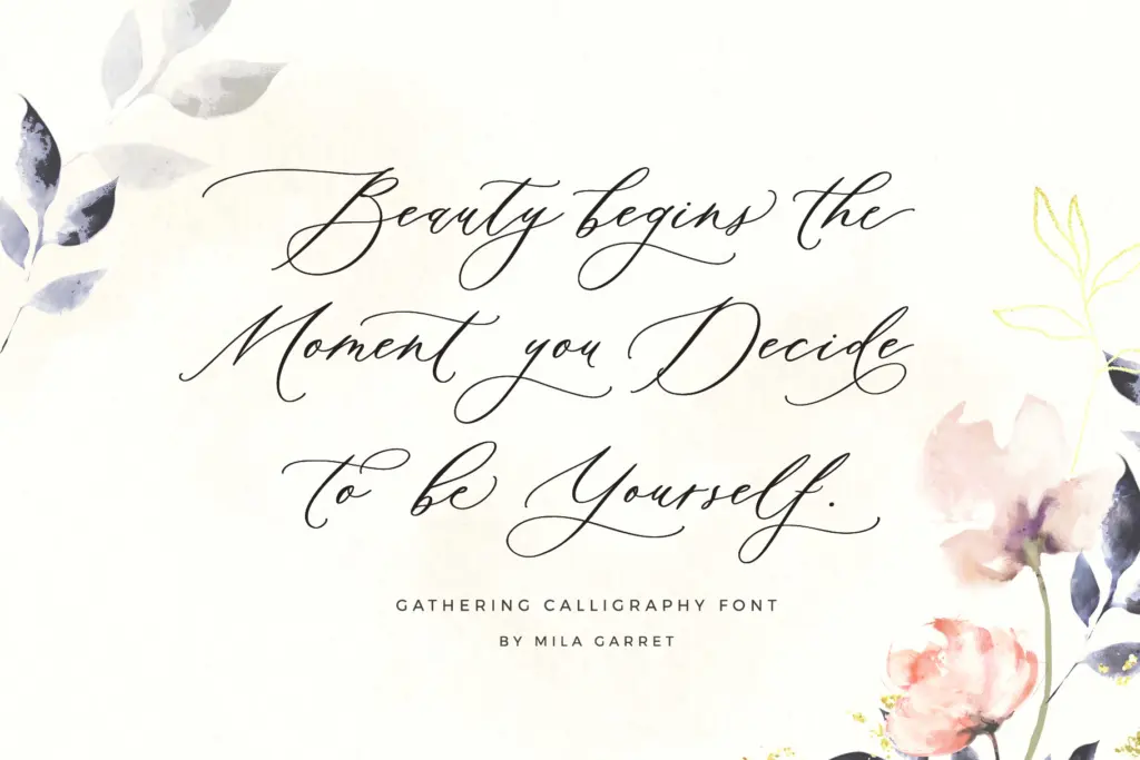
The baseline has a gentle, informal waver rather than a rigid horizontal — letters sit a touch above or below their neighbours, which is deliberate and reads as handwriting rather than a computer-generated wobble. Ascenders and descenders extend generously, with loops and tails that swing well below the baseline on letters like g, y and j. This is a script built for short phrases and names, not for setting long passages, and it shows: the letterforms want room to breathe.

Character set and features
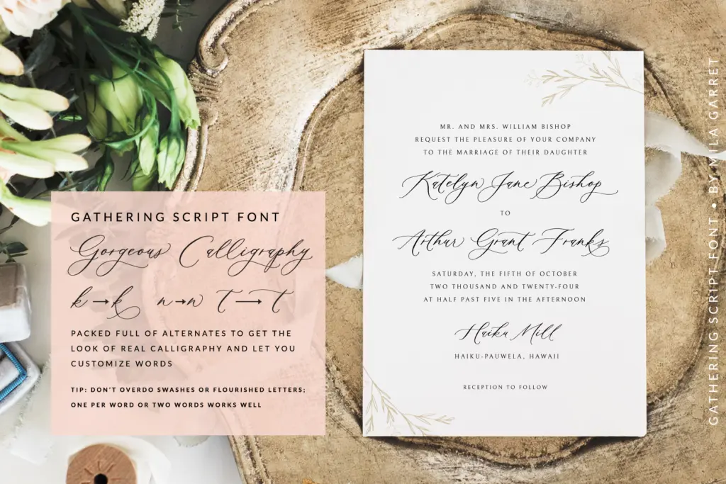
The font includes a substantial set of alternate glyphs, which is really the point of a script like this. Rather than one fixed shape per letter, many characters — particularly capitals and letters with tails — have two or three variants that can be swapped in through OpenType features or a glyphs panel, depending on the software. This lets you avoid the repetition that flattens a script when the same word or letter combination appears twice in a line, a common problem with cheaper calligraphy fonts that ship with only a single glyph per character.
Swashes are the other headline feature. Capitals in particular carry extended flourishes designed to open up beginnings and ends of words — useful for a monogram or a short line like a couple’s first names, less useful if you need the same swash to sit comfortably mid-sentence. Kerning between standard pairs is handled reasonably well, though scripts with this much stroke variation always require some manual nudging in tighter compositions, and this one is no exception. There’s no indication of extended language support here, so treat it as a Latin-alphabet tool until proven otherwise.
Use cases
This is a font for short, ceremonial text: names on an invitation suite, a monogram, a save-the-date, a line on a place card. It’s built for wedding stationery specifically, and it does that job well — the calligraphic pedigree and swash options give designers real material to work with rather than a single static look. It also holds up in logo work for businesses wanting a handwritten, personal signature — florists, bakeries, boutique studios — where a short name benefits from the alternate glyphs breaking up repeated letters.
Where it struggles is anywhere text runs long. Set a full paragraph and the connected strokes, varying baseline and generous swashes start fighting each other; legibility drops and the page feels busy rather than elegant. Keep it to headlines, names and short quotes, pair it with a plain sans or serif for body copy, and it does exactly what it’s designed to do.
What we liked, and what we didn’t
Strengths
- Alternate glyphs genuinely reduce repetition across names and short phrases
- Convincing pointed-pen taper gives it more calligraphic credibility than typical brush scripts
- Swash capitals suit monograms and short branding lines well
Trade-offs
- Legibility drops quickly once text runs beyond a phrase or two
- No indication of extended language support beyond basic Latin
Gathering Calligraphy Wedding Script is a well-drawn pointed-pen style script with enough alternates to avoid the repetition that ruins cheaper scripts. It's built for short, ceremonial text and does that job convincingly, but it's not a font to set a paragraph in. Treat it as a headline and monogram tool and it earns its keep.
Verdict

Tantype reviews typefaces in depth — every font is tested in real branding, editorial and screen layouts before a word gets written. 555+ fonts reviewed and counting.