
Aston Script Pro: a dense copperplate-style script for wedding and label work
Design style
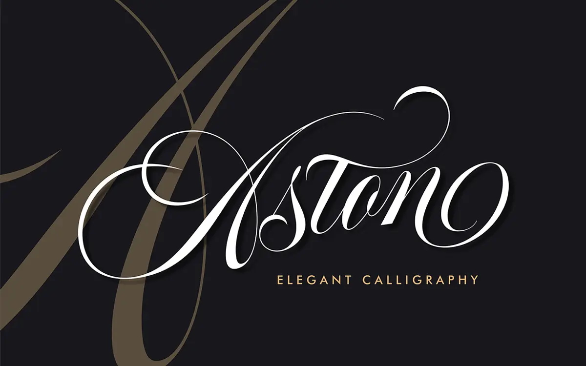
Aston Script Pro sits in the copperplate-influenced calligraphy tradition, but it isn’t a strict revival. The strokes carry the tapering thick-to-thin contrast you’d expect from a pointed-pen script, then loosen up into looping ascenders and descenders that feel more contemporary than classical. The slant is moderate rather than aggressive, which keeps individual letters readable even before they’re joined into words. Connections between letters are the real focus here: many pairs have been drawn to flow into each other with dedicated ligatures rather than relying on generic joining rules, so the baseline rhythm reads as handwritten instead of mechanically kerned.
It leans decorative without tipping into illegibility. Swashes on capitals and some ascenders add flourish, but the lowercase skeleton stays close to a normal cursive hand, so the font doesn’t demand constant squinting to figure out which letter is which. This is a script built for short lines of type where the eye can take in a whole word at once, not for paragraphs.
Character set and features
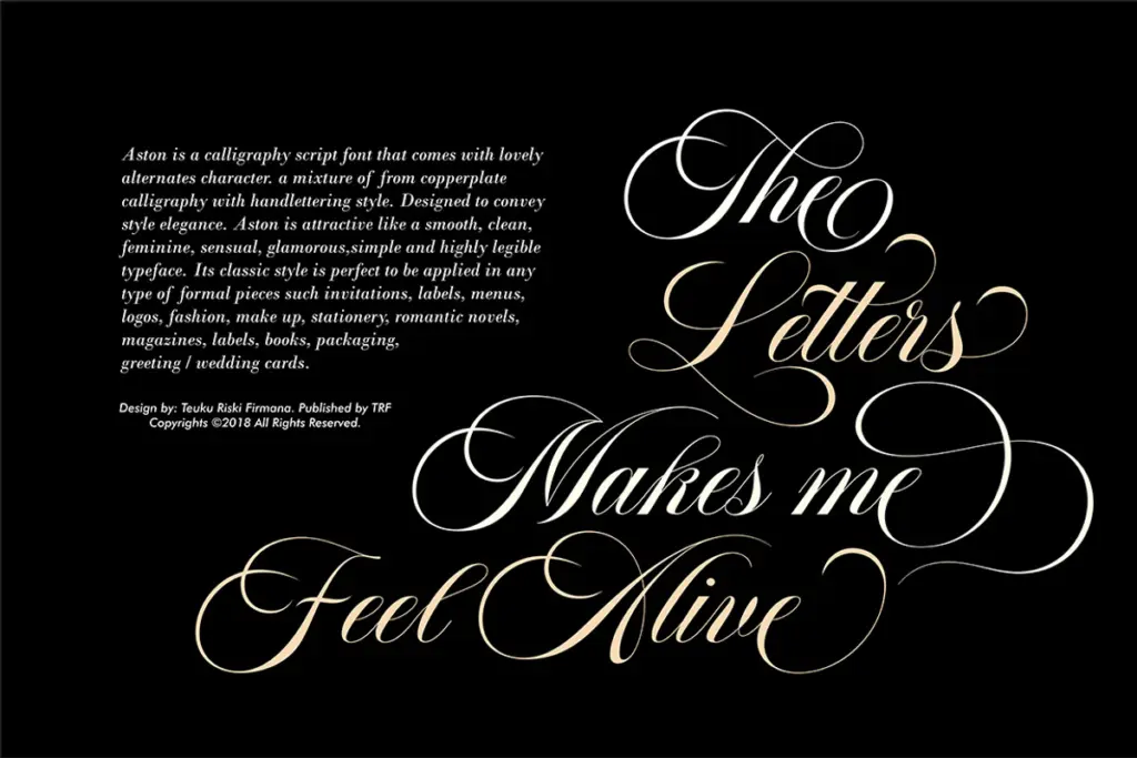
The glyph count is unusually large — over 1,300 glyphs with more than a thousand alternates — and that volume is both the strength and the catch. There’s real depth here: multiple versions of common letters, contextual alternates for tricky letter combinations, and ligatures that solve awkward joins you’d otherwise have to fake by hand in a vector program. But none of this is automatic. The OpenType features have to be accessed deliberately through a glyphs panel, and the font is most useful in software that actually exposes that panel — Illustrator, Photoshop CC, InDesign, or CorelDraw. Drop it into an app without OpenType support and you’ll get a plain, far less interesting default state, since the interesting work lives in the alternates rather than the base character.
The inclusion of PUA (Private Use Area) encoding is a practical touch: it means the extra glyphs can be reached by keystroke even in environments that don’t support OpenType features properly, which widens where the full character set is actually usable. Broader language support is mentioned as part of the package, useful if your project needs more than a basic Latin set.
Use cases
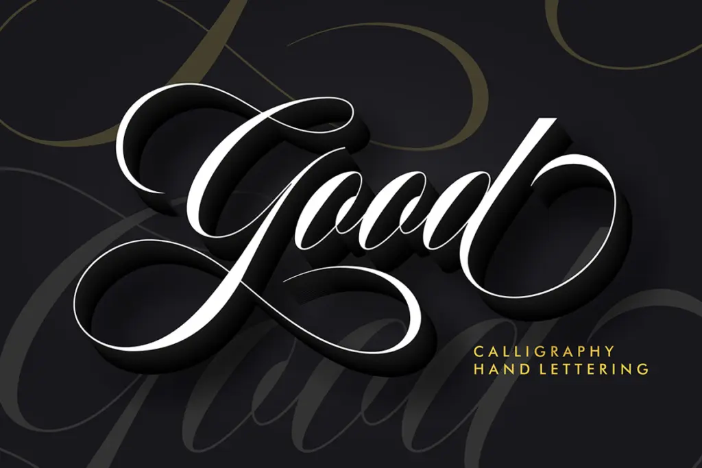
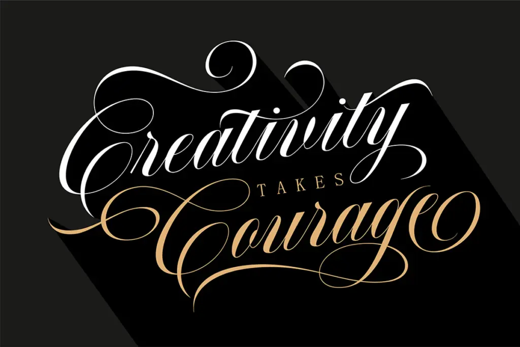
This is a font for headline and display moments, not body copy. Wedding invitations, place cards, and monogram-style branding are the obvious fits — the swash capitals and looping connections give exactly the kind of formal, hand-finished feel that occasion stationery wants. It also reads well at small sizes on packaging and labels, where a single word or short phrase needs to look considered rather than typed. Fashion and beauty branding, menu headers, and editorial titling are other reasonable homes, especially where a design already leans toward warmth or nostalgia. Given the manual nature of the alternates, it rewards designers willing to spend time swapping glyphs by hand to smooth out repeated letters or awkward collisions — it is not a font you drop in and walk away from if you want it to look its best.
What we liked, and what we didn’t
Strengths
- Ligatures and contextual alternates give letter joins a genuinely handwritten flow rather than mechanical kerning.
- Large glyph set with PUA encoding means the extra characters are reachable even without full OpenType support.
- Moderate slant and readable lowercase skeleton keep it legible at small sizes despite the ornamentation.
Trade-offs
- OpenType features require manual glyph-panel work, so the font looks plain until you put in the effort.
- Not built for long-form text — it's strictly a short-line, display-use script.
Aston Script Pro is a well-drawn, decorative calligraphy script with real depth in its alternate glyphs, but it demands manual OpenType work to look its best. It's a strong pick for wedding stationery, labels, and short branding lines, less useful anywhere you need speed or long text.
Verdict

Tantype reviews typefaces in depth — every font is tested in real branding, editorial and screen layouts before a word gets written. 555+ fonts reviewed and counting.