
Fitzgerald: A Retro Serif Family for Nostalgic Branding and Editorial Work
Design style
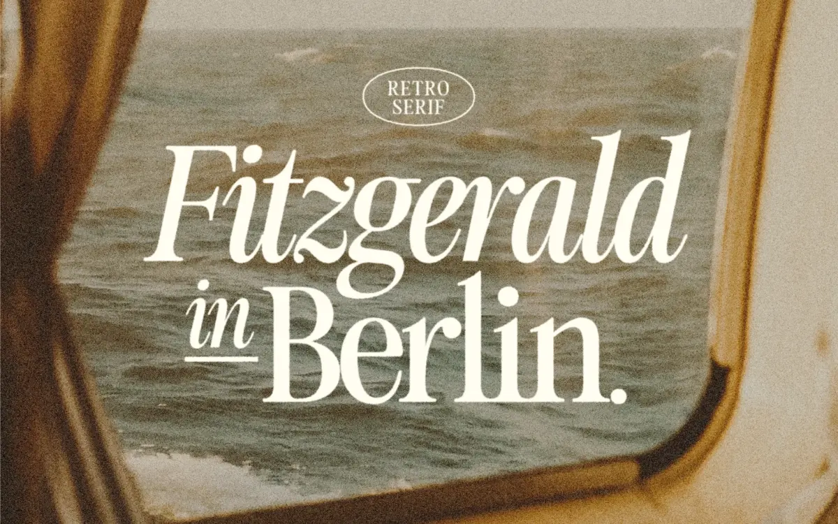
Fitzgerald sits in that well-populated but still useful territory of retro serifs — the kind that nod at mid-century advertising type and old paperback covers without going full pastiche. The letterforms carry moderate contrast between thick and thin strokes, with bracketed serifs that feel sturdy rather than delicate. There’s a slight warmth to the curves, an unevenness that reads as hand-finished rather than mechanically drawn, which is likely the intent behind calling it a retro face rather than a straight revival.
The italic is where the personality shows up most. It leans rather than swaggers, with a few connected forms that soften the transition between letters. It’s restrained compared to a full script, but it gives the family a second gear beyond straightforward upright text.
What Fitzgerald doesn’t do is push into anything eccentric. There’s no oversized swash, no exaggerated ball terminal, no single letter that becomes the calling card of the design. That’s a deliberate trade-off: it makes the face easier to use across a range of jobs, but it also means Fitzgerald won’t be the thing that makes a design memorable on its own. It needs to be styled into place by whoever is using it.
Character set and features
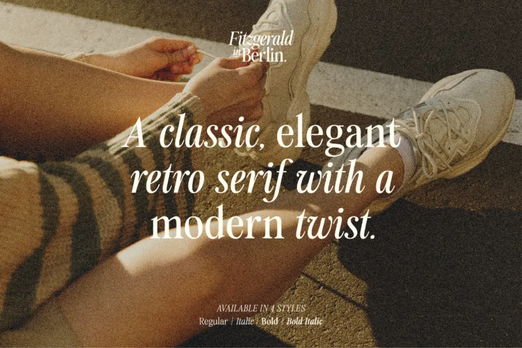
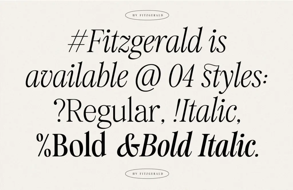
The family comes in four styles — Regular, Italic, Bold, and Bold Italic — which is a sensible spread for a retro serif rather than an over-engineered one. You get enough weight range to set a headline in Bold and support it with Regular body copy, plus italics for emphasis or captions, without the family sprawling into weights nobody will actually reach for.
Language coverage extends to European languages and Vietnamese, which is worth noting if your work needs diacritics beyond basic Latin — many retro display fonts skip this entirely. The seller mentions standard ligatures accessible through OpenType features, though getting the full set means digging into the Glyphs panel in something like Illustrator rather than having them apply automatically. That’s a minor friction point for anyone expecting ligatures to fire on their own in less OpenType-savvy software.
There’s no mention of small caps, alternates, or an extended stylistic set, so treat this as a solid working family rather than a feature-stuffed one. What’s here is dependable; there isn’t much extra to explore beyond it.
Use cases
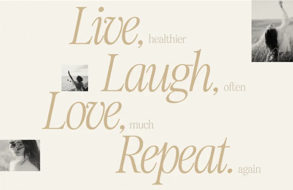
Fitzgerald reads well at logo and headline sizes, where its moderate contrast and confident serifs carry weight without extra styling. It’s a reasonable fit for packaging that wants a nostalgic but tidy feel — think small-batch food and drink labels, artisanal branding, that general lane of vintage-adjacent commercial work.
The seller’s claim of body-text readability is plausible in principle given the letter spacing and stroke weight, but four styles is a thin toolkit for long-form editorial setting — there’s no true text-optimized cut, so test it at your intended body size before committing to paragraphs of copy. For wedding stationery, short editorial headers, or social graphics, it does its job cleanly and without fuss.
What we liked, and what we didn’t
Strengths
- Bracketed serifs and moderate contrast give it a warm, hand-finished retro character
- Vietnamese and broad European language support beyond typical retro display fonts
- Four styles cover headline, body, and emphasis needs without unnecessary bloat
Trade-offs
- No dedicated text-optimized cut, so long-form body copy needs testing before committing
- Ligatures require manual access through the Glyphs panel rather than firing automatically
Fitzgerald is a competent, well-mannered retro serif that does headline and branding work reliably without trying to be a showpiece. It's a safe choice for nostalgic packaging, logos, and wedding stationery, but the four-style family and reliance on manually accessed ligatures mean it needs some care if you push it toward body text.
Verdict

Tantype reviews typefaces in depth — every font is tested in real branding, editorial and screen layouts before a word gets written. 555+ fonts reviewed and counting.