
Fifty Fifty Serif: an editorial serif with ligature depth for headline work
Design style
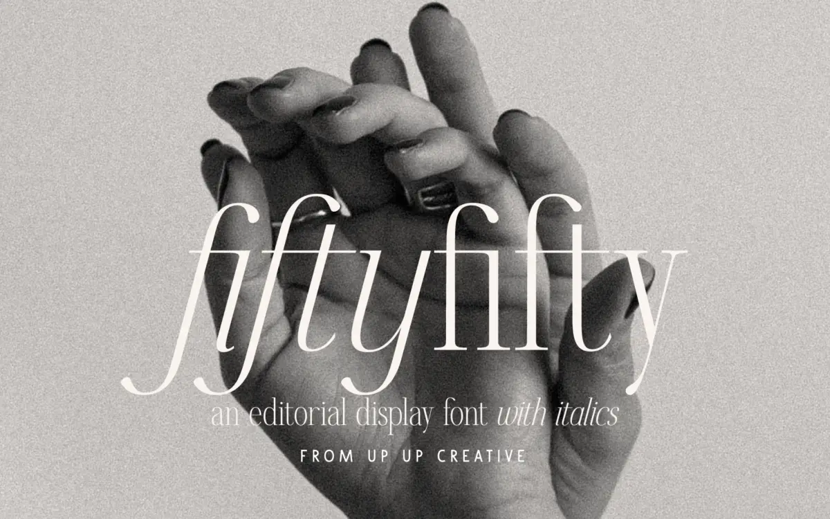
Fifty Fifty sits in the editorial serif camp: moderate contrast, smooth curves rather than sharp bracketing, and a general air of restraint. It doesn’t reach for personality through eccentric terminals or exaggerated stroke swings. Instead it leans on proportion and consistency, which is what gives it that slightly cool, magazine-page feel rather than something warmer or more crafted-looking. The caps are the strongest part of the design. They’re evenly weighted, confident at large sizes, and read well as standalone initials or in short all-caps settings. The lowercase is more understated but holds its own once you see it set in running text rather than isolated letters — the curves in the bowls and the shoulders of characters like m and n keep a consistent rhythm across a line.
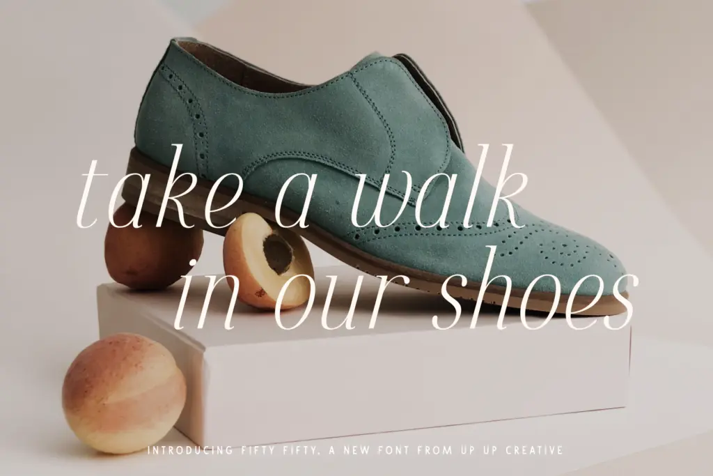
The italic is a genuine companion rather than an obligatory slant. It has its own cursive logic in places, with entry strokes and joins that give it a more fluid, less mechanical feel than the roman. Pairing the two within a headline — roman for a word, italic for emphasis — is one of the more satisfying things you can do with this family.
Character set and features
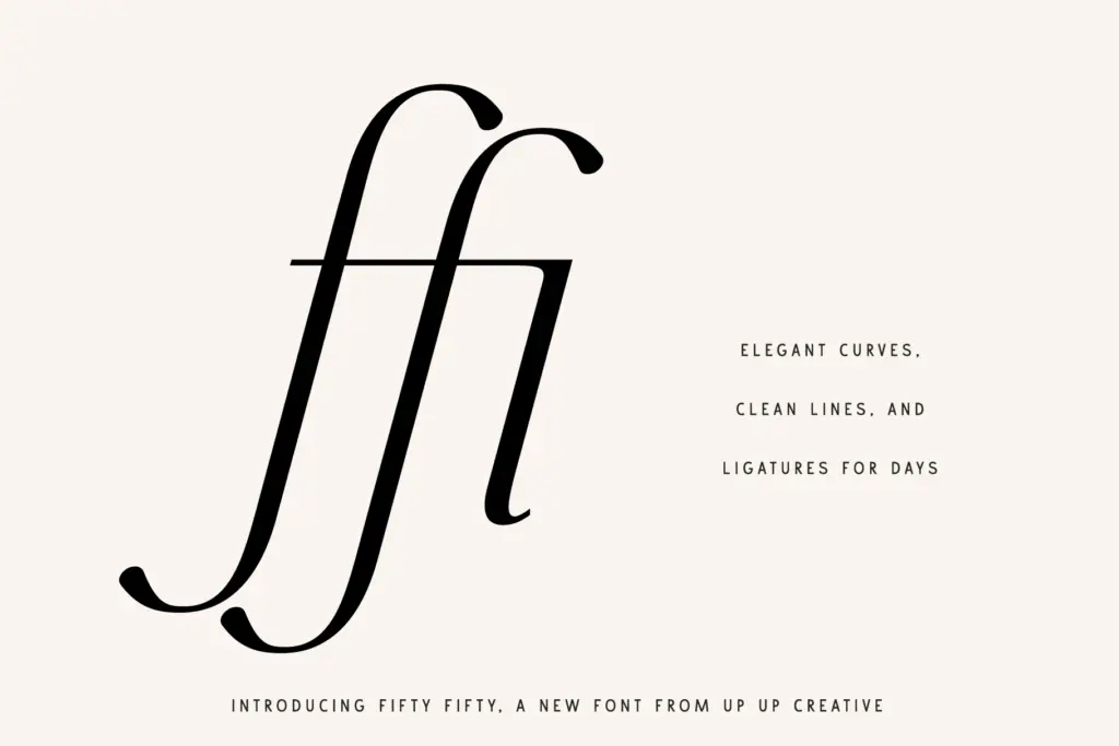
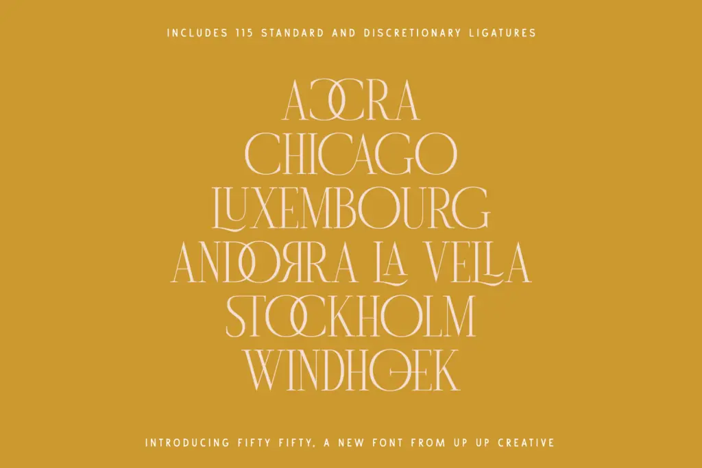
The glyph count here is substantial, at roughly 700 glyphs, and a large portion of that is given over to ligatures — upwards of 115 standard and discretionary combinations. That’s a lot for a two-style family, and it shows in how the font behaves in extended settings: common letter pairs knit together instead of sitting as separate shapes, which reduces the slightly mechanical look serif display fonts can fall into when set loosely. Stylistic sets and character variants give you some control over individual letterforms without needing a second font file, and there’s multilingual support along with currency symbols, which is useful if you’re producing branding work that needs to travel beyond a single market.
The catch is that all of this lives behind OpenType features, and the seller is upfront that accessing them properly requires software that handles OpenType well — Illustrator or InDesign, not a bare-bones word processor. If you’re working in Word, you’ll get the base characters and lose most of what makes the ligature set worthwhile. That’s not a flaw in the type design, but it does change who can actually use the font as intended.
Use cases
This is a headline font first. It’s built for editorial mastheads, pull quotes, branding lockups, monograms, and poster-scale type where the ligatures and caps can do their work at size. It’s less suited to long-form body copy — the x-height and rhythm are tuned for display use, not paragraphs of reading text at 10pt. Logo designers and brand identity work will find plenty to use here, particularly where a monogram or wordmark benefits from a ligature doing double duty as a flourish. Anyone producing packaging, poster series, or editorial layouts where a serif needs to look considered rather than decorative will get good mileage from it, provided the software supports the feature set it was built around.
What we liked, and what we didn’t
Strengths
- Caps are strong enough to carry headlines and monograms on their own
- Large ligature set genuinely changes how the font reads in extended headline settings
- Italic feels like a designed companion, not just a slanted duplicate
Trade-offs
- Lowercase and overall design are tuned for display sizes, not long-form reading
- Full feature set requires OpenType-savvy software; Word users lose much of the value
Fifty Fifty is a confident editorial serif with a caps set that does most of the heavy lifting and a ligature library that adds real texture at headline sizes. It's not built for body text, and its best features are locked behind OpenType-capable software, but for branding, logos, and display work it's a solid, well-considered choice.
Verdict

Tantype reviews typefaces in depth — every font is tested in real branding, editorial and screen layouts before a word gets written. 555+ fonts reviewed and counting.