
Valty: a retro serif with five weights for headline-heavy branding
Design style
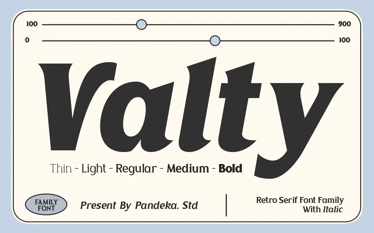
Valty is a display serif that leans on the graphic vocabulary of the 1980s and 90s: bold, slightly bulging letterforms with curves that push into playful territory rather than staying strictly formal. It isn’t trying to be a workhorse text serif — the proportions are too generous and the curves too exaggerated for that. Instead it reads as a poster and packaging face, the kind of thing you’d expect on a cassette sleeve or a diner sign redrawn for a contemporary brand.
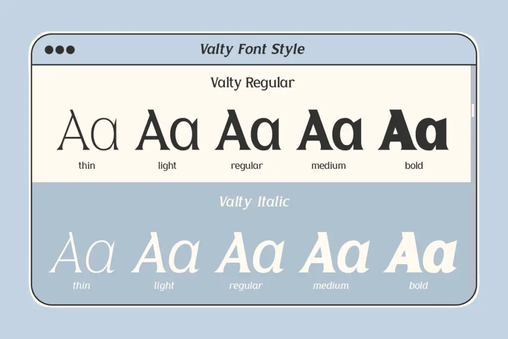
The five weights — Thin, Light, Regular, Medium and Bold — give the family a reasonable amount of range within that retro frame. At Thin the serifs get delicate enough that the vintage bulge softens into something closer to a modern serif with quirky details. At Bold the letterforms thicken into something confident and loud, closer to what most buyers will actually reach for when they want that retro punch. The italic companion follows the same logic across the weight range, adding a slight forward lean without abandoning the curvy terminals that define the upright.
Character set and features
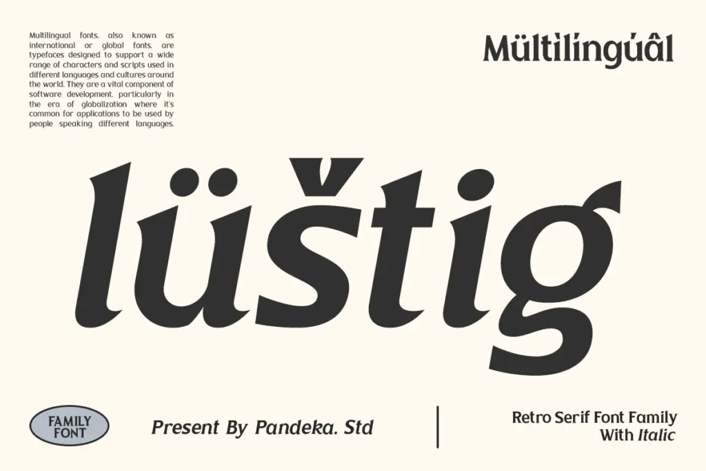
Valty covers uppercase and lowercase letters, numerals and punctuation, and the seller notes multilingual support, so it should handle most Latin-based language needs beyond straightforward English copy. The ten-style structure — five weights each in Regular and Italic — is the main practical asset here. It means a single purchase gives a designer a proper weight ladder rather than one display style stretched to cover every job.
PUA encoding is mentioned for accessing special characters, which matters if the font includes swash alternates or decorative glyphs tucked outside the standard character map — useful, but it does mean checking the character map or install instructions before assuming every glyph is one keystroke away. There’s no indication of extended stylistic sets, ligature sets beyond the basics, or alternate figure styles, so treat this as a solid, uncomplicated character set rather than a feature-dense one.
Use cases
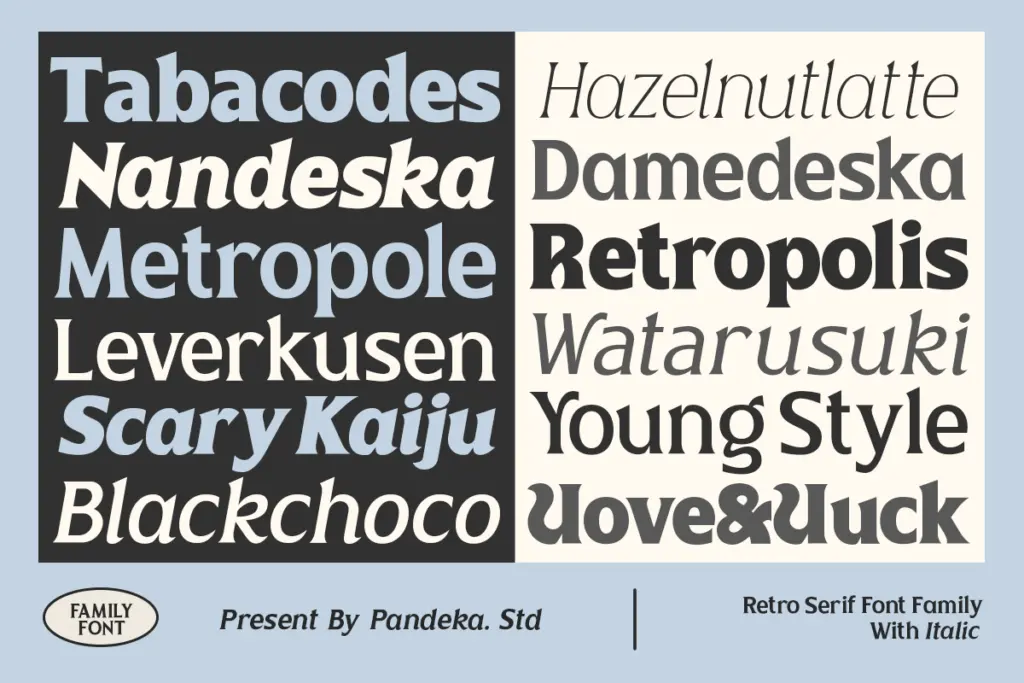
Valty’s natural home is headline and display work: posters, packaging, editorial titles, logotypes that want a retro wink without going full pastiche. The heavier weights work well as standalone wordmarks or short headline treatments where the bulge and curve of the serifs can be appreciated at size. The lighter weights extend that into subheads or secondary display copy where you still want the family’s personality but need less visual weight.
It is not built for body copy. The letterforms carry too much personality and the counters aren’t tuned for small-size reading — set it below display sizes and the curves that make it interesting start to blur the letter recognition. Pair it, in practice, with a plain, quiet sans or serif for the actual reading text, and let Valty do the talking at the top of the page. For brands wanting a nostalgic, slightly playful voice — beauty, food and drink, music, anything with a vintage-adjacent story — Valty gives you the tone in five convenient doses.
What we liked, and what we didn’t
Strengths
- Five weights plus italics give real range for headline hierarchy
- Bold, curvy terminals give an authentic 80s/90s poster feel
- Works well as a standalone display face for logos and packaging
Trade-offs
- Not legible enough at small sizes to serve as body text
- Character set is straightforward with no extended stylistic alternates mentioned
Valty is a confident, curvy retro serif that does its best work loud and large. The five-weight range gives it more flexibility than most display fonts, but it's a headline tool through and through, not a text face.
Verdict

Tantype reviews typefaces in depth — every font is tested in real branding, editorial and screen layouts before a word gets written. 555+ fonts reviewed and counting.