
Jinglers: a monoline script for vintage signage and logo work
Design style
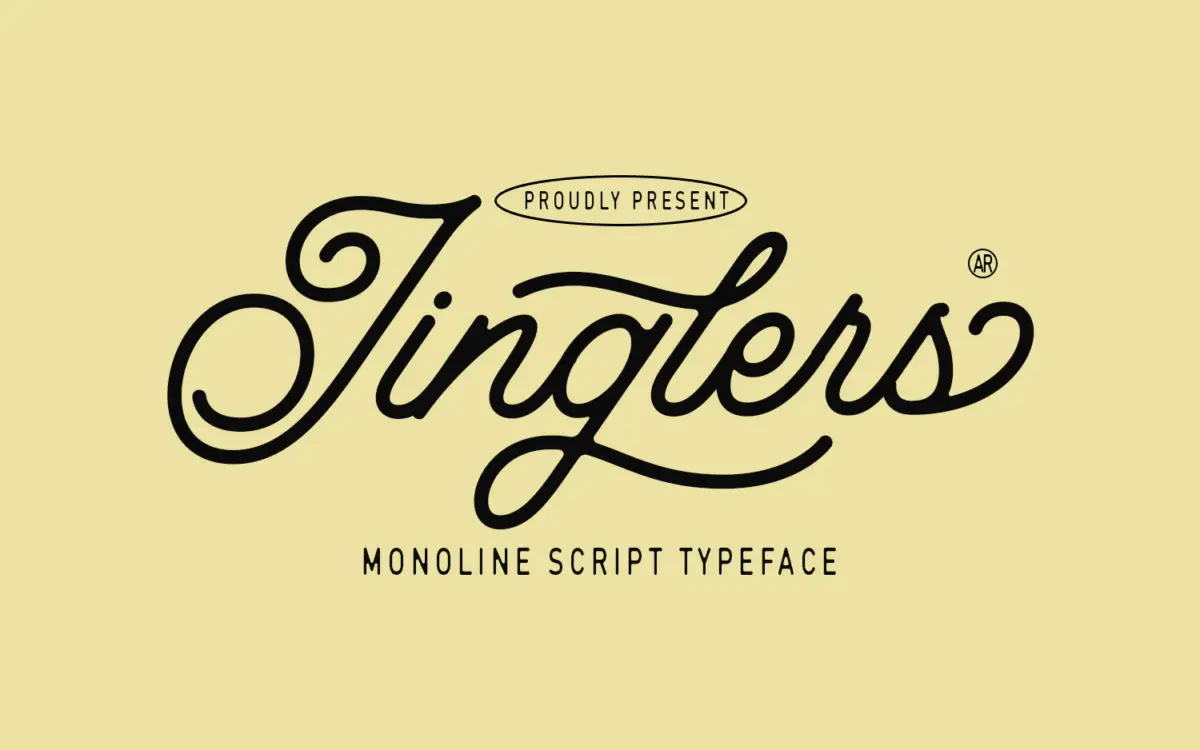
Jinglers is a connected script built on a single stroke weight, which puts it in the same family as the monoline revival scripts that have been popular in branding for the past decade. Where it differs from the generic version of that style is a slightly looser, more hand-inflected rhythm — the joins between letters aren’t perfectly mechanical, and you can see small variations in slant and loop size that give it a signage feel rather than a calligraphic one. It reads as something painted or routed rather than pointed with a brush.
The monoline treatment means there’s no thick-thin contrast to carry drama, so the typeface leans on its letter shapes instead: generous ascenders and descenders, loops that stay open rather than crossing, and a baseline that dips and rises gently rather than running flat. That movement is what sells the vintage reference — think hand-painted shopfronts and mid-century soda labels rather than formal invitation scripts. It’s a font with a specific mood, and it commits to it rather than trying to be neutral.
Character set and features
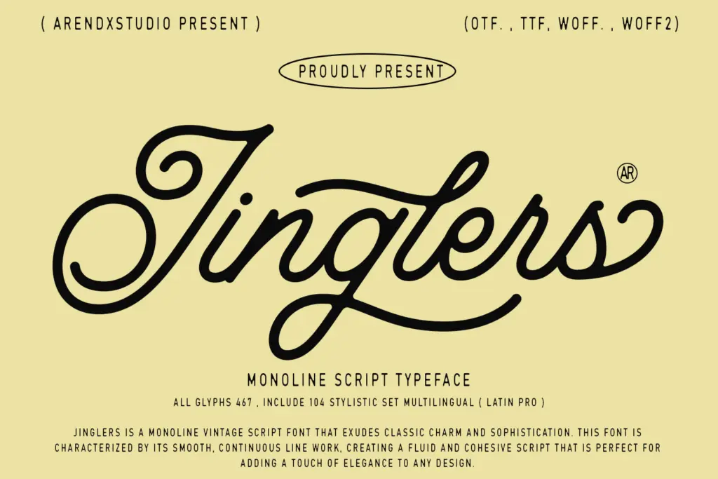
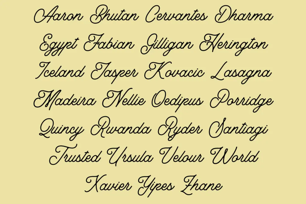
As a connected script, Jinglers depends on consistent joining behaviour across the alphabet, and for the most part the letters flow into each other cleanly at the sizes you’d expect to use them — headlines, logotypes, short lockups. The uniform stroke weight is forgiving here: there’s no contrast to break down awkwardly when spacing gets tight, which is one of the practical upsides of the monoline approach over a traditional script with pressure variation.
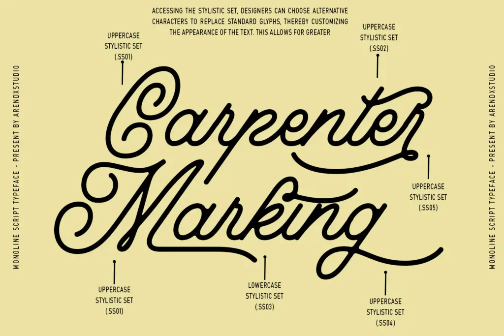
The brief doesn’t detail swash alternates, ligature sets, or language coverage, so treat those as unknowns rather than assumptions — check the character map before committing to a layout that depends on special alternates or extended accents. What is clear from the design itself is that this is a script meant to be set at a handful of words, not paragraphs. Monoline scripts like this one tend to lose their rhythm in long-form setting, where the eye starts to notice the regularity of the stroke rather than the character of the letters.
Use cases
Jinglers is built for the jobs its vintage reference implies: logotypes for cafés, bakeries, barbershops and small retail brands chasing a retro identity; packaging labels where a short brand name needs warmth without looking twee; poster and signage headlines where a hand-done feel is wanted at a glance rather than on close reading. It also suits editorial use as a section header or pull-quote treatment where a script accent is needed in small doses.
It’s less suited to body copy, dense paragraph work, or contexts calling for a neutral, era-less script — the retro cues are baked in deeply enough that they’ll show through any attempt to use it generically. Pair it with a plain sans or slab for supporting text; the monoline script should stay the loud part of the system, not carry the whole page.
What we liked, and what we didn’t
Strengths
- Loose, hand-signed joins give it more personality than a typical monoline script
- Even stroke weight keeps it legible at small logo sizes where contrast scripts often blur
- Strong fit for a specific mid-century retail and packaging aesthetic
Trade-offs
- No stated detail on alternates or ligatures, so check the character set before relying on them
- Falls apart in longer settings where its retro mannerisms become repetitive rather than charming
Jinglers is a competent monoline script with a clear retro point of view, strongest in short bursts — logotypes, packaging, signage headlines. It's not a flexible workhorse and doesn't pretend to be one. Buy it for the mood, not for range.
Verdict

Tantype reviews typefaces in depth — every font is tested in real branding, editorial and screen layouts before a word gets written. 555+ fonts reviewed and counting.