
Tokyo Dreams: a ligature-rich serif for custom logotypes and headlines
Design style
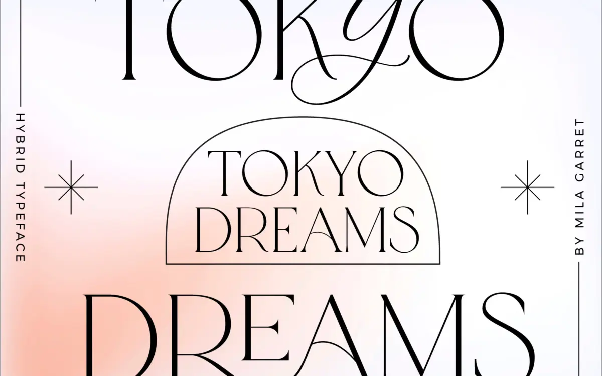
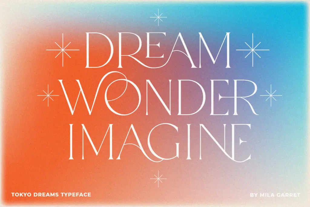
Tokyo Dreams is a display serif built around the idea that no two words should look quite the same. The base letterforms are a restrained, minimal serif with narrow apertures and modest stroke contrast — nothing radical on their own. What makes the design interesting is the second layer: a set of script letters designed to be dropped into the middle of serif words, breaking up the rhythm and giving the word a handmade, custom-lettered feel. It’s a hybrid approach rather than a single voice, and the three styles included lean into that: a plain minimal serif, a ligature-heavy headline version, and a hybrid that mixes script and serif letters within the same setting.
The plain serif is genuinely the strongest of the three. It’s quiet, well-spaced, and holds its own as a clean display face without any of the ligature tricks. The hybrid and ligature versions are more of a performance — closer to lettering than typesetting, meant to be typed out letter by letter and eyeballed rather than set and forgotten.
Character set and features
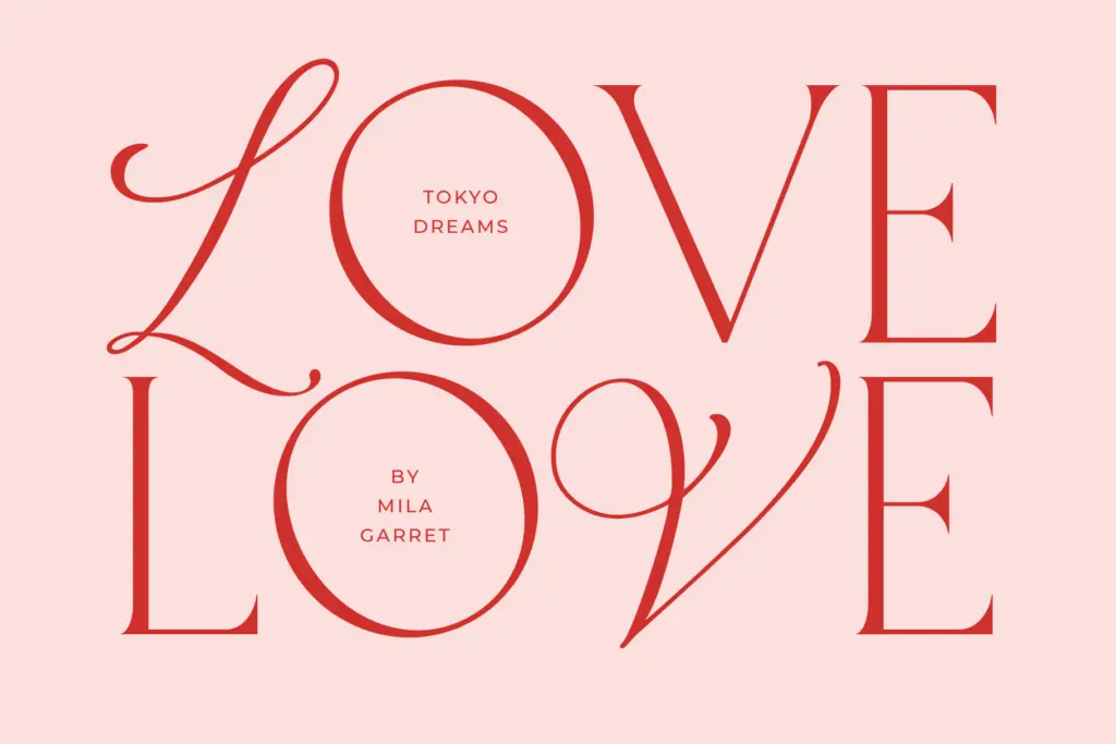
The headline draw here is 99 ligatures, which is a lot, and the seller is upfront that the font rewards experimentation — typing in lowercase in a preview tool to see what combinations trigger. That’s a fair description of how it behaves: certain letter pairings connect into custom flourishes, and the script alternates can be swapped in via uppercase access in the hybrid cut or as stylistic alternates in the main file. This gives a designer real control over which word, or even which single letter, gets the ornamental treatment, rather than forcing every instance of a given letter to look the same.
The trade-off is that this level of customisation asks for manual work. You’re not just picking a font and typing — you’re auditioning ligature combinations, checking which alternates read cleanly at your chosen size, and often adjusting kerning by eye once script and serif letters sit side by side. Anyone expecting an out-of-the-box paragraph setting will be disappointed; this is a font built for short strings, not long-form text. At body-copy sizes, the script insertions lose their charm fast and the whole thing gets busy.
Use cases
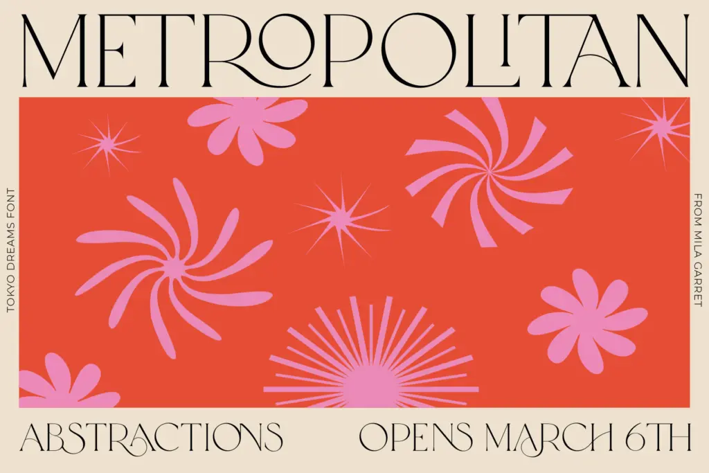
Tokyo Dreams is at its best in short-form, high-visibility contexts: a wordmark, a masthead, a pull quote, a single line on a product label or invitation suite. The hybrid version in particular suits branding work where a client wants something that reads as bespoke lettering without commissioning custom lettering — a boutique name, a fashion label, a quote card for social media. The plain serif cut is versatile enough to sit underneath the display treatment as a companion for supporting text, which is a sensible pairing built into the family itself.
It’s less suited to anything requiring consistency across long passages, multiple languages, or unattended use by non-designers, since getting good results depends on someone choosing which ligatures and alternates to trigger. Treat it as a display and branding tool rather than a general-purpose text face, and it earns its keep.
What we liked, and what we didn’t
Strengths
- The plain serif cut is clean and usable on its own as a straightforward display face.
- 99 ligatures give real control over customising individual words rather than whole passages.
- Script alternates can be inserted selectively, so no two logotypes need look identical.
Trade-offs
- Gets busy and hard to read once set beyond a short phrase or headline.
- Getting good results requires manually auditioning ligatures and adjusting spacing, not just typing.
Tokyo Dreams is a display serif built for short, deliberate typography — logos, headlines, single lines of quote or invitation copy — rather than for setting text. The ligature and hybrid script system rewards manual curation more than automatic typing, so results depend on the hand behind it. The plain serif cut alone is a solid, quieter option if the ornamentation isn't needed.
Verdict

Tantype reviews typefaces in depth — every font is tested in real branding, editorial and screen layouts before a word gets written. 555+ fonts reviewed and counting.