
Letters from Madelyn: a three-weight calligraphy script with deep swash options
Design style
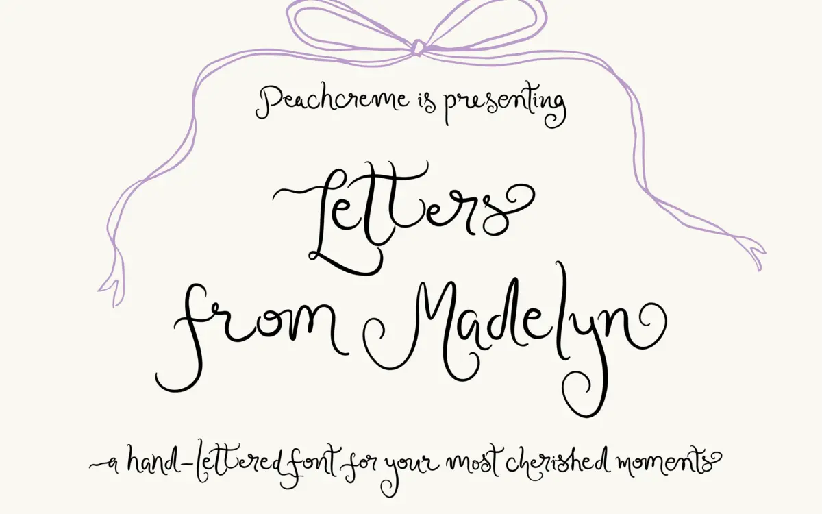
Letters from Madelyn sits in the modern-calligraphy camp: a monoline-leaning script with pointed-pen inflection, moderate slant, and looping ascenders that give it a handwritten rather than engraved feel. It doesn’t try to imitate formal copperplate — the joins are looser, the baseline wanders slightly letter to letter, which is what gives it its personality rather than a fault to be corrected. The three weights (Regular, Semi-Bold, Bold) share the same skeleton but change the stroke’s presence considerably; Regular reads as a fine, almost fragile hand, while Bold thickens the downstrokes enough to hold up as a short headline on its own.
What separates it from a lot of scripts in this bracket is the swash system layered on top of that skeleton. Rather than a single flourish per letter, most lowercase characters carry at least two alternates with distinct entry and exit strokes, and a handful go up to ten variations. That’s a lot of raw material to work with, and it shows in how differently a word can be set depending on which glyphs you pull in — tighter and quieter, or loose and ornamental.
Character set and features
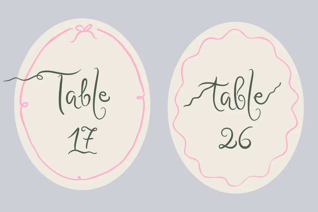
The font ships with 82 ligatures, which is the real engine behind its flexibility. Contextual joins let common letter pairs flow as if drawn in one pass rather than assembled from separate glyphs, and that matters more here than in most scripts because the alternates are so varied — without the ligatures, mismatched swash choices would look stitched together rather than written. In a OpenType-aware app with stylistic sets or contextual alternates turned on, the font does a fair amount of the composition work itself; without that support, you’re working manually through a glyph palette, which is slower but gives more control.
The trade-off with this much optionality is that the font asks for attention. Setting a single word well usually means auditing the alternates rather than trusting the default typing sequence, especially where you want the beginning and ending swashes to sit cleanly against neighbouring letters or an edge of the composition. This isn’t a font you drop into a paragraph and walk away from — it’s closer to a kit of parts for one or two words at a time.
Use cases
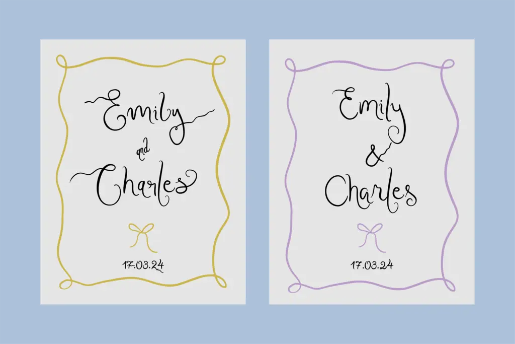
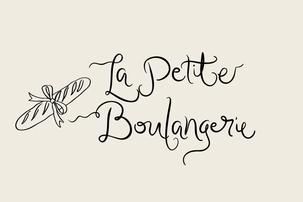
Given the swash depth and the three weights, this reads as a font built for short-form, high-visibility settings: a couple’s names on a wedding invitation, a monogram line, a logotype for a boutique brand, a save-the-date headline. The Bold weight in particular has enough stroke weight to work as a standalone wordmark, while Regular and Semi-Bold suit supporting lines — a date, a location, a tagline — where you want the calligraphic voice to continue without competing with the main line.
It is not a body-copy typeface, and treating it as one will fight the design’s intent; the swashes and baseline movement that make single words feel personal become noise across sentences. Used the way it’s built — sparingly, at larger sizes, with time spent in the alternates — it does what a boutique script is supposed to do: make a short piece of text feel considered rather than templated.
What we liked, and what we didn’t
Strengths
- Three weights give real range from delicate to headline-strong within one script
- 82 ligatures and extensive alternates allow genuinely varied, non-repetitive word compositions
- Bold weight holds up as a standalone wordmark or monogram treatment
Trade-offs
- Requires manual glyph selection or OpenType-aware software to look its best; typing it plainly underuses it
- Not suited to paragraph or body-text settings — the movement and swashes work against sustained reading
Letters from Madelyn is a well-drawn modern calligraphy script whose real value is in its swash and ligature depth rather than its usability as a general-purpose typeface. It rewards designers willing to hand-pick alternates for short, prominent text — names, monograms, wordmarks — and will frustrate anyone expecting it to behave like a body font. Worth having in the toolkit if your work leans toward wedding stationery or boutique branding.
Verdict

Tantype reviews typefaces in depth — every font is tested in real branding, editorial and screen layouts before a word gets written. 555+ fonts reviewed and counting.