
Brenelsa: A Swash-Heavy Calligraphy Script for Wedding and Branding Work
Design style
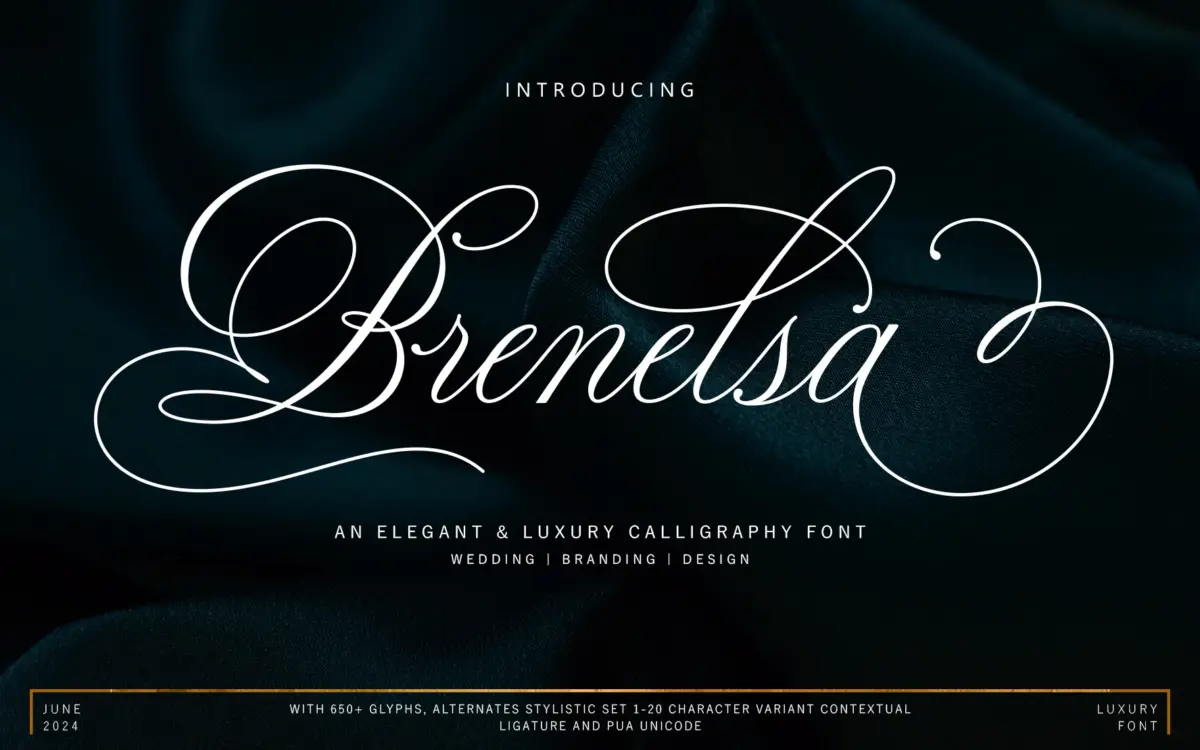
Brenelsa sits in the well-populated field of connected calligraphy scripts, the kind built around a monoline-leaning pen but with enough contrast to feel handwritten rather than mechanical. The lowercase has a loose, slightly forward-leaning rhythm, with entry strokes that swing wide before settling into the letter body. Loops are generous rather than tight, which gives words a relaxed, informal cadence even when the overall structure leans classic.
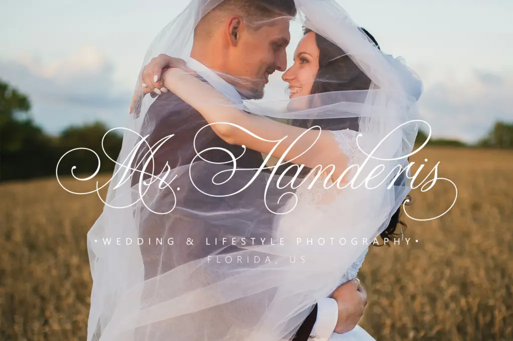
Where the font distinguishes itself is in its swash work. Capitals carry long, looping flourishes that extend well beyond the letter’s natural footprint, and several lowercase exit strokes are built to travel into the next word rather than stop cleanly. This is a script designed to be composed, not just typed — it rewards a designer willing to swap in alternates and kern by eye rather than accept the default string as final.
Character set and features
The set is large, with over 650 glyphs, and the alternates are organised into the OpenType categories you’d expect: swash, stylistic sets, stylistic alternates, and contextual alternates, spanning stylistic set ranges into the high teens. That’s a lot of raw material, but it also means the font is only as good as the software rendering it. In Illustrator, InDesign, or recent Word builds, contextual alternates and swash substitution work as intended, smoothing repeated letters and varying word-final flourishes automatically. Outside that environment, the PUA Unicode mapping is the fallback — usable through Character Map or Font Book, but slower going, and it puts the burden of selecting the right ligature or swash entirely on the user.
International language support and standard punctuation and figures are included, which covers the basics of setting real copy rather than just display words. Numerals follow the same slightly loose calligraphic logic as the lowercase, so they read as part of the same family rather than a bolted-on sans-serif figure set, which is a detail some competing scripts miss.
Use cases
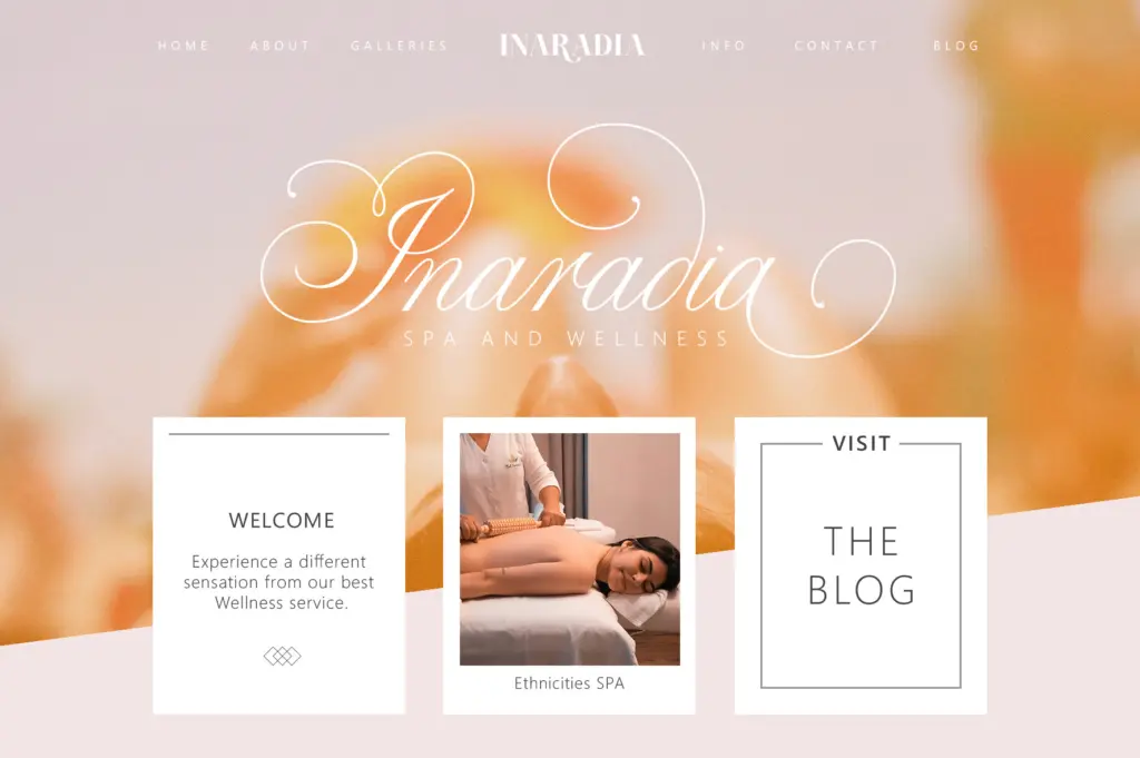
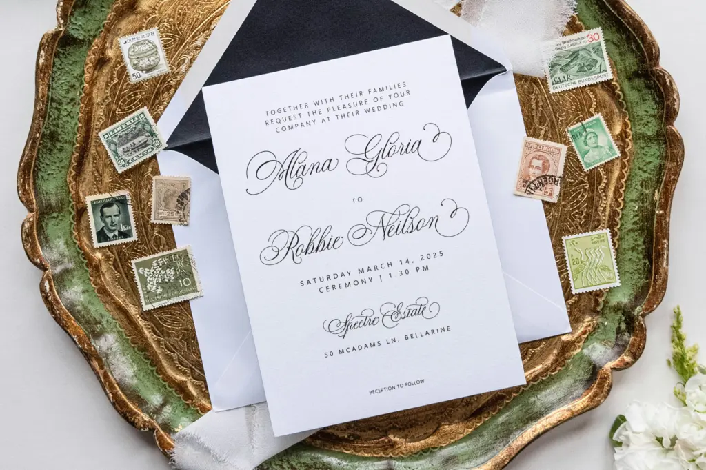
Brenelsa is built for the jobs scripts like this usually do: wedding invitations and stationery, greeting cards, quote graphics, logotypes, and short editorial headers. It’s at its best at display size — a name, a title, a single line of copy — where the swashes have room to do their work and the connected forms don’t crowd each other. Push it into paragraph-length text and the flourishes start to fight each other; this was never intended as a body-copy face and shouldn’t be asked to be one.
For branding and packaging work, the alternates give a designer real flexibility to customise a wordmark without redrawing letterforms, provided there’s time budgeted for manually picking through the stylistic sets rather than trusting the defaults. Teams without access to full OpenType-aware software should plan on the Character Map workflow going in, rather than discovering it’s necessary after the fact.
What we liked, and what we didn’t
Strengths
- Long, expressive swash alternates give logos and titles real character
- Large glyph set with numerals and punctuation drawn in the same calligraphic voice
- Contextual alternates smooth repeated letters automatically in supported software
Trade-offs
- Without full OpenType support, accessing alternates means manual Character Map or Font Book work
- Not suited to anything beyond short display lines — paragraph settings get crowded fast
Brenelsa is a well-stocked calligraphy script with genuinely long, expressive swashes and a large alternate set. It needs OpenType-aware software or patient PUA access to show its full range, and it's strictly a display face rather than a body-copy option.
Verdict

Tantype reviews typefaces in depth — every font is tested in real branding, editorial and screen layouts before a word gets written. 555+ fonts reviewed and counting.