
Aline Barton: a swash-heavy script for invitations and branding work
Design style
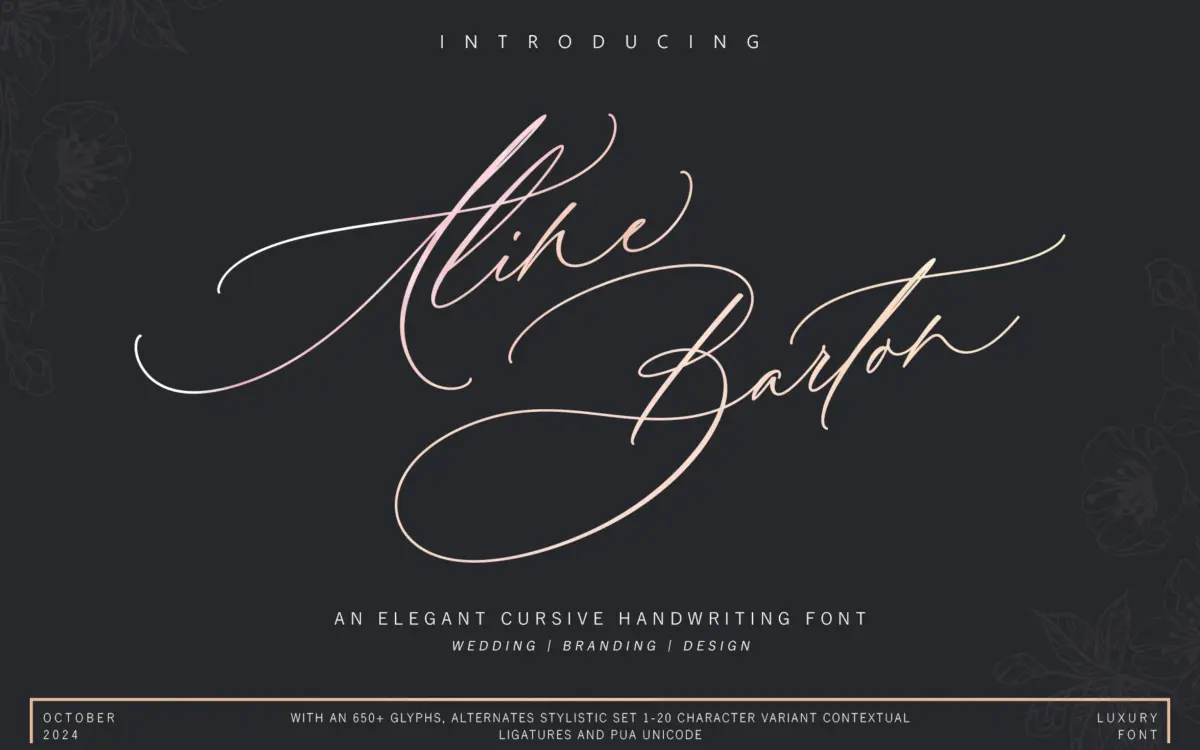
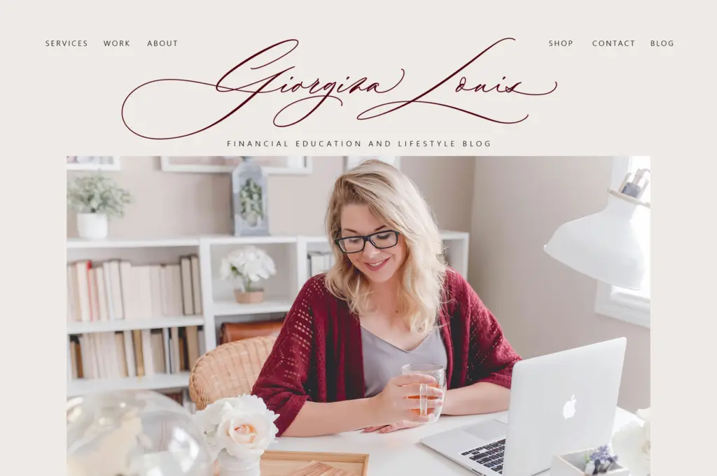
Aline Barton belongs to the crowded family of connected, brush-inspired scripts that dominate the wedding and branding corners of the type marketplace. The strokes lean toward a monoline-with-flair treatment rather than true variable-pressure calligraphy, so the flow reads as consistent rather than expressive. Letters connect with long entry and exit strokes, and the swash forms are pushed further than a restrained script would allow, particularly on capitals. It reads as a font built for decoration first and text second.
The two capital styles do offer a genuine point of view: one set is calmer and closer to a formal invitation hand, the other trades legibility for flourish, with loops that extend well above and below the baseline. That split gives the designer some room to move between a quieter register and a more ornamental one without switching typefaces entirely, though the difference is more about restraint than structural variation.
Character set and features
With over 650 glyphs, the alternate coverage is substantial for a script at this level. Swash variants, stylistic sets numbered up to 20, contextual alternates, and stylistic alternates are all present, along with PUA Unicode encoding so the extras remain reachable in apps without OpenType support, via Character Map or Font Book. That’s a practical inclusion — a script font with 650 glyphs and no PUA fallback is a font half the buyers can’t actually use.
The stylistic sets suggest the designer anticipated the usual script-font problem: repeated letters looking identical in a short line of text. Whether all 20 sets earn their keep or simply duplicate minor swash variations isn’t something a spec sheet can tell you, but the sheer number means there’s likely to be a usable alternate for most common letter clashes. International language support and standard punctuation are included, which matters more than it sounds for anything beyond English-language proofs.
Use cases
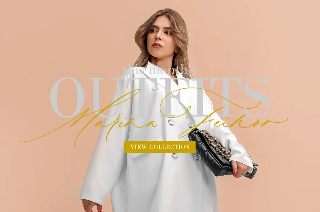
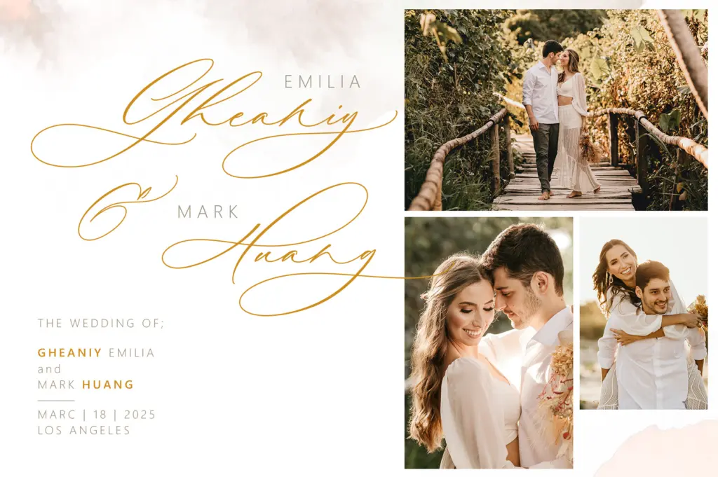
This is a display script, not a text face, and it should be treated that way. Set as a name, a title line, a monogram, or a short phrase on an invitation, it will do its job — the connected forms and swash capitals read as intentional and finished at large sizes. Wedding stationery, greeting cards, and short branding lockups (a logotype, a product name, a header on packaging) are the natural fits, and the alternates give a designer enough variation to avoid the flattest, most obviously-templated look.
Push it into paragraph-length copy, a body of quoted text, or small captions, and the long swashes start colliding with tracking and line spacing, forcing manual kerning fixes letter by letter. It’s also not a font for dense compositions — the ornamental capitals need space around them to read as intentional rather than cluttered. Used sparingly, at headline size, with attention paid to which stylistic set is doing the work, it’s a capable addition to a script library. Used as a paragraph font or crammed into a busy layout, its strengths become its liabilities fast.
What we liked, and what we didn’t
Strengths
- 650+ glyphs with stylistic sets give real variation across repeated letters
- PUA Unicode encoding means the alternates are reachable even without OpenType-aware software
- Two capital styles let a designer choose between a calmer and a more ornamental register
Trade-offs
- Long swashes and connected forms make it impractical for anything beyond short lines of text
- The more decorative capital style sacrifices legibility for flourish and needs careful spacing to avoid clutter
Aline Barton is a competent, ornament-forward script that does its best work at headline size on invitations and short branding lines. The alternate glyph set and PUA encoding are genuinely useful, but the long swashes and dual capital styles demand careful handling and plenty of white space. It's not a font you reach for when you need flexibility across a whole project — it's a font you reach for when you need one confident line to look finished.
Verdict

Tantype reviews typefaces in depth — every font is tested in real branding, editorial and screen layouts before a word gets written. 555+ fonts reviewed and counting.