
Signatera: a signature-style script for logos and wedding sets
Design style
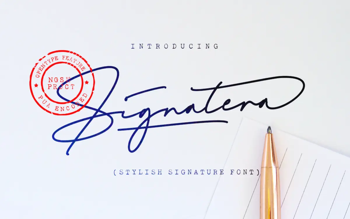
Signatera belongs to the signature-script family that has become a mainstay of the logo-font marketplace: a fast, single-stroke monoline built to look like a flourished autograph rather than a formal calligraphic hand. The strokes stay consistent in weight, with the sense of movement coming from long entry and exit swashes rather than any thick-thin contrast. That monoline approach means it reads more like a felt-tip signature than a pointed-pen script, and it wears that identity honestly throughout the set.
The joins are loose and gestural, letters connecting through low, sweeping ligatures that keep the baseline feeling handwritten rather than mechanically repeated. It’s not trying to be a working handwriting simulation with lots of natural variance — it’s a designed signature shape, tidy enough to sit inside a logotype or a monogram without looking accidental. That’s both its strength and its limit: it’s polished rather than raw, closer to a mock-up of confidence than to genuine spontaneity.
Character set and features
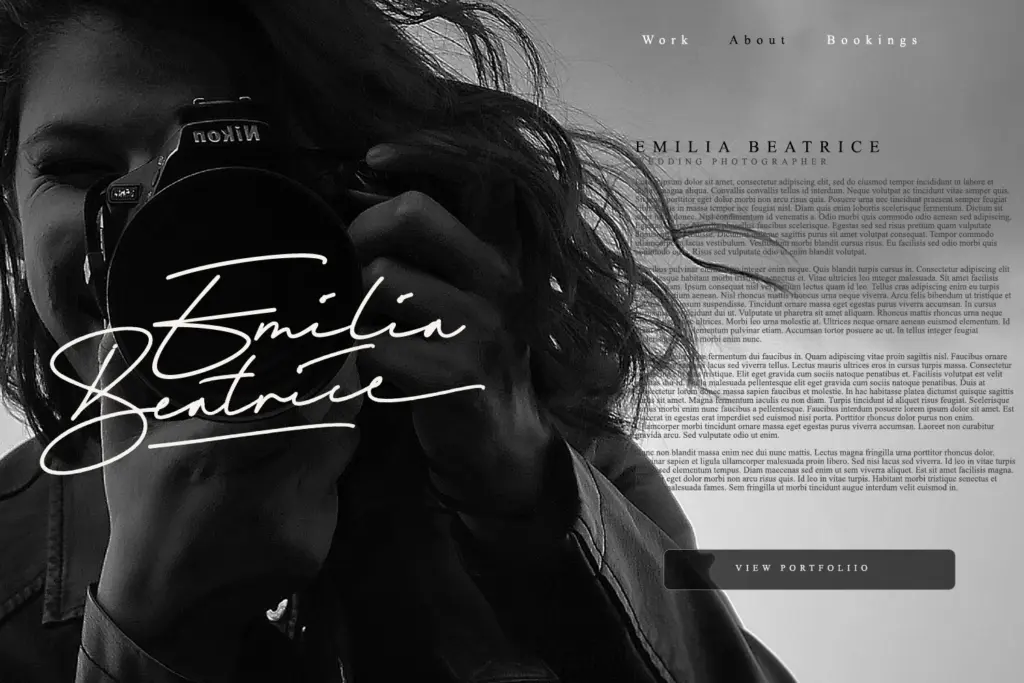
The set covers uppercase and lowercase, numerals, and standard OpenType punctuation, along with accented characters for multilingual setting. Ligatures and a stylistic alternate set are included, which matters more here than in most scripts — swap in the alternates and you can break up repeated letter shapes or awkward collisions that come from the connected lowercase forms. Anyone setting this by hand should expect to spend time in the glyph panel; signature scripts rarely look finished straight out of the box, and this one is no exception.
Uppercase letterforms carry the most flourish, with extended entry strokes that need generous space around them to avoid crowding neighbouring words. Lowercase is calmer and more compact, which helps overall legibility once you’re past a handful of words. At small sizes the connected strokes start to close up, so this is not a font for body copy or anything that needs to hold up in a footnote.
Use cases
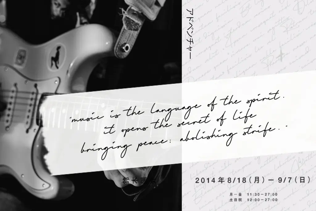
This is a font built for a single job done at a large size: the signature moment in a brand mark, a fashion logotype, a photography watermark, or the featured line on a wedding invitation. Used as a standalone wordmark, a headline title, or a monogram, it does what it’s designed to do — it looks handwritten and confident without asking the viewer to actually read much of it. Pair it with a plain sans or serif for supporting text, since Signatera has no interest in functioning as a secondary typeface.
It’s less suited to anything long-form, dense, or set at production-print scale without generous leading and tracking. Buyers looking for a font that can carry both the hero line and the body copy of a project will need something else alongside it. Within its narrow lane — logos, taglines, invitation headers, packaging accents — it’s a competent, well-drawn option, just not a particularly distinctive one against the crowded field of signature scripts already on the market.

What we liked, and what we didn’t
Strengths
- Clean monoline strokes keep the signature look consistent across the set
- Stylistic alternates and ligatures let you fix awkward letter collisions
- Multilingual accent support extends its use beyond English-only branding
Trade-offs
- Connected lowercase strokes close up and lose clarity at small sizes
- The style is common in the signature-script category, so it doesn't stand out much
Signatera does the one job signature scripts are hired for: a confident, flourished wordmark for a logo or invitation headline. It's competently drawn but doesn't distinguish itself much from the many similar scripts already available, and it needs careful spacing and alternate-glyph work to look its best.
Verdict

Tantype reviews typefaces in depth — every font is tested in real branding, editorial and screen layouts before a word gets written. 555+ fonts reviewed and counting.