
Boldy Grotesque: a heavy condensed sans built for short, loud headlines
Design style
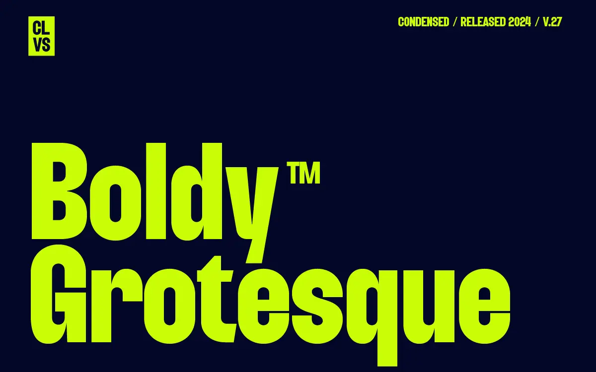
Boldy Grotesque is a condensed display sans that leans hard on the grotesque tradition without pretending to be a text face. The letters are narrow and heavy, with tight apertures and squared-off terminals that give the whole set a compressed, industrial feel. There’s little contrast between strokes, which is typical of the genre, and the counters are kept open enough that letters like a, e and s don’t clog up even when the tracking is tight.
What separates it from a generic condensed grotesque is the attitude in a few of the details: slightly blunted corners on the bowls, a straightened leg on the R, and a general sense that the letterforms were drawn to be shouted rather than read quietly. It’s not a subtle design, and it doesn’t try to be. The bold weight is the point — there’s no indication of a companion light or regular cut, so this is a one-note instrument rather than a family with range.
Character set and features
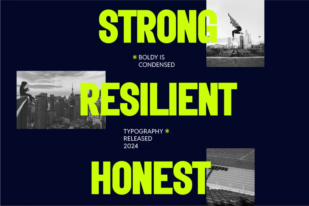
The font ships in OTF, TTF and WOFF, covering desktop layout software and web use without any conversion headaches. Alongside the standard letters, numbers, punctuation and symbols, there are 40 alternates and ligatures, which is a reasonable amount of stylistic flexibility for a single-weight display face — enough to vary repeated letters in a logotype or headline without the set feeling thin.
Language support is broad for a font in this category, covering a run of Western and Northern European languages along with a few less common inclusions. That’s a genuine practical plus if you’re working across European markets, though it’s worth checking your specific diacritic needs before committing, since coverage lists like this don’t always extend evenly to every accented character.
Because the font is limited to standard character slots plus the alternates, it works in basic apps like Canva as well as full OpenType-aware software — useful if your workflow moves between a design team and a client who only has access to templated tools.
Use cases
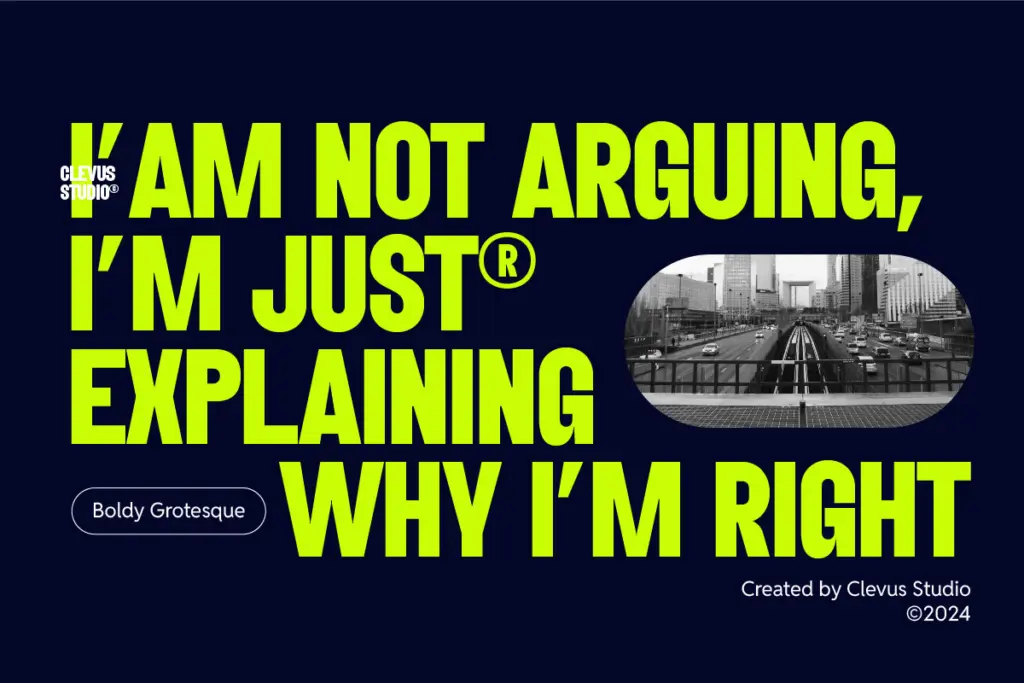
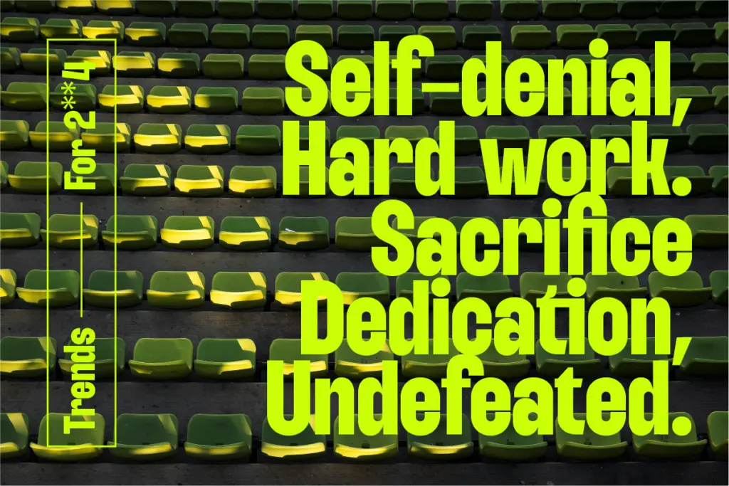
This is a font for short bursts of text: logotypes, headlines, poster type, badge lockups, the top line of a social post. The condensed width means it packs a lot of visual weight into a narrow horizontal space, which is exactly what you want on a phone screen or a vertical poster where room is tight. Wedding stationery and quote graphics are plausible uses too, though the mood here is bold and contemporary rather than delicate, so it suits a modern, graphic invitation more than a romantic one.
It is not built for body copy, and you shouldn’t try to make it do that job — the tight spacing and heavy weight that make it punchy at large sizes will fight you at paragraph length. Treat it strictly as a display tool, pair it with a plainer text face for anything longer than a line or two, and it does its intended job efficiently.
What we liked, and what we didn’t
Strengths
- Tight condensed width makes strong use of limited horizontal space on posters and social graphics
- 40 alternates and ligatures give a single weight useful variety for logotypes
- Broad European language coverage and Canva compatibility widen practical use
Trade-offs
- Single bold weight only, with no lighter cut for hierarchy or body text
- Tight spacing and heavy strokes make it unsuitable for anything beyond short headline text
Boldy Grotesque does one job well: loud, narrow, high-impact headline type. It's not a text face and it's not a family, so its usefulness is bounded by design, but within that narrow lane it's a competent, no-nonsense option.
Verdict

Tantype reviews typefaces in depth — every font is tested in real branding, editorial and screen layouts before a word gets written. 555+ fonts reviewed and counting.