
Midnight Symphony Font Free Download
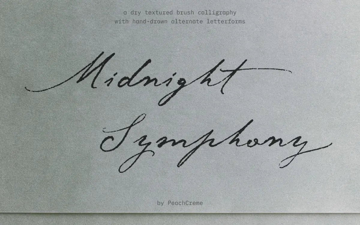
Is Midnight Symphony free to download?
Midnight Symphony is a commercial font sold on Creative Market, so the full version needs a paid license. Get it from the official listing: Midnight Symphony font download.
Need something free? These script fonts from Google Fonts are free for personal and commercial use:
Design style
Midnight Symphony is a brush script built around the dry-brush effect rather than a smoothed-over imitation of one. The strokes carry visible breaks where the bristle would naturally skip and catch, and the letterforms keep that texture rather than filling it in digitally. The result reads as raw calligraphy rather than the polished, uniform-weight scripts that dominate the category. Contrast swings between thick, saturated downstrokes and thin, ink-starved connectors, giving the whole thing a tactile, worked-by-hand feel. It sits closer to nostalgic, rustic lettering than to luxury minimalism, and it wears that identity consistently across the character set rather than just in a few showpiece glyphs.
Character set and features
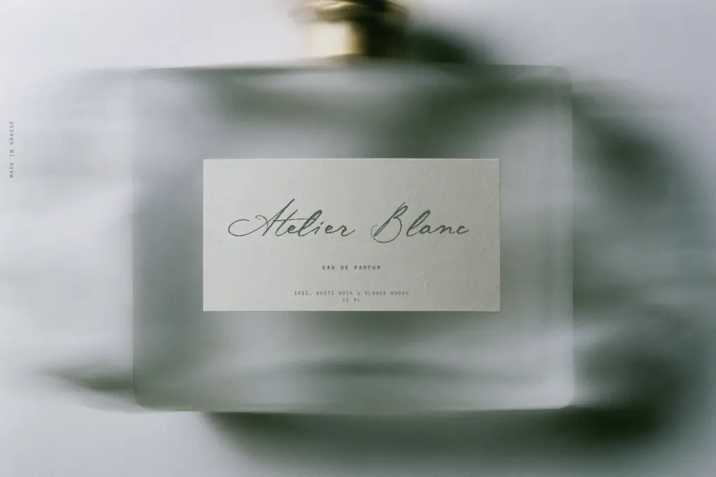
The alternate structure is the real substance of this release. With 115 lowercase alternates and 43 capital alternates spread across seven stylistic sets, most letters have two or three distinct forms to draw from, which matters a great deal in a script where repeated letters can otherwise flatten a layout into something obviously templated. The 15 double-letter ligatures (bb, ll, tt, and similar pairs) are a practical touch — double letters are where hand-lettered scripts usually break down into awkward, mechanical repetition, and having dedicated connections for them removes one of the more common tells that a script font was set rather than drawn. Because the texture is baked into the strokes rather than applied as a filter, it holds up reasonably well across sizes, though as with any dry-brush script the finer breaks in the ink are more visible — and more effective — the larger you set it. At small sizes the texture reads more as roughness than as brushwork, which is worth testing before committing to a layout.
Use cases
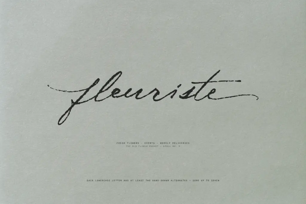
This is a font for work that wants some grain in it: packaging for small-batch goods, editorial headlines with a handmade angle, logotypes for brands leaning into craft or vintage positioning, and any display setting where a slick, even script would feel out of place. The alternates make it genuinely usable for longer phrases — a product name, a tagline, a short wedding invitation line — without the repetition that plagues scripts with fewer variants. It’s less suited to body copy or anything that needs to be read quickly at small sizes, and the texture will fight with backgrounds that already have their own pattern or noise. Pair it with a plain sans or a quiet serif to let the brushwork carry the personality rather than competing with a second decorative face. On clean, high-contrast backgrounds — paper stock, solid color panels, simple photography — it does the job it was built for.
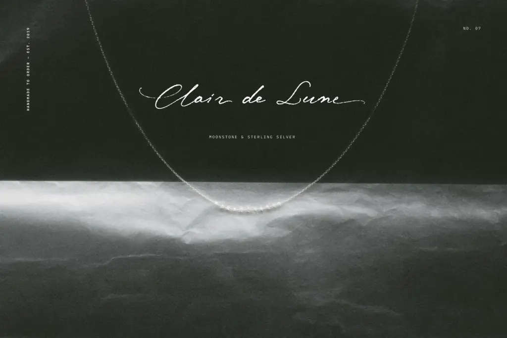
We included Midnight Symphony in our roundup of the best brush script fonts, alongside other picks in the same style.
What we liked, and what we didn’t
Strengths
- 115 lowercase and 43 capital alternates genuinely reduce repetition across longer phrases
- Dry-brush texture is baked into the strokes rather than applied as a filter, so it stays consistent at display sizes
- Double-letter ligatures solve a common awkwardness in hand-lettered scripts
Trade-offs
- Texture becomes noisy rather than expressive at small sizes
- Needs a plain, uncluttered background to avoid visual competition
Midnight Symphony delivers a script with real, unsmoothed texture and enough alternates to avoid the repetition that plagues most brush fonts. It's built for display and branding work rather than body text, and the texture demands a clean, cooperative background to read well. Within that lane, it's a considered, well-executed piece of lettering.

Tantype writes independent reviews of typefaces: what each font does well, where it falls short, what it suits, and where it is sold.