
Suite Home: a casual handwritten script for everyday branding work
Design style
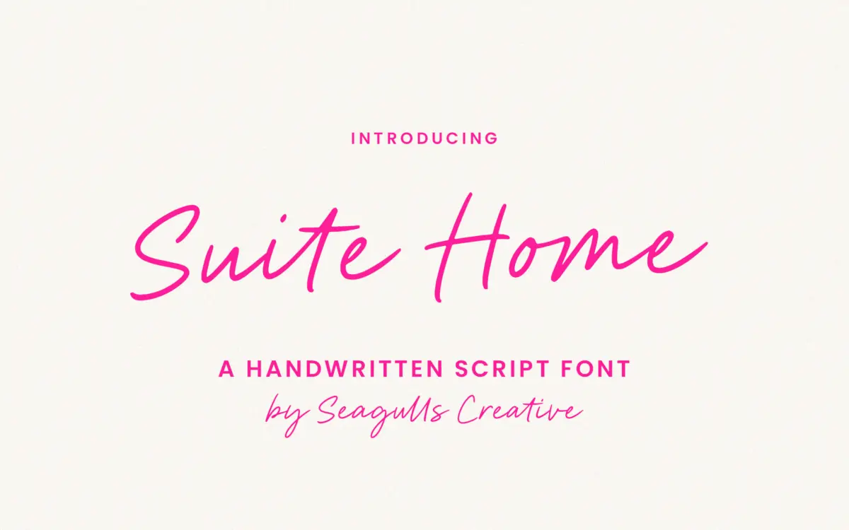
Suite Home sits in the loose, casual end of the handwritten script category. The strokes have a felt-tip or brush-pen quality rather than the tapered contrast of a pointed-pen script, and the baseline dips and rises with the kind of irregularity that reads as genuinely handwritten rather than mechanically randomised. Letters lean slightly, joins are informal, and there’s no attempt at the polish you’d expect from a formal invitation script. It’s the kind of face that wants to look like someone wrote it quickly and meant it, not one drawn to impress at wedding-stationery scale.
The x-height runs generous for a script, which keeps the lowercase open rather than cramped, but it also flattens some of the drama scripts usually trade on. Ascenders and descenders are moderate, not showy. There’s nothing here that screams for attention on its own; the personality is in the texture of the stroke, not in flourish or extreme scale contrast.
Character set and features
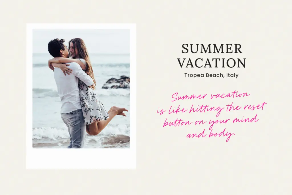
The set covers standard letters, numbers, punctuation and a run of ligatures, which is where a font like this earns its keep. Common letter pairs are stitched together to avoid the slightly robotic look scripts get when every letter sits in isolation. Used well, the ligatures smooth over the joins between letters that otherwise wouldn’t connect naturally in a casual script — that’s a genuine time-saver rather than a marketing bullet point.
Multilingual support is included, which matters more than it sounds for a script this casual, since diacritics on a loose handwritten baseline can easily look bolted-on if they aren’t drawn with the same hand. It’s worth checking your specific language needs against a character-map preview before committing, as is true of any script font’s extended glyphs.
What’s missing, as with most single-weight handwritten scripts, is any structural flexibility. There’s one weight, one mood. No alternate character sets beyond the ligatures to vary rhythm across a longer line, and no companion sans or serif to pair it with for body copy. You’re getting a single voice, well executed within its lane, not a system.
Use cases
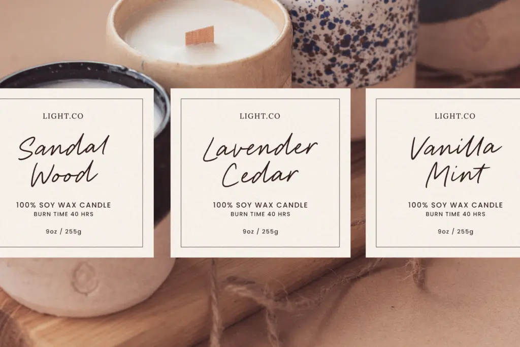
This is a font for the accent line, not the paragraph. Logotypes for small studios, cafés, or home-goods brands looking for warmth over formality; product labels; Instagram graphics and blog headers where a handwritten signature feel is wanted without the fussiness of calligraphic scripts. The seller’s own framing — branding, packaging, social posts — is accurate to what it’s built for.
It will struggle in contexts that need restraint or gravitas: wedding suites that want elegance rather than casualness, anything printed small where the baseline jitter starts to look untidy, or long-form use where a single script voice gets monotonous fast. Pair it with a plain sans or serif for supporting text; don’t ask it to do everything in a layout.

What we liked, and what we didn’t
Strengths
- Ligatures smooth over joins that would otherwise look disconnected in a casual script
- Generous x-height keeps the lowercase legible at small sizes
- Multilingual support is drawn into the same casual hand rather than tacked on
Trade-offs
- Single weight with no structural variation limits it to accent use, not body text
- The loose baseline can look untidy at very small sizes or in dense formal layouts
Suite Home is a competent, unpretentious handwritten script suited to informal branding and social graphics. It doesn't reach for elegance or drama, which is either exactly what you need or a reason to look elsewhere.
Verdict

Tantype reviews typefaces in depth — every font is tested in real branding, editorial and screen layouts before a word gets written. 555+ fonts reviewed and counting.