
Postcards from Napoli Script: a rough-inked handwriting face for stationery and travel branding
Design style
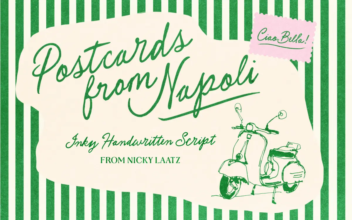
Postcards from Napoli Script sits in the well-populated field of pen-and-paper handwriting fonts, but it leans harder into imperfection than most. The strokes carry visible ink pooling at the start and end of letters, and the baseline drifts slightly from letter to letter, which reads as a real hand rather than a smoothed-out digital approximation. It’s a monoline script in spirit, though the pen pressure varies enough to give it a loose sense of contrast — thicker where the nib would have dragged, thinner on the quick connecting strokes.
The italicised slant and generous exit strokes give it a conversational, slightly hurried feel, like something dashed off on a café table rather than composed. That’s the point, and it mostly works. Where it wobbles is in the letterforms that need more discipline: the connections between letters can look accidental rather than deliberate at certain size and colour combinations, and a few of the swash capitals sit heavier than the lowercase they sit beside, throwing off the rhythm of a word if you’re not careful with kerning.
Character set and features
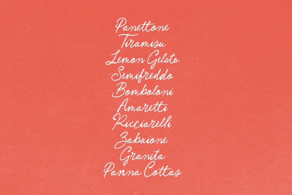
The font includes OpenType alternates and ligatures, which is the feature that actually makes this typeface usable rather than merely decorative. Turned on, they break up repeated letter shapes across a word and reduce the mechanical look that plain handwriting fonts often fall into when the same lowercase ‘a’ appears three times in a sentence. Designers should plan to use software that supports OpenType features — without them, the font reads flatter and more repetitive than intended.
PUA encoding is included, which matters for anyone working in an app or environment that doesn’t support standard OpenType access to alternates — it gives a fallback route to the extra characters via unique Unicode positions. This is a practical inclusion rather than a flashy one, and it’s worth checking that your workflow actually benefits from it before assuming it does.
No detail is given on language support or weight variants, so treat this as a single-style script with a fixed character set rather than a expandable family.
Use cases
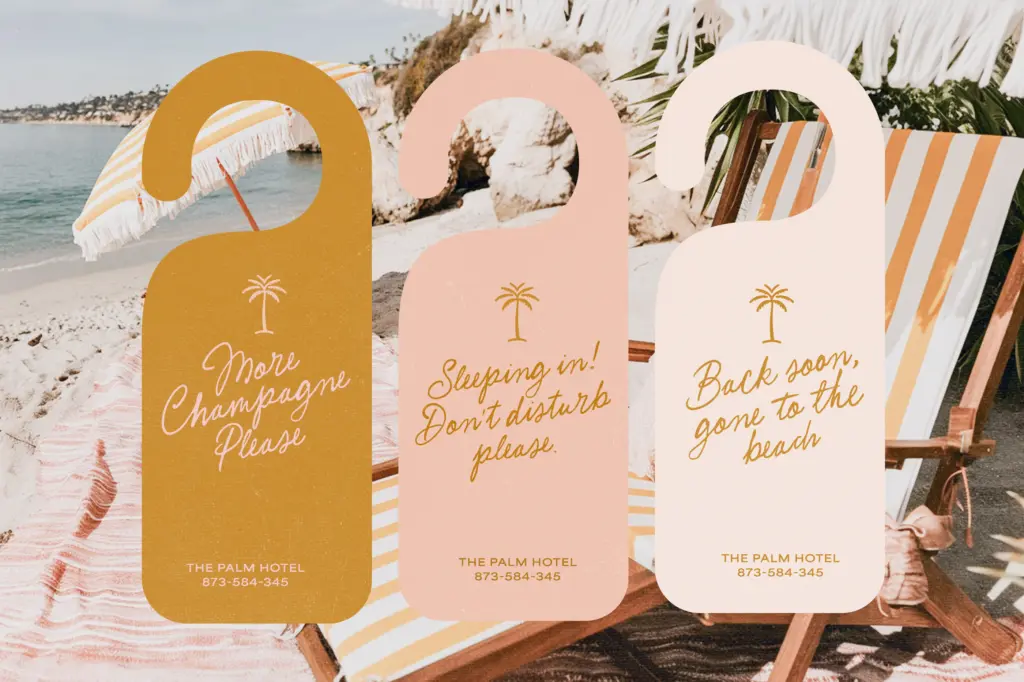
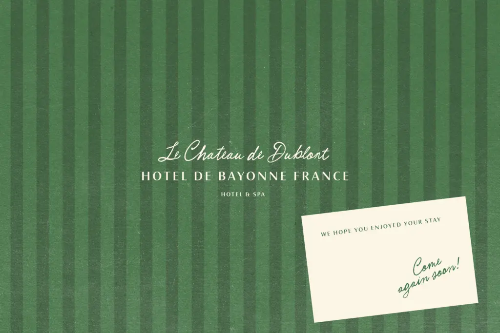
This is a font for short bursts of text where personality matters more than density: invitation wording, packaging call-outs, greeting card messages, logotypes for boutique or hospitality brands wanting a handmade, European feel. The rough, inky texture suits anything trying to evoke travel, romance, or an artisanal hand — postcards, travel journals, café signage, wedding stationery with a casual rather than formal tone.
It is not a font for body copy or long-form reading. The irregular baseline and varying stroke weight that make it charming in a headline become fatiguing across paragraphs. Stick to short lines, generous leading, and let the alternates do the work of variation. Pair it with a plain, restrained sans or serif for supporting text — the contrast will let the script carry the emotional weight of a layout without asking it to do everything.
What we liked, and what we didn’t
Strengths
- OpenType alternates and ligatures genuinely reduce the repetitive look common to handwriting fonts
- PUA encoding gives a fallback for apps without full OpenType support
- Ink-pooling and baseline drift give it a convincingly handmade, unpolished character
Trade-offs
- Some capital swashes sit heavier than the lowercase, disrupting word rhythm without careful kerning
- Baseline irregularity that reads as charming in headlines becomes tiring across longer passages
Postcards from Napoli Script delivers a convincingly imperfect, ink-textured handwriting style that earns its personality through genuine variation rather than a single repeated glyph shape. It's built for short, expressive text — invitations, packaging, café-style branding — not for reading in bulk. The alternates and ligatures are doing real work here, so skipping them undercuts the whole point of the font.
Verdict

Tantype reviews typefaces in depth — every font is tested in real branding, editorial and screen layouts before a word gets written. 555+ fonts reviewed and counting.