
Dreams on Paper: a pencil-sketch script for handwritten warmth in branding
Design style
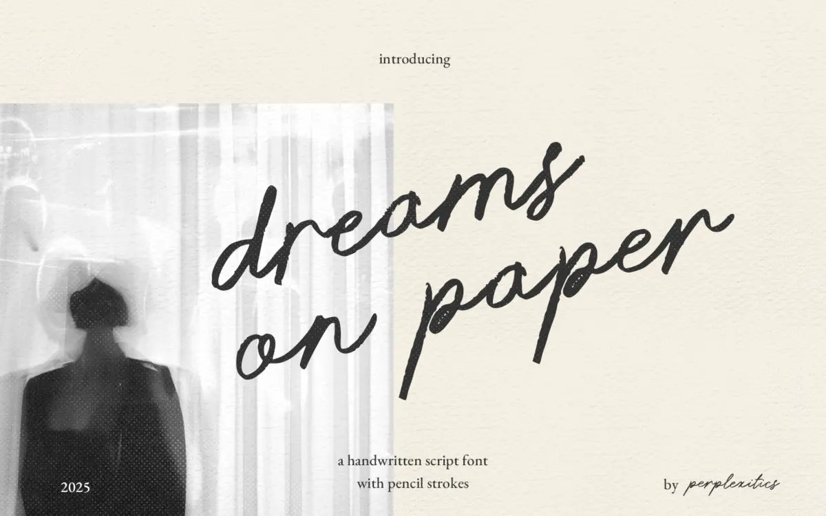
Dreams on Paper is a single-weight script built to look like it came off the end of a graphite pencil rather than a marker or brush. The strokes carry a faint granular texture and slightly irregular pressure, so letters thicken and thin in ways that mimic an actual hand pressing down and lifting off. There’s no attempt at polish here — the whole point is the opposite. Baselines drift, joins wobble a little, and the overall feel is closer to a page torn from a sketchbook than a finished piece of lettering.
That said, it isn’t chaotic. The letterforms keep a consistent slant and a legible skeletal structure underneath the texture, which stops the font from tipping into illegibility the way some overly distressed scripts do. It reads as one person’s handwriting rather than a random scatter of marks, which is the harder trick to pull off in this category and the one this font gets mostly right.
Character set and features
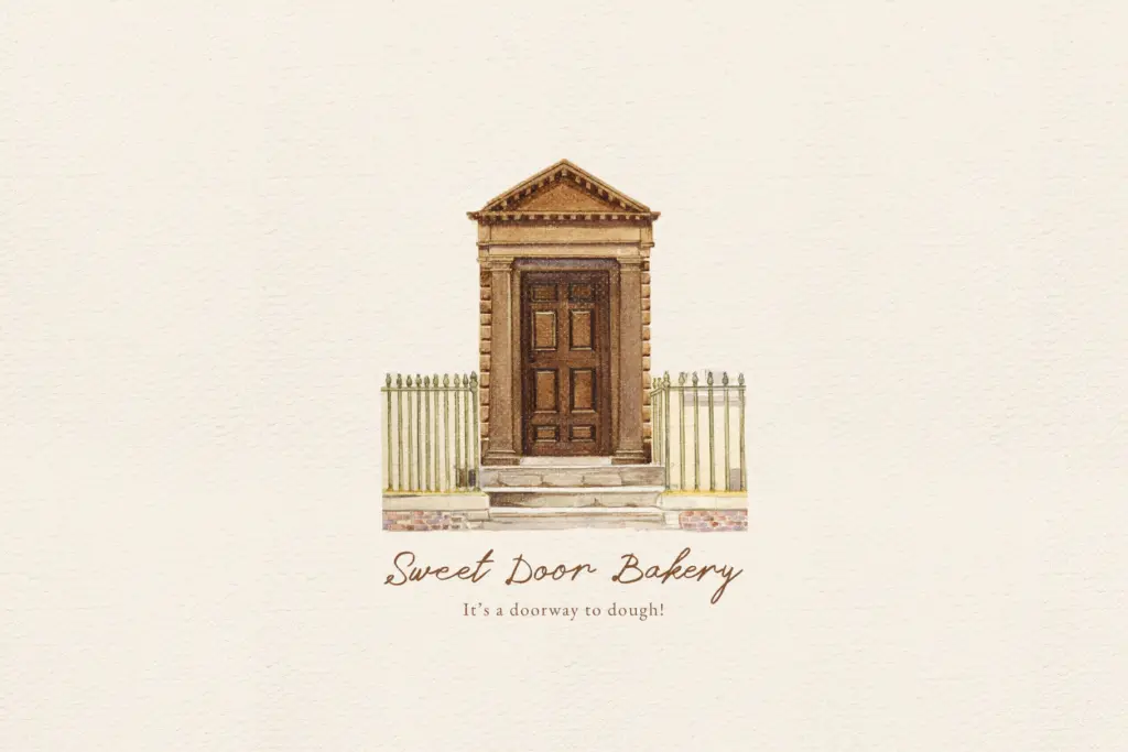
The set covers uppercase and lowercase, numerals, and standard punctuation, along with an extended range of accented characters for languages beyond English. That’s a genuine plus for a script this specific in style — a lot of pencil-effect fonts stop at basic Latin and leave anyone setting French, Polish or Turkish text stranded.
What it doesn’t have is any sign of contextual alternates or swash variants, which matters more here than it would in a cleaner script. Handwritten fonts that repeat the same glyph shape for every instance of a common letter can start to look mechanical fairly quickly, especially in longer lines of text, and without alternates to break up repetition, that’s a real risk with Dreams on Paper once you’re past a few words. Kerning is serviceable but not seamless — a few letter pairs need manual nudging in tighter headline settings.
Use cases
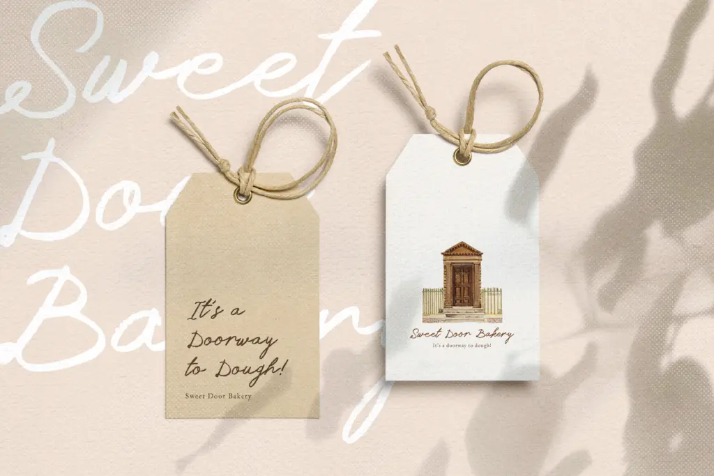
This font is built for short bursts of text where texture is doing the emotional work: a handwritten note on a package insert, a quote card for social media, a signature-style line on an invitation, a scribbled aside in a moodboard or zine layout. At those lengths, the pencil texture reads as intentional and adds warmth without becoming distracting.
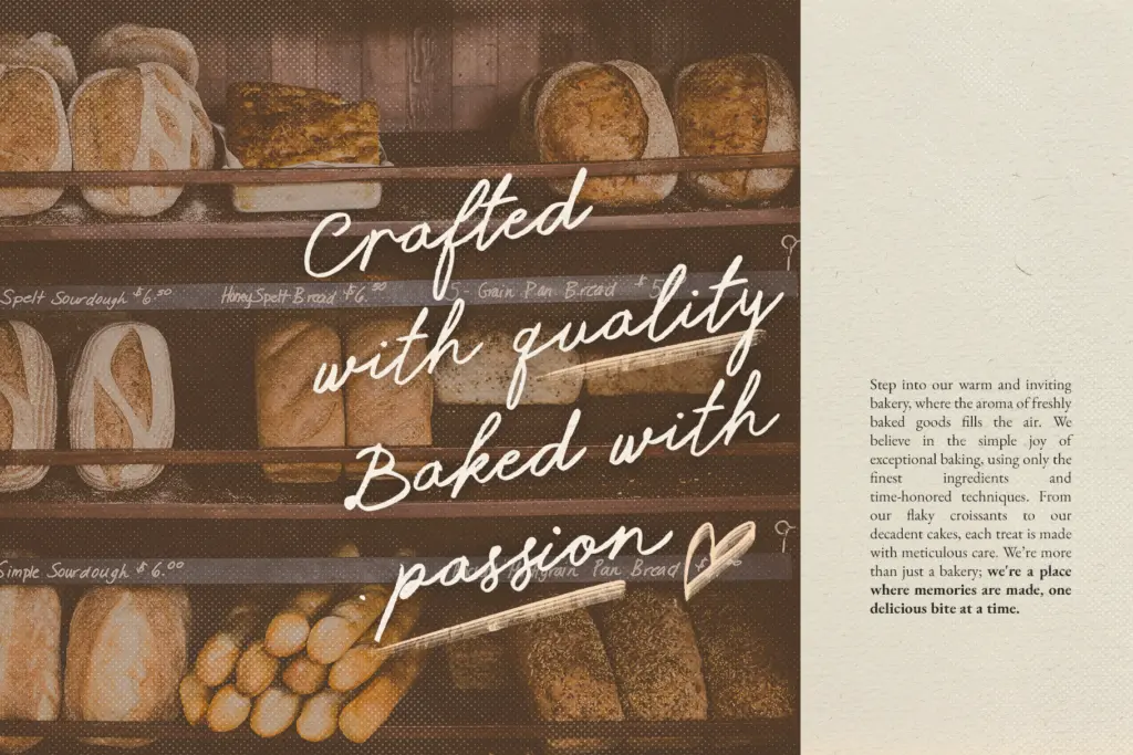
It’s less suited to anything that needs to hold up at very small sizes or across a paragraph of body copy — the roughness that gives it character also softens the edges enough that legibility drops once you’re below display or subheading sizes. Reproduction matters too: the texture will look sharper on matte stock or a well-rasterized digital export than on glossy print or low-resolution screens, where the grain can turn muddy. Pair it with a plain sans or serif for any supporting text, and keep it to headlines, taglines, or short handwritten-style callouts rather than asking it to carry a whole layout.
What we liked, and what we didn’t
Strengths
- Convincing graphite texture that reads as genuine hand-drawn lettering rather than a filter effect
- Extended Latin character set with accented characters covers more languages than most fonts in this style
- Legible underlying letterforms keep the roughness from tipping into illegibility
Trade-offs
- No contextual alternates, so repeated letters can look mechanical across longer lines
- Texture and legibility both degrade at small sizes or on lower-quality print and screen output
Dreams on Paper does one job convincingly: it looks like a real pencil sketch rather than a digital approximation of one. But without alternate glyphs it repeats itself in longer text, and the texture that gives it character also limits how small or how densely it can be set.
Verdict

Tantype reviews typefaces in depth — every font is tested in real branding, editorial and screen layouts before a word gets written. 555+ fonts reviewed and counting.