
Slight: a heavily slanted hand-lettered script built for layout play
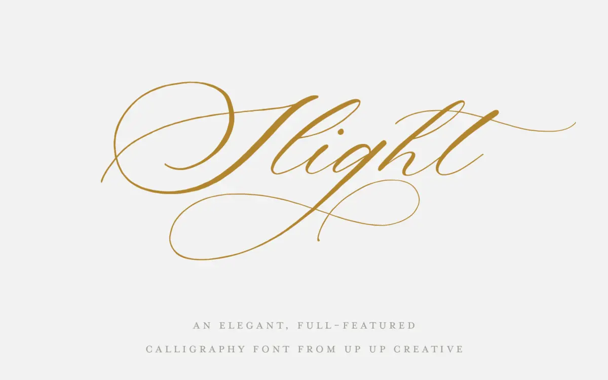
Design style
Slight is a hand-lettered script with a pronounced right slant, closer to a fast, connected calligraphy hand than to a formal copperplate. The strokes carry a moderate contrast between thick and thin, but the emphasis here is on rhythm and forward motion rather than the crisp shading of pointed-pen scripts. Letters lean hard into each other, and the joins feel loose and human rather than mechanically calculated, which gives it a warmer, more improvised character than a lot of scripts built primarily for logotypes.
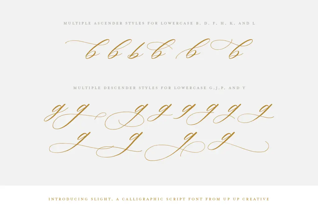
What sets Slight apart from the average script release is its treatment of ascenders and descenders. Rather than a single default form for each letter, the font ships with multiple versions of these strokes, some of them quite long and looping. Used deliberately, this lets you build compositions where a word’s silhouette varies noticeably from one setting to the next — a useful trick for headline work, but one that needs a steady hand to keep from feeling arbitrary.
Character set and features
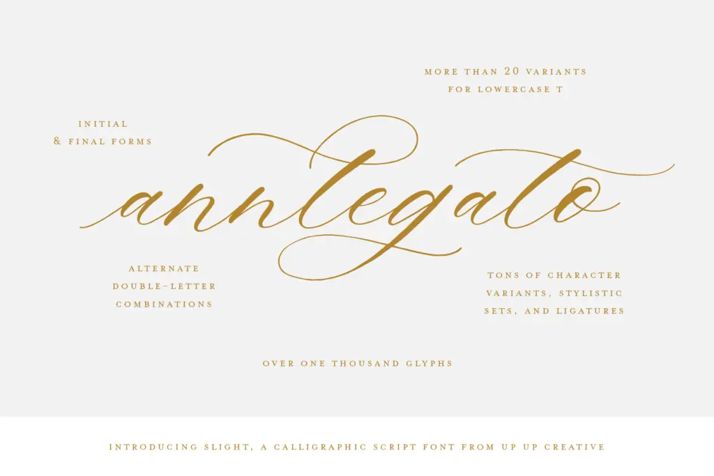
The glyph count is substantial, reportedly over a thousand, and the OpenType feature set backs that up: contextual alternates, stylistic alternates, initial and final forms, ligatures, and six separate ampersand styles. This is a font built to be swapped and rebuilt in the glyphs panel rather than typed and left alone. Multilingual support and multiple currency symbols extend its reach beyond English-only branding work.
The catch is accessibility. Getting real value out of Slight means working in an OpenType-savvy application — Illustrator or InDesign — and being willing to dig through alternates by hand. Word can access some features through its advanced font menu, but the deeper glyph set apparently needs a separate character-map file from the designer directly. That’s an unusual hoop to require, and it makes this a font best suited to someone already comfortable digging through the glyphs panel rather than someone who wants a plug-and-play script.
Use cases
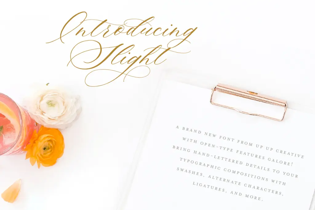
Slight reads best in the roles scripts have always done well: wedding invitations and stationery, editorial headers, packaging accents, and branding marks where a personal, handwritten voice is the point. The heavy slant and looping alternates make it particularly suited to display sizes — a word or short phrase set large, where the variation between letterforms can actually be seen and appreciated. At small text sizes the connected joins and slant will fight legibility, so this isn’t a font for body copy or long-form setting.
Designers doing invitation suites, logotypes with a handwritten feel, or editorial spreads that need a signature-style flourish will get the most out of it, provided they’re willing to spend time in the alternates rather than typing it out cold. It rewards experimentation more than speed.
What we liked, and what we didn’t
Strengths
- Multiple versions of ascenders and descenders let you vary word shapes across a layout
- Deep OpenType feature set including six ampersands and contextual alternates
- Warm, hand-lettered feel that avoids looking mechanically generated
Trade-offs
- Accessing the full glyph set requires a separate file from the designer, not just the font itself
- Heavy slant and connected joins make it unsuitable for small text or body copy
Slight is a warm, loosely-joined script with an unusually deep alternate set, best used at display sizes where its varied ascenders and descenders can actually register. It rewards patient glyph-panel work more than quick typing, and its access to the deepest features requires extra steps outside standard software. A solid pick for invitation and branding work, less so for anyone wanting instant results.
Verdict

Tantype reviews typefaces in depth — every font is tested in real branding, editorial and screen layouts before a word gets written. 555+ fonts reviewed and counting.