
Runalto: a luxury display serif for branding and editorial headlines
Design style
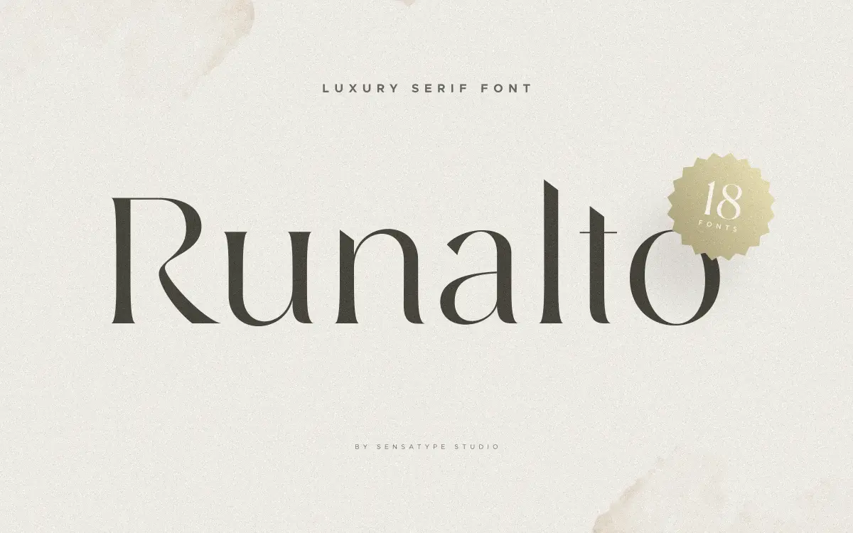
Runalto sits in the well-populated field of “luxury” display serifs: high contrast strokes, sharpened serifs, and a general air of restraint that’s meant to read as expensive rather than decorative. The uppercase carries most of the personality here — tall, narrow proportions with serifs that taper to fine points rather than sitting flat, which gives titles a slightly formal, engraved quality. The lowercase is calmer, with shorter x-height and less flourish, so the typeface doesn’t try to do everything a script does. It’s a serif that wants to be looked at briefly, in a headline or a wordmark, not read for paragraphs.
What separates a good luxury serif from a generic one is usually the quality of the thin strokes and the consistency of the contrast, and Runalto is decent but not remarkable on this front. The transitions between thick and thin are clean enough at large sizes, though a few joins — particularly where curves meet stems — feel slightly abrupt rather than modulated. It’s not a flaw that ruins the font, but it’s the kind of detail that separates a font built for one job (a logotype) from one that’s been refined across a full weight range. Runalto reads as the former.
Character set and features
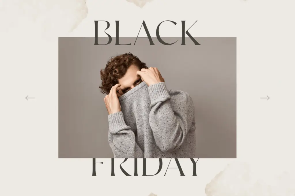
The set covers uppercase and lowercase, numerals, punctuation, and multilingual character support, which is enough for most Latin-script branding and packaging work. There’s no mention of alternate characters, ligatures, or a companion italic, and nothing in the material suggests small caps or old-style figures — so designers looking for the kind of granular OpenType control that separates a workhorse serif from a one-trick display face should look elsewhere. This is a font built around a single confident voice rather than a system of variations.
Spacing is even and the letterforms hold their shape well in isolation, which matters more than usual for a font intended to sit large and alone — a single word on a label, a name on an invitation. Where it gets tested is in longer strings: at smaller sizes the fine serifs start to lose crispness, particularly in digital contexts with anti-aliasing, so this isn’t a font to drop into small print or dense text blocks.
Use cases
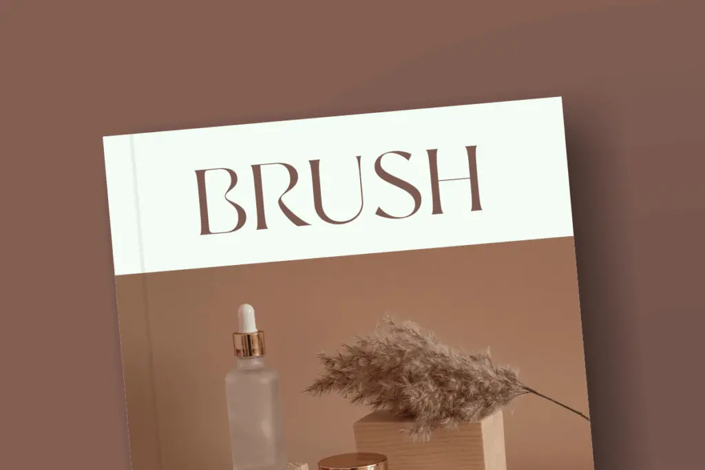
Runalto’s actual home is the short line: a logotype, a magazine masthead, a product name on packaging, the header of a wedding invitation. It has enough formality to suit editorial mastheads and enough delicacy to suit perfume or cosmetics packaging, where thin strokes read as refinement rather than fragility. It’s a reasonable choice for a boutique hotel, a jewellery brand, or an invitation suite that wants a serif with some ceremony to it, without going as far as full calligraphic script.
It’s less suited to body copy, UI, or anywhere it needs to hold up at 12px — the thin strokes and tight spacing weren’t drawn for that. Pair the ambition of the headline use with a plainer workhorse font for supporting text, since Runalto isn’t trying to be a full system on its own.
What we liked, and what we didn’t
Strengths
- Strong presence in short headline settings like logotypes and mastheads
- Even spacing keeps single words or names looking deliberate rather than crowded
- Multilingual character support extends its use beyond basic Latin branding work
Trade-offs
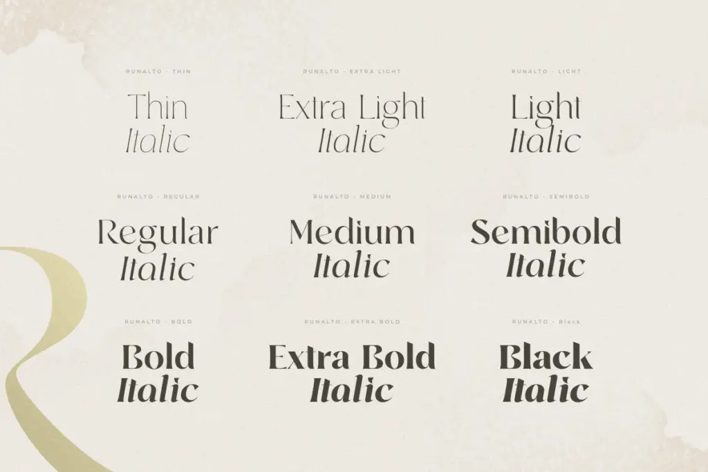
- Thin strokes lose crispness at smaller sizes, limiting it to display use only
- No listed alternates, ligatures or italic companion, so it works as a single fixed voice rather than a flexible system
Runalto is a competent luxury-style display serif suited to short lines of type — logos, masthead treatments, packaging, invitations. It doesn't offer the depth of features or refinement that would make it a long-term workhorse, but for its intended job it's a solid, if unremarkable, choice.
Verdict

Tantype reviews typefaces in depth — every font is tested in real branding, editorial and screen layouts before a word gets written. 555+ fonts reviewed and counting.