
Advera: a bold sans display font built for logotypes and headlines
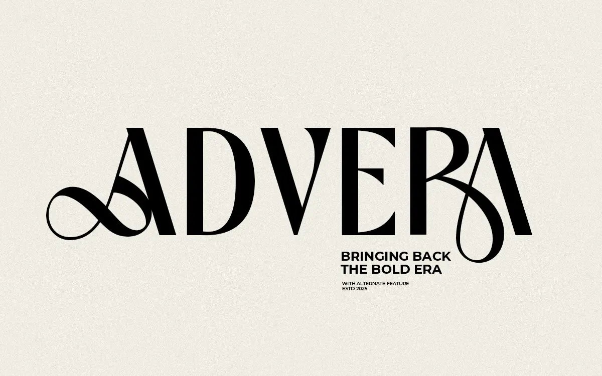
Design style
Advera is a bold sans built for scale rather than for setting paragraphs. The letterforms lean into thick, confident strokes with tight counters and a squared-off geometry that reads as contemporary rather than retro. There’s a slight tension in the drawing between rigid, ruler-straight verticals and a few looser terminals that keep it from feeling too mechanical. It sits in the same territory as a lot of current branding sans faces: chunky, a bit brash, designed to be read from a distance rather than admired up close.
What separates it from a generic bold grotesque is the alternate character set. Several letters have swapped-in variants with different terminal treatments or altered proportions, which gives designers room to tune the personality of a wordmark without switching typefaces entirely. The ligatures do similar work, softening a handful of awkward letter pairings that show up often in short display settings — logotypes, monograms, single words set large.
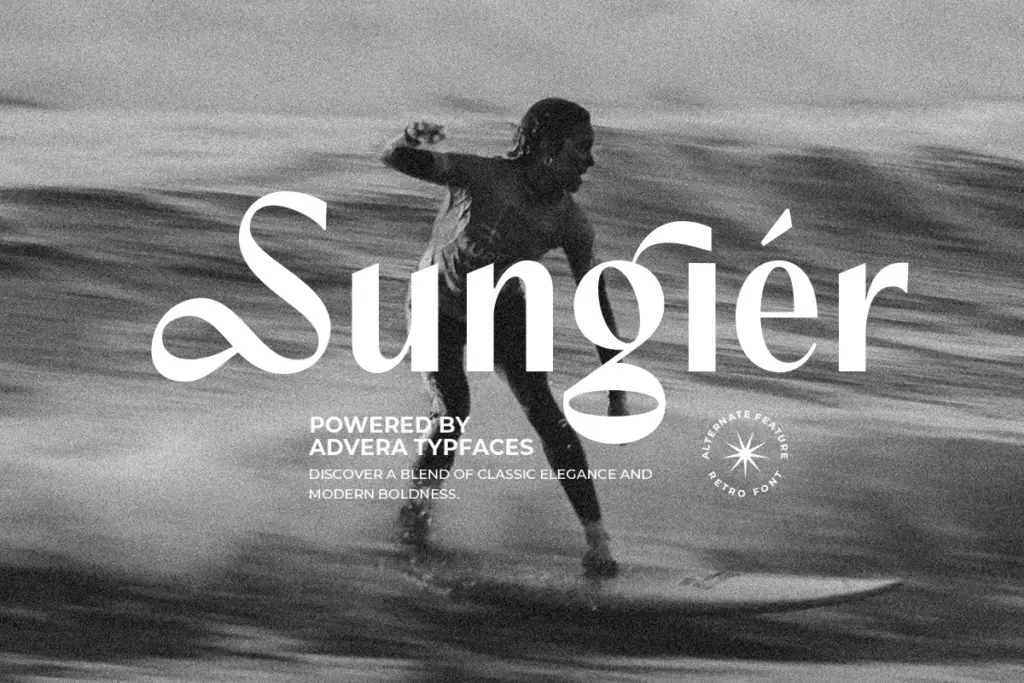
Character set and features
The OpenType features are the real reason to reach for Advera over a plainer bold sans. Alternates let you adjust individual letters — swapping a terminal here, a bowl shape there — so two logotypes built from the same base font don’t end up looking identical. Ligatures handle common combinations that would otherwise look cramped or collide at tight tracking, which matters more in display work than most buyers expect, since a single word blown up to poster size exposes every spacing flaw. The seller notes multilingual support, which extends the font’s reach beyond a narrow Latin set, though the specifics of language coverage aren’t something to take on faith without checking the character map before committing to a project with diacritic-heavy copy.
There’s no indication of a full weight range here — this is a single bold cut, not a family with light-to-black variation. That’s fine for what it’s built to do, but it does mean Advera can’t carry a layout on its own; it needs a supporting text face for body copy, captions, or anything set smaller than a headline.

Use cases
Advera’s natural home is short-form, high-impact type: logotypes, wordmarks, headline treatments, packaging call-outs, poster type, and quote graphics where three or four words need to dominate a page. The alternates make it genuinely useful for identity work, where a designer often wants a bold sans that doesn’t look like it came straight out of the box. It’s less suited to anything requiring extended reading — body text, long captions, dense UI — because the tight counters and heavy weight that make it punchy at large sizes will clot and blur once it’s set small.
Pair it with a plain, quieter sans or a simple serif for supporting text, and let Advera do the shouting. Used sparingly — a single word, a short line, a monogram — it earns its weight. Used across paragraphs, it will fight the reader rather than inform them.

What we liked, and what we didn’t
Strengths
- Alternate characters let designers vary letterforms across different logotype builds
- Ligatures smooth over tight letter pairings that usually break at display sizes
- Bold, squared geometry reads clearly at poster and headline scale
Trade-offs
- Single weight only, so it can't carry a layout without a supporting text face
- Tight counters and heavy strokes make it unsuitable for anything smaller than a headline
Advera is a solid bold display sans with useful alternates and ligatures that give logotypes some personality beyond the default. It's a single-purpose tool — great for short, large-scale type, not built for anything else — so buyers should know exactly what job they're hiring it for.
Verdict

Tantype reviews typefaces in depth — every font is tested in real branding, editorial and screen layouts before a word gets written. 555+ fonts reviewed and counting.