
Vaquero: a weathered western sans for rodeo posters and rustic branding
Design style
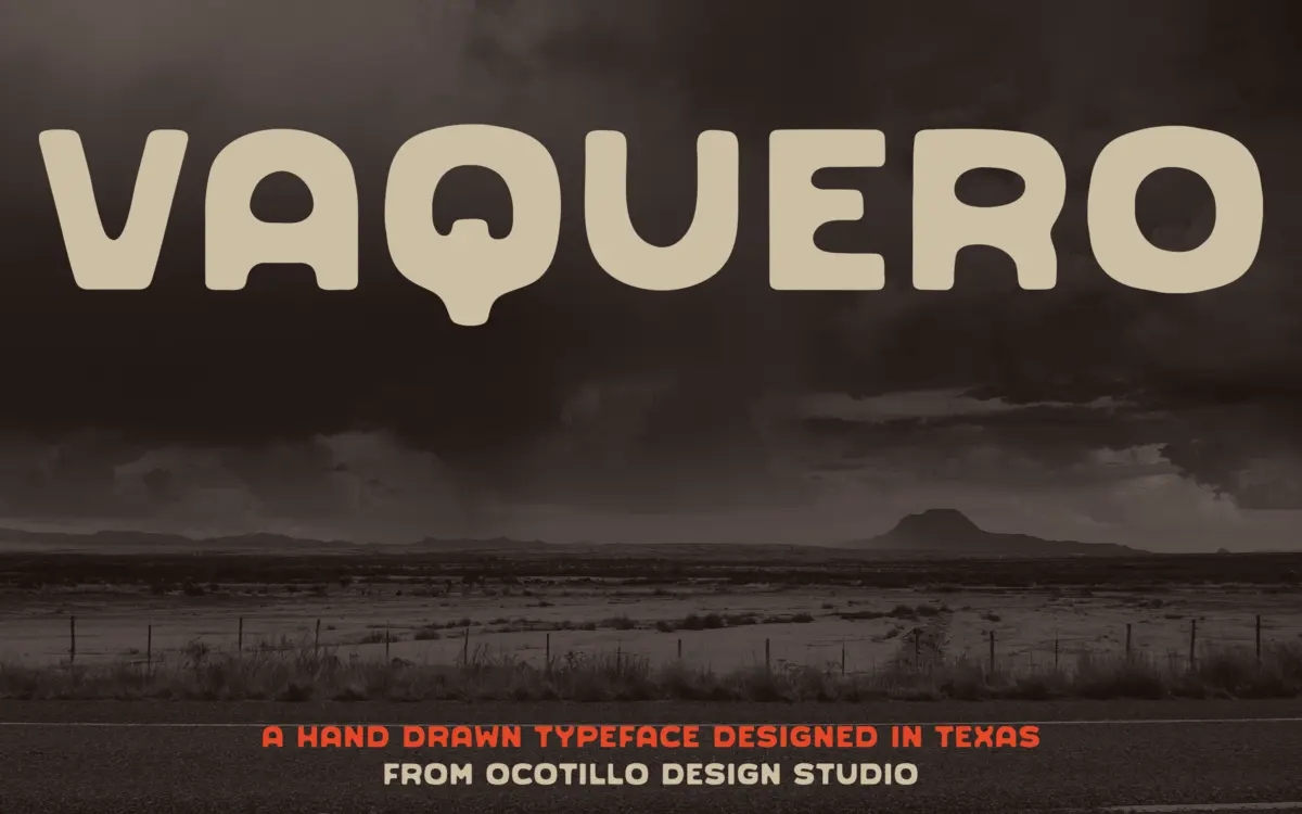
Vaquero sits in that stretch of the display market where sans serif construction meets frontier signage. The letters carry the marks of a hand rather than a pen plotter smoothed clean: strokes wobble slightly off true, corners round unevenly, and the overall texture reads as painted or branded rather than typeset. This is a sans in structure but not in temperament. It leans into the worn, sun-bleached look of hand-lettered ranch signs and saloon fronts rather than the neutrality most sans faces aim for.
The weathered quality is the whole point here, and it’s handled with some restraint. Rather than distressing every edge into illegibility, the roughness sits mainly at stroke terminals and corners, leaving the counters and overall letter shapes intact. That’s a reasonable trade-off for a typeface built around a mood: it commits to the theme without sacrificing the basic job of being read.
Character set and features
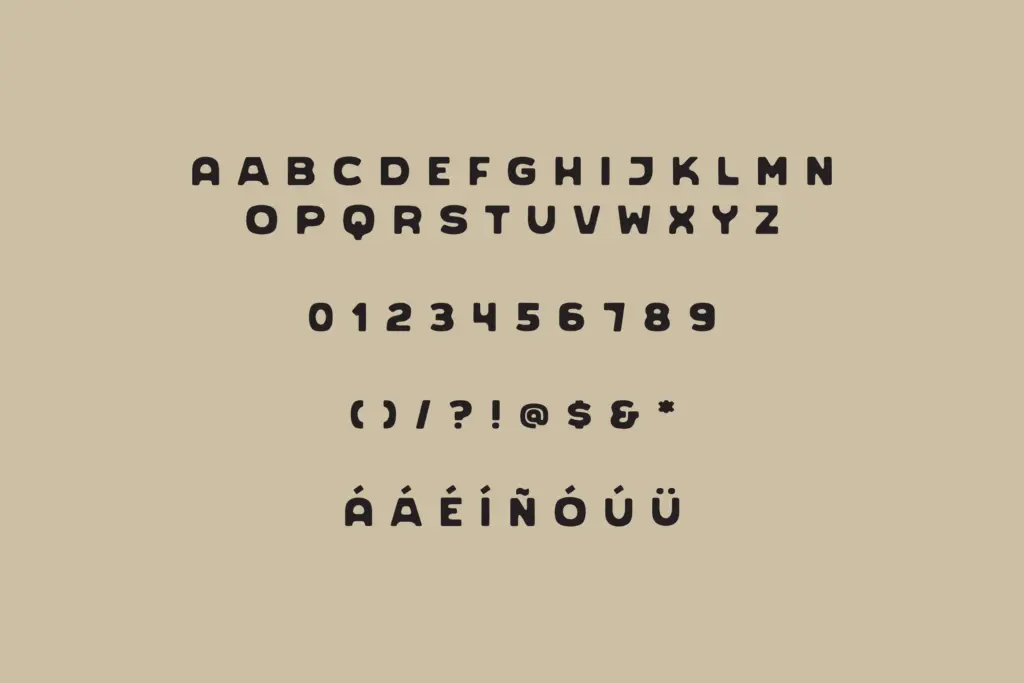
The stated headline feature is an alternate A glyph, which gives some flexibility in how aggressively western the setting looks — useful for a word like RANCH or BRAND where a single letter can tip the whole line’s character. Beyond that, the brief doesn’t detail broader OpenType features, ligatures, or extended language support, so treat this as a single-style display font rather than a full-featured family until you’ve checked the character map yourself.
Because it’s built as a hand-drawn display face, spacing and rhythm are doing a lot of the work. Letters that would be perfectly uniform in a grotesque here have individual quirks — a slightly heavier crossbar, a terminal that doesn’t quite close. That’s consistent with the hand-lettered premise, but it does mean kerning pairs need checking in longer headlines; hand-drawn irregularity can produce awkward gaps or collisions that a geometric sans would never have.
Use cases
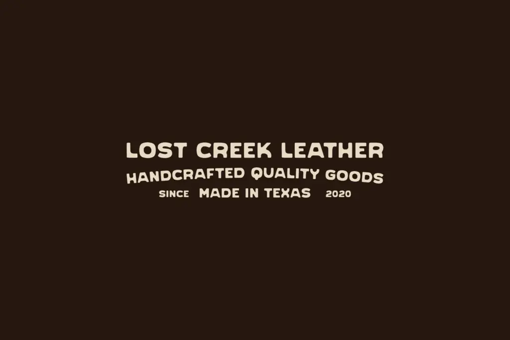
Vaquero’s natural home is anything with a western, rustic, or Americana theme: rodeo posters, ranch and ag brand marks, beer and spirits labels, barbecue restaurant signage, festival flyers with a frontier bent. It also works for products trading on desert or southwestern identity — the kind of packaging that wants to feel handmade and regional rather than corporate.
It’s a display face first, and should be used that way. Set it large, in short bursts — a logotype, a headline, a single word on a poster — rather than as running text or body copy, where the irregular strokes will tire the eye and slow reading. Pair it with a plain, quiet sans or serif for supporting text so the personality stays concentrated in the headline rather than spreading thin across a whole layout.
Designers reaching for genuine western character without resorting to full slab-serif cowboy clichés will find this a workable option. Just don’t expect it to flex into corporate branding, editorial body text, or anything asking for neutrality — that’s not the job it was built for.
What we liked, and what we didn’t
Strengths
- Weathered, hand-drawn texture gives genuine western character without leaning on slab-serif cliché
- Restrained distressing keeps letterforms legible at display sizes
- Alternate A glyph offers useful variation for short headline settings
Trade-offs
- Irregular strokes and spacing make it unsuitable for anything beyond short headline text
- Feature set appears limited — no broad OpenType alternates or confirmed multilingual support
Vaquero delivers a convincing weathered-west mood for headline and logo work, with enough hand-drawn irregularity to feel genuine rather than templated. It's not built for body text or for brands wanting neutrality, and the feature set appears limited to a single style plus one alternate glyph. A solid, narrow-purpose display face rather than an all-rounder.
Verdict

Tantype reviews typefaces in depth — every font is tested in real branding, editorial and screen layouts before a word gets written. 555+ fonts reviewed and counting.