
Casually Handwritten: a raw, unpolished script for personal-feeling branding
Design style
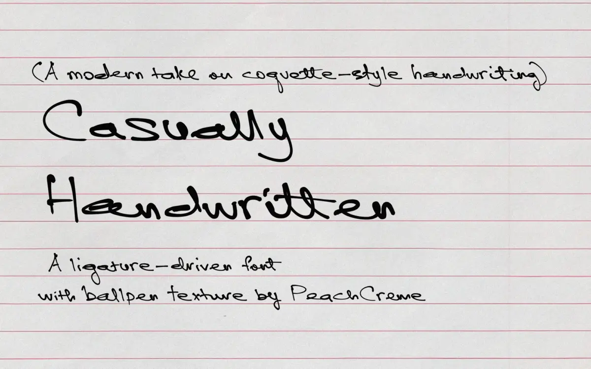
Casually Handwritten sits at the loose end of the script spectrum, closer to a note scribbled on a paper bag than a formal invitation script. The strokes carry the small wobbles and pressure changes of an actual pen, and the letterforms don’t pretend otherwise — baselines drift, x-heights vary letter to letter, and joins between characters look built rather than engineered. That’s the point of it. It reads as handwriting rather than a font styled to look like handwriting, which is a harder trick to pull off than it sounds, and one a lot of scripts in this category fumble by over-smoothing every curve.
Where it separates itself from generic marker-script fonts is in restraint. There’s no exaggerated swash energy, no oversized capitals trying to prove personality. It’s quieter than that — the kind of script you’d use because you want a headline to feel like it was written by a person at a desk, not performed for a camera.
Character set and features
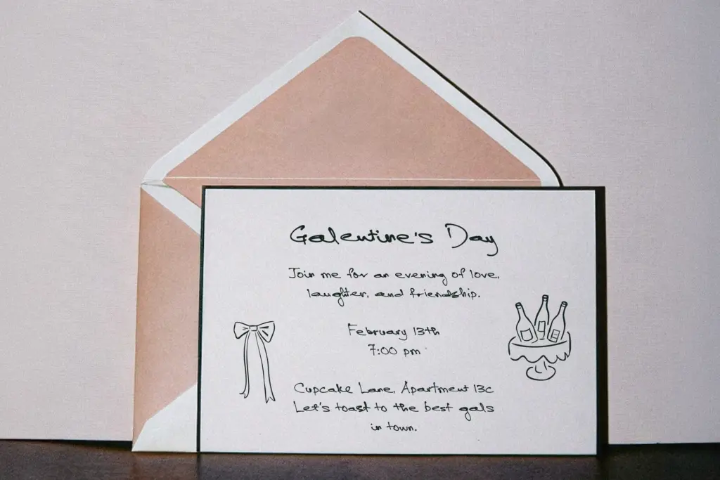
The font’s real substance is in its 135 ligatures and alternate lowercase forms. This is a lot of alternates for a script at this price point, and it shows in use: repeated letters within a word don’t fall into an obvious pattern, which is usually the giveaway that a script is a font rather than a hand. Set a few words with the alternates active and you get genuine variation rather than a single swapped glyph doing all the work.
The catch is that none of this happens automatically without a layout program that supports OpenType features — Illustrator, InDesign, Photoshop with the right settings. Drop it into a tool that doesn’t read ligatures and stylistic alternates, and you’ll get a flatter, more repetitive version of the font that loses most of what makes it worth choosing. Anyone buying this for a no-code storefront builder or a basic design app should test that first.
The alternates are lowercase-only, per the brief, so there isn’t a matching set of expressive capitals — sentence-starting caps sit in a plainer, less experimental register than the lowercase around them. That’s not a flaw so much as a scope decision, but it’s worth knowing before you set a full word in caps expecting the same looseness.
Use cases
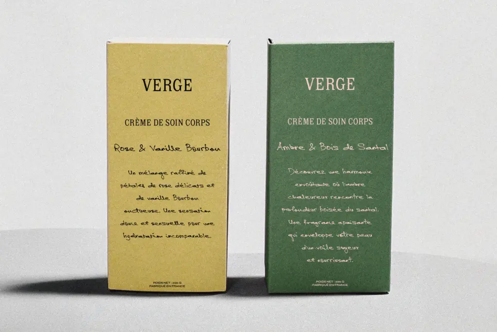
This is a font for short, intimate uses: a product label, a note card, a journal spread, a line on wedding stationery that wants to feel like it was addressed by hand rather than printed by a machine. It works well as an accent — a signature line, a
What we liked, and what we didn’t
Strengths
- 135 ligatures and lowercase alternates give real word-to-word variation instead of an obvious repeating pattern
- the imperfect, hand-built feel is convincing rather than an over-smoothed script pretending to be a hand
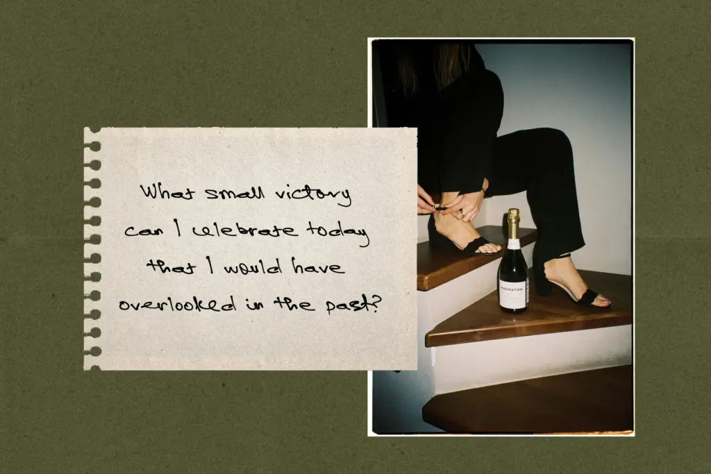
- works well as a small, intimate accent on packaging, cards, and journaling layouts
Trade-offs
- alternates only work in software that supports OpenType ligatures and stylistic sets, so results vary a lot by app
- no matching expressive capitals, so full-caps or heavy body-copy use falls flat compared to the lowercase
Casually Handwritten does what its name promises: it looks like an actual hand, wobbles included, thanks to a genuinely large set of ligatures and lowercase alternates. It's best used sparingly, in short lines, and only in software that reads OpenType features properly — push it further than that and the charm turns to clutter.
Verdict

Tantype reviews typefaces in depth — every font is tested in real branding, editorial and screen layouts before a word gets written. 555+ fonts reviewed and counting.