
Keel: a hand-drawn coastal serif for signage and seaside branding
Design style
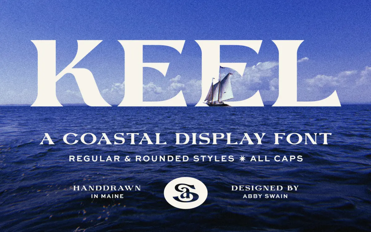
Keel is a display serif built around the look of hand-carved lettering rather than anything you’d set from a metal type case. The strokes are irregular in a deliberate way — slightly bowed verticals, serifs that don’t quite match their neighbours, terminals that taper unevenly like a chisel dragged by hand. It reads as a font drawn to imitate signage, not a font drawn to imitate a book face, and that distinction matters for how you use it.
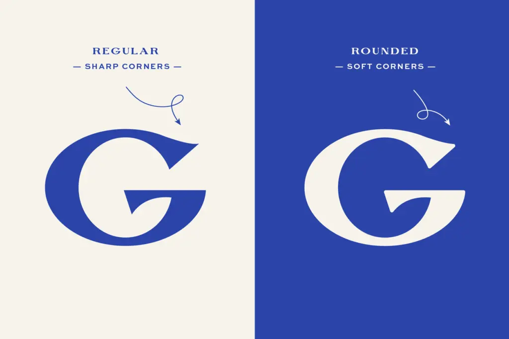
The two styles included — a regular cut and a rounded cut — share the same skeleton but change the mood considerably. The regular version has sharper serif ends and feels closer to weathered board lettering; the rounded version softens every terminal into a bulb shape, which pushes it toward something friendlier and a bit more childlike. Having both in one family is useful, since it means you’re not locked into one register once you commit to the letterforms.
Character set and features
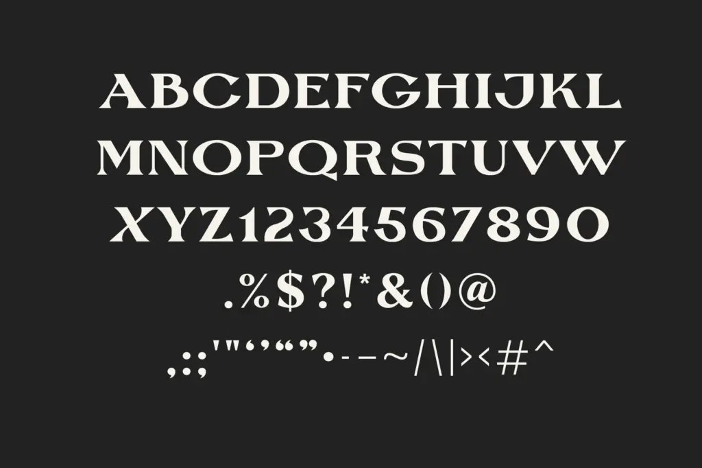
As a display serif, Keel is built for words, not paragraphs. Letter pairs have been drawn with enough individual character that no two lowercase ‘e’s or ‘a’s look machine-stamped, which is exactly the point of a hand-drawn face like this — but it also means the rhythm of a full sentence is looser than a text serif’s. Spacing has been handled with that in mind; letters sit with enough air around them that the irregularity doesn’t read as sloppy, it reads as intentional.
The rounded companion style earns its keep here. Swap between the two and you get a harder, saltier version and a softer, storybook version from the same basic drawing — a small but genuinely practical bit of range for a single-purchase display font. Don’t expect this to behave like a workhorse text family with extended weights or true italics; it’s scoped to what a display serif needs to do, and it does that scope well rather than overreaching into territory it wasn’t drawn for.
Use cases
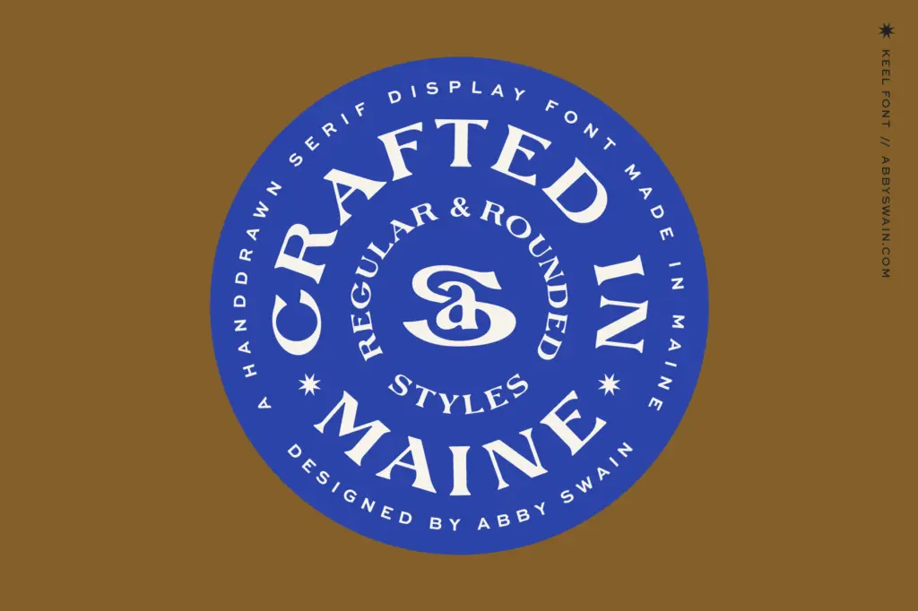
Keel’s obvious home is coastal and maritime branding — marina signage, seafood restaurant menus, boat charter logos, beach town identity work — anywhere a client wants lettering that looks carved rather than typeset. It also has a natural fit with children’s book covers and illustration work involving sea themes, where the slightly uneven hand-drawn quality reads as charming rather than unfinished.
It works well on wedding stationery too, particularly for couples leaning into a nautical or coastal venue, though designers should treat it the way they’d treat any hand-lettered display face at that size: as a headline or monogram element, paired with a calmer serif or sans for the body copy and details. Push it too far into small print and the irregularity that makes it charming at large sizes starts to work against legibility. Keep it to titles, logotypes, and short lines of set copy and it holds its footing.
What we liked, and what we didn’t
Strengths
- The regular and rounded styles give two distinct moods from one drawing, useful for varying a brand's tone
- Spacing is handled carefully enough that the intentional hand-drawn irregularity doesn't collapse into messiness
- Well suited to its stated niche — coastal, marina, and seafood branding reads convincingly through this face
Trade-offs
- Legibility drops quickly at small sizes or in dense settings, so it's strictly a display tool
- The character has a strong regional flavour that won't suit brands outside the coastal or nautical mood
Keel is a competent, well-observed hand-drawn serif that does one job convincingly: coastal, carved-sign lettering with a bit of storybook charm. It's not built for long-form setting and shouldn't be asked to do that, but for headlines, logotypes, and short display lines in maritime or nautical branding, it delivers exactly what it promises.
Verdict

Tantype reviews typefaces in depth — every font is tested in real branding, editorial and screen layouts before a word gets written. 555+ fonts reviewed and counting.