
National Forest Font Duo: routed-sign script and print for rustic branding
Design style
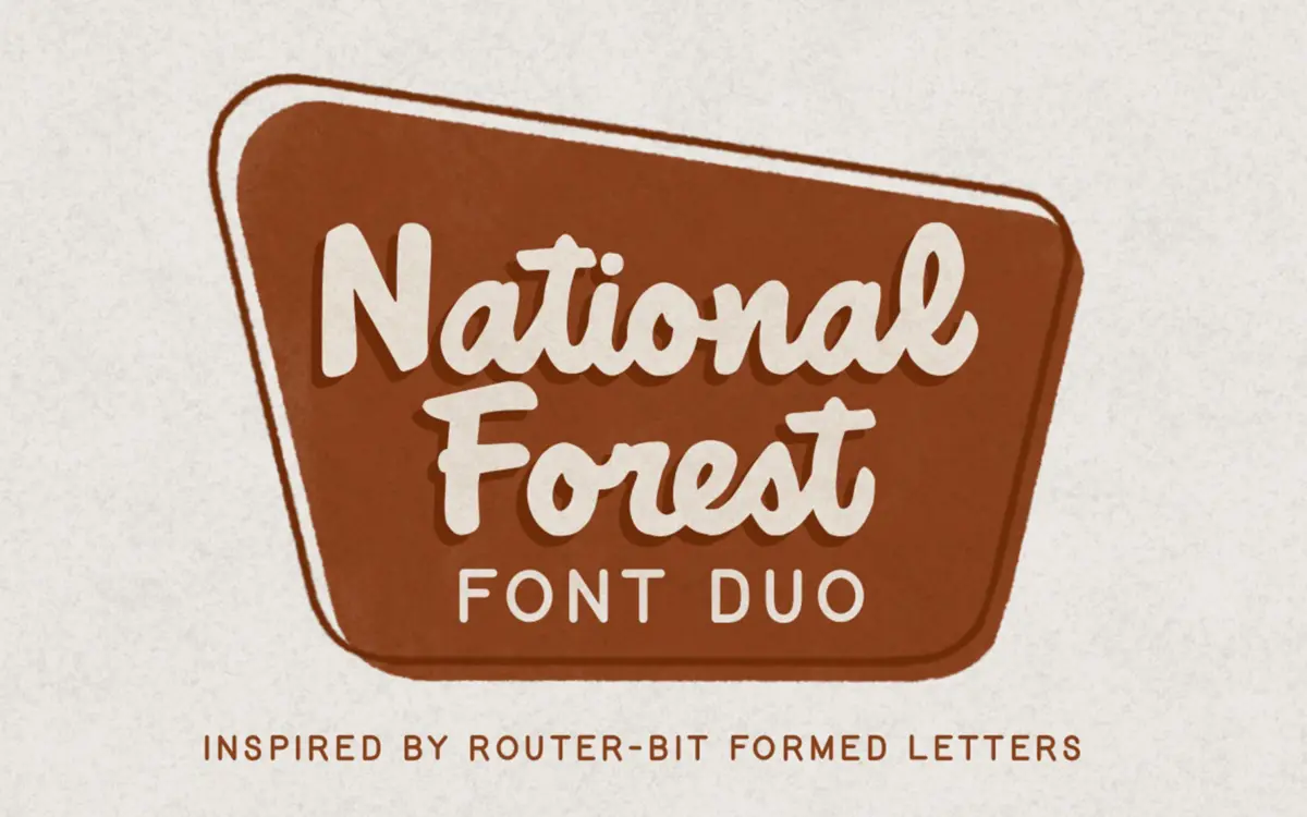
National Forest borrows its logic from park signage cut with a router bit, where the tool’s radius rounds every corner and forces a certain bluntness into the letters. That constraint carries through the digital version. The script is loose and slightly wobbly, with joins that don’t quite line up the way a calligraphic script would, and the print companion has the same rounded, slightly heavy stroke endings you’d get from a bit cutting into wood rather than a pen dragging across paper.
It reads as handmade rather than polished. The imperfections are deliberate — a baseline that dips, strokes that vary in weight from letter to letter — and they’re consistent enough across the set that the effect looks intentional rather than sloppy. This is not a font built for restraint. It has a point of view and it commits to it.
Character set and features
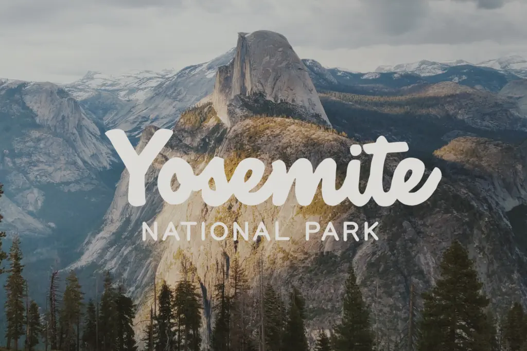
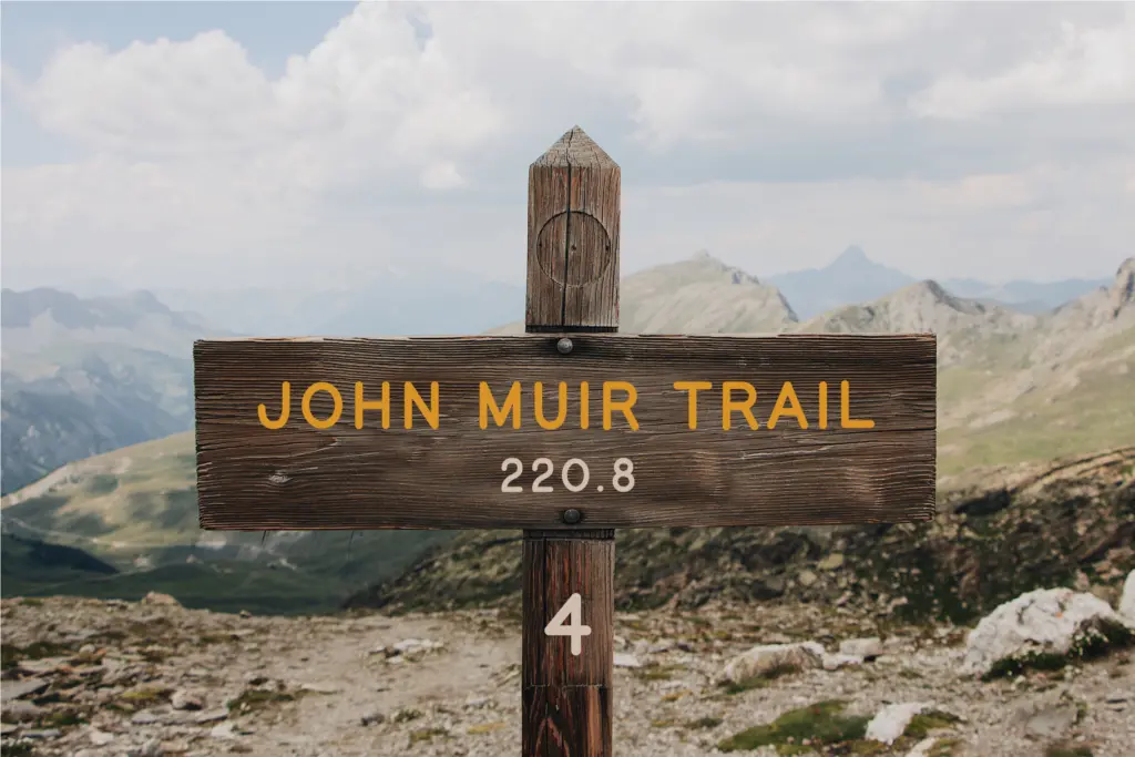
As a duo, the pairing does the job you’d expect: the script carries the emotional, decorative weight while the print handles anything that needs to stay readable at a glance — taglines, addresses, ingredient lists. The print is upright, slightly condensed in feel, with open counters that keep it legible even though the strokes have the same rounded, carved character as the script.
The script itself is more demanding. Letters lean into each other with tight, informal connections rather than smooth calligraphic ligatures, so at very small sizes some of the joins can blur together, particularly in lowercase clusters like m, n, and w. It’s not a script built for long paragraphs — it wants short words, names, single lines. Numerals and basic punctuation are present and follow the same rounded, routed treatment as the letters, which keeps the whole family visually consistent when script and print are used side by side.
Don’t expect a wide range of weights or alternate stylistic sets here — this is a duo built around one script style and one print style, not an expandable system. What you get is coherent, but it isn’t a flexible superfamily.
Use cases
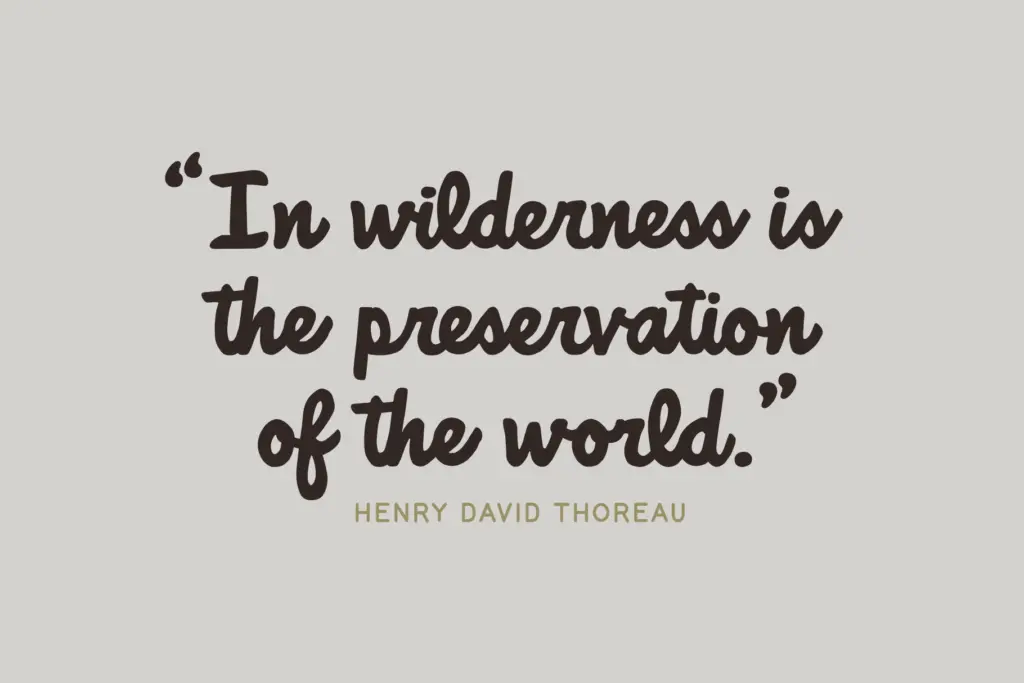
This is a good fit for anything trading on outdoorsy, rustic, or national-park nostalgia: cabin and campground branding, outdoor apparel, craft beverage labels, retreat or retail signage that wants to look hand-carved rather than digitally produced. The script works well as a short lockup — a business name, a single word on a badge or patch — paired with the print handling supporting copy underneath.
It’s less suited to dense text. Anyone setting body copy, long headlines, or anything that needs to stay crisp at small sizes should lean on the print face and keep the script to accent roles: a logotype, a header, a single line on packaging. Used that way, the duo holds its charm without asking the reader to decode a paragraph of wobbly joins. Wedding stationery with a rustic or outdoor theme is another reasonable use, provided the client wants informal over elegant.
What we liked, and what we didn’t
Strengths
- The routed, rounded stroke treatment gives the script and print a genuinely cohesive, carved-sign feel
- Print companion stays legible even while matching the script's rustic character
- Well suited to short lockups — logos, badges, single-line headers
Trade-offs
- Script joins can blur at small sizes, especially in letter clusters like m, n, w
- Limited to one script and one print style, with no extra weights or alternates to expand the system
National Forest nails a specific, rustic-outdoor mood with real charm in the script's imperfections. It's a strong pick for short lockups and branding but not built for dense text or heavy paragraph use.
Verdict

Tantype reviews typefaces in depth — every font is tested in real branding, editorial and screen layouts before a word gets written. 555+ fonts reviewed and counting.