
Peachy Rebels: a retro font duo pairing a chunky sans with a casual script
Design style
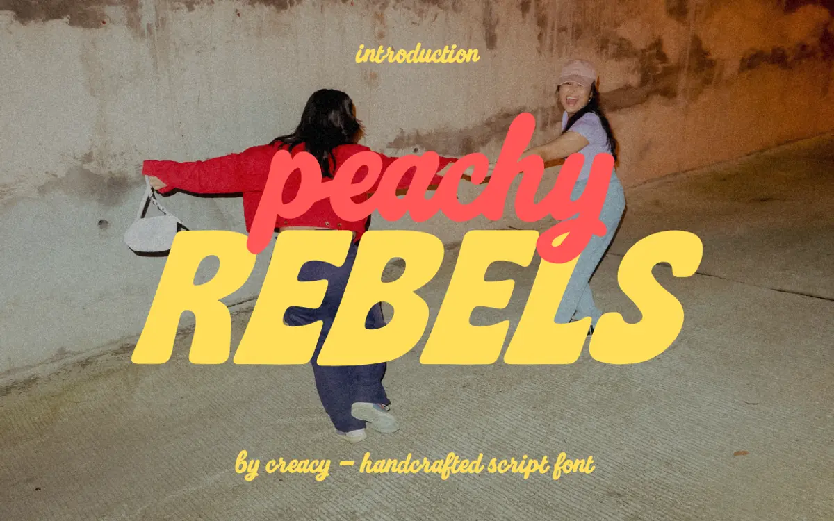
Peachy Rebels is a two-part set: a bold, rounded uppercase sans for shouting and a looser handwritten script for whispering underneath it. The sans leans into a retro, bubble-letter feel — thick strokes, soft corners, no sharp edges anywhere. It reads like something drawn for a milkshake sign or a 70s fashion promo, which is clearly the point. The script half is looser and more casual, with a handwritten slant and connecting strokes that give it a felt-tip, notebook-margin energy rather than formal calligraphy.
The pairing works because the two halves don’t compete. The sans carries weight and attention; the script adds a lighter, more personal texture. Neither is trying to be a workhorse text face, and neither pretends to be. It’s a decorative duo built for contrast, not for subtlety.
Character set and features
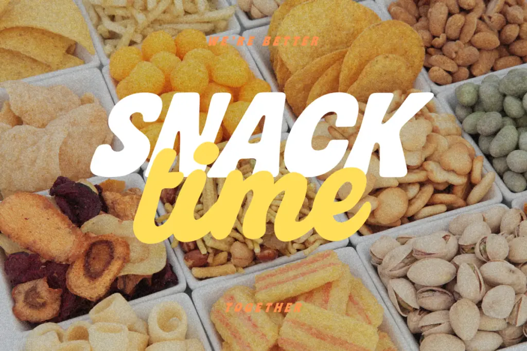
The set is straightforward: uppercase-only sans (A–Z), lowercase-only script (a–z), numerals, and standard punctuation. That capitals-only and lowercase-only split is worth flagging up front — you can’t set a full sentence in either style alone without reaching for the other, which is by design but does mean the duo is meant to be used as a duo, not as two interchangeable options.
The script includes ligatures and alternates, which helps smooth over the repetition that casual scripts often suffer from when letters like ‘ll’ or ‘th’ show up twice in a headline. Latin-based multilingual support is included, so accented characters in most Western European languages should be covered, though anything beyond that isn’t part of the brief. Files come in OTF, TTF and WOFF, covering desktop and web use without extra conversion.
What’s absent is any indication of weight variation or an italic companion for the sans — this is one style per half, not a family with room to flex. If a project needs a lighter or heavier register, you’ll be reaching outside this file.
Use cases
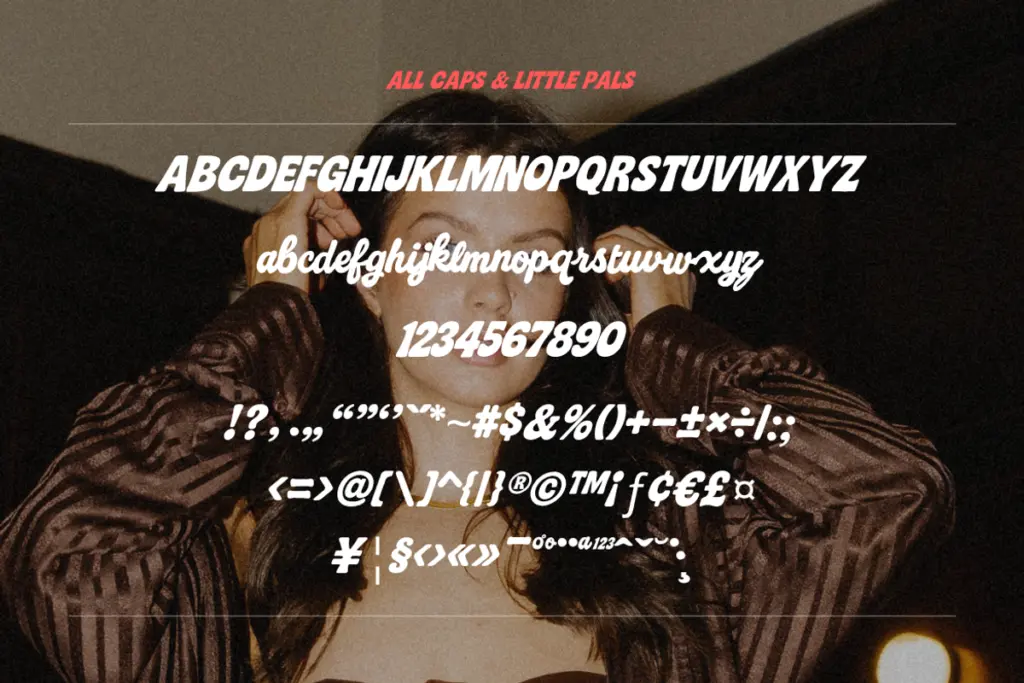
This is a branding and packaging font first. The chunky sans is suited to logotypes, product names, and headline treatments where you want something loud but rounded rather than aggressive — think snack packaging, lifestyle brands, retro-leaning fashion labels. Paired with the script for a tagline or a secondary line, it gives a two-tier hierarchy without needing a second typeface family.
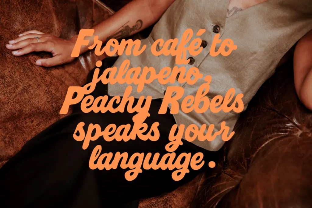
Social media graphics and stickers are an obvious fit too: short bursts of text, high contrast, low reading demands. It’s less suited to anything that needs sustained body copy or a formal, editorial tone — the personality is too loud for long-form reading, and the letter case restrictions make paragraph-length text awkward to typeset cleanly.
For wedding stationery or anything asking for elegance, this isn’t the right register — it’s playful and a little sassy, not refined. But for quirky branding, packaging with attitude, or headline work that wants some retro bounce, Peachy Rebels does a specific, limited job well.
What we liked, and what we didn’t
Strengths
- The chunky rounded sans has real retro character without tipping into novelty.
- Ligatures and alternates in the script cut down on repetitive letter patterns.
- The contrast between bold sans and casual script gives instant hierarchy without a second family.
Trade-offs
- No weight variation or italic option means limited flexibility beyond the two included styles.
- Uppercase-only sans and lowercase-only script make full-sentence setting clunky without careful pairing.
Peachy Rebels does one job well: loud, bubbly retro branding with a lighter script for contrast. It's not built for body text or formal use, and the capitals-only/lowercase-only split limits flexibility, but for packaging, stickers and social graphics with attitude it delivers exactly what it promises.
Verdict

Tantype reviews typefaces in depth — every font is tested in real branding, editorial and screen layouts before a word gets written. 555+ fonts reviewed and counting.