
Mr Christo: a calligraphic script built for branding and invitations
Design style
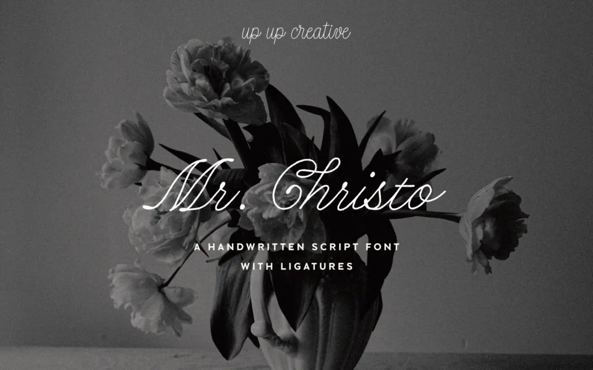
Mr Christo sits in the well-populated field of calligraphic scripts: a brush-pen construction with visible pressure changes, looping ascenders and a slight forward lean. What sets it apart from the flood of similar releases is restraint in the joins. Rather than letting every letter swing into an exaggerated tail, the baseline stays fairly disciplined, so words read as words before they read as flourish. The contrast between thick downstrokes and thin hairlines is pronounced but not brittle — nothing feels like it’s about to snap under a bold weight treatment.
There’s a warmth to the letterforms that reads as handmade rather than templated. You can see where a nib might have caught or a stroke tapered unevenly, and that texture is part of the appeal. It’s not a clinical, vector-perfect script; it has a bit of grain to it, which suits the kind of projects that want a personal, written feel rather than a polished corporate flourish.
Character set and features
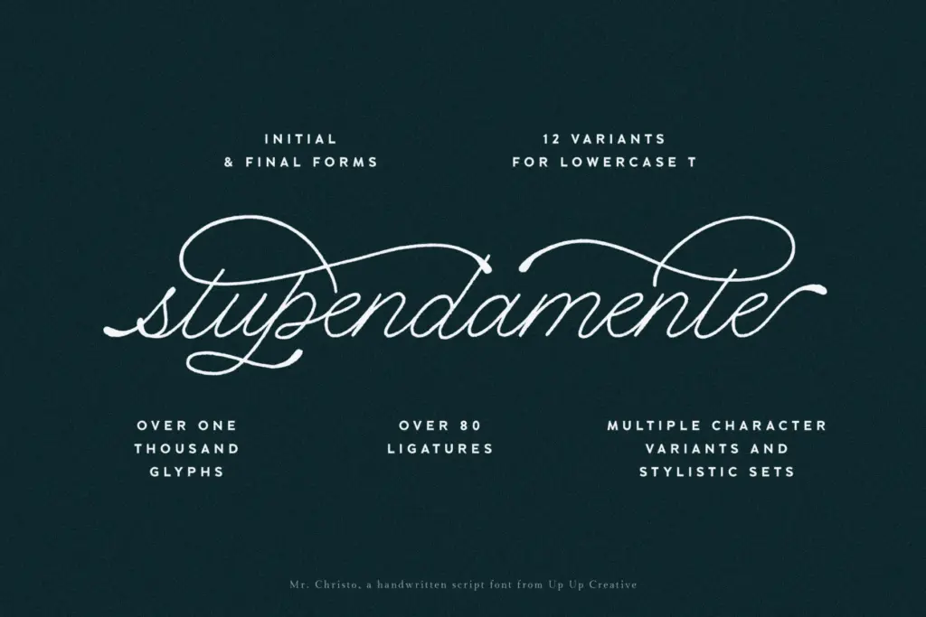
The glyph count here is substantial, with over a thousand characters including nearly a hundred ligatures. That’s not a marketing number for its own sake — in a connecting script, ligatures are the difference between awkward letter collisions and a line that reads as continuous handwriting. Common problem pairs (double letters, ascender-into-descender combinations) get dedicated forms, which spares you a lot of manual kerning.
OpenType support extends to stylistic sets and contextual alternates, along with initial and final forms that let the first and last letter of a word behave differently from the ones in the middle — a small but meaningful touch that keeps word-openings from looking clipped. Broad language coverage is claimed, which matters if your client list isn’t exclusively English-speaking; scripts with this many alternates tend to hold up reasonably well across diacritics, though you should always proof any language beyond your primary market before shipping.
None of this is usable without effort, though. A script this rich in alternates needs an OpenType-aware layout tool — Illustrator, InDesign, or similar — to unlock the ligatures and contextual forms. Drop it into a basic web builder or a program with no OpenType panel and you’ll get a much flatter, less interesting result than the specimen images promise.
Use cases
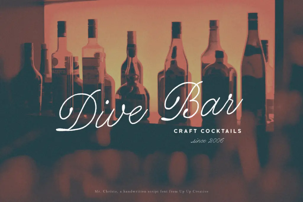
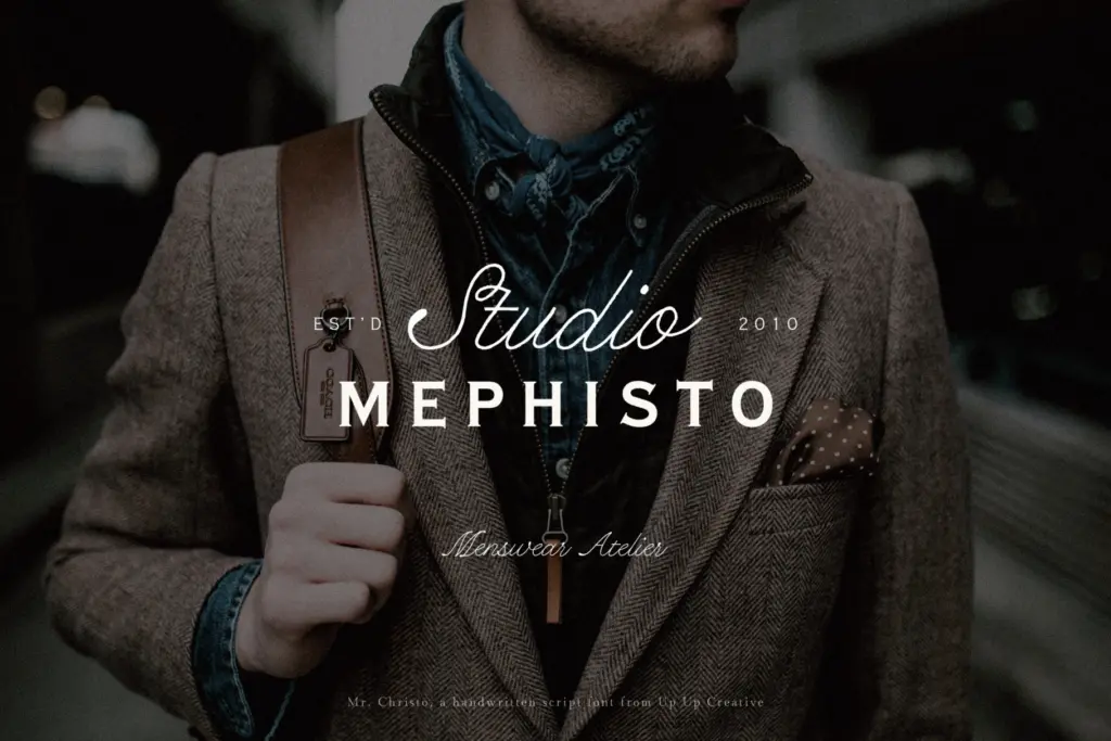
This is a display font, not a body-text one, and it should be treated that way. At headline sizes — wedding invitation names, packaging logotypes, editorial pull quotes — the flourish and contrast read clearly and add genuine character. Push it down to paragraph sizes and the loops start to compete with each other, hurting legibility.
It pairs naturally with a plain, well-behaved sans or serif for supporting text; the script should be doing the talking in the composition, not sharing the stage with another decorative face. Wedding stationery, boutique branding, editorial mastheads and short-form marketing copy are all sensible homes for it. Anywhere that needs sustained reading — books, long-form web copy — is the wrong job for this typeface.
What we liked, and what we didn’t
Strengths
- Ligatures and contextual alternates handle awkward letter pairs without manual fixing
- Contrast and looping strokes stay controlled rather than tipping into illegibility
- Initial and final forms give word openings and endings a more natural, handwritten finish
Trade-offs
- Legibility drops off quickly below headline sizes, limiting it to display use
- Full feature set only shows up in software with proper OpenType support
Mr Christo is a well-drawn calligraphic script with genuine restraint in its joins and a large, thoughtfully built OpenType feature set. It rewards use in headline and invitation-scale settings but loses clarity fast at smaller sizes, and it needs an OpenType-capable layout tool to look its best.
Verdict

Tantype reviews typefaces in depth — every font is tested in real branding, editorial and screen layouts before a word gets written. 555+ fonts reviewed and counting.