
The Nifty Kitten Script: a wonky handwritten script for playful branding
Design style
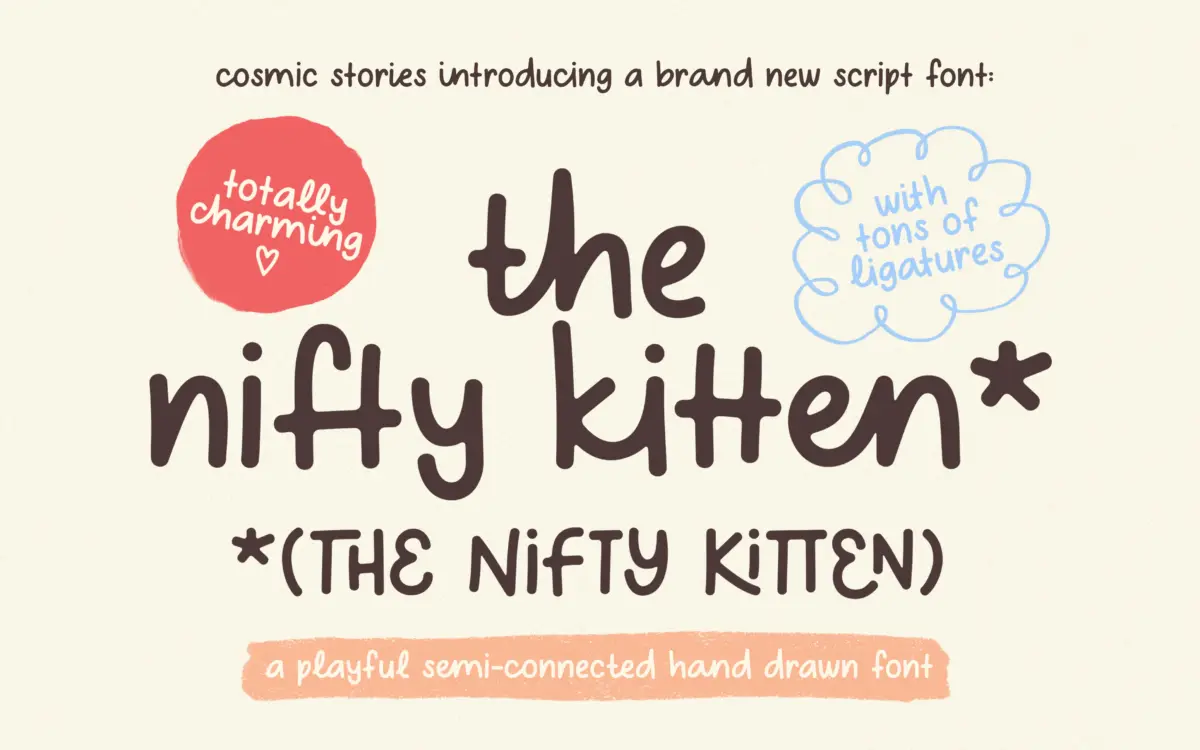
The Nifty Kitten Script leans into the deliberately rough, handmade end of the script spectrum. Strokes wobble slightly off their baseline, joins are uneven, and the overall rhythm reads more like a felt-tip note than a formal calligraphic hand. This is not a script built on smooth contrast or confident swash work — it is built on charm, and it knows it. The letterforms are heavy and rounded, with thick, blunt strokes that give the face a childlike, almost doodled quality rather than the fluid elegance of a copperplate-style script.
That looseness is the point. Where a lot of handwritten scripts try to disguise their construction and pass as spontaneous, this one is upfront about being drawn, imperfect, and a little clumsy on purpose. It won’t suit anyone chasing polish, but for projects that want to feel handmade and unfussy, the wonkiness does real work.
Character set and features
The font ships with more than 120 ligatures and alternate characters, and the seller notes that each letter has at least two drawn versions. This is the feature that matters most in practice: OpenType-aware software can swap in alternates automatically when identical letters sit next to each other, which keeps repeated letters — double o’s, double l’s — from looking mechanically stamped. It’s a smart bit of engineering for a script this rough, since repetition is exactly what would expose the artifice otherwise.
Multilingual support covering Western, Central, and Eastern European character sets is included, which extends the font’s reach beyond English-language projects without needing a separate glyph set. Users comfortable digging into OpenType panels in apps like Illustrator or InDesign will get the most out of the alternates; those working purely in Canva or similar drag-and-drop tools may only see the default glyphs unless the alternates are pre-baked into stylistic sets.
Use cases
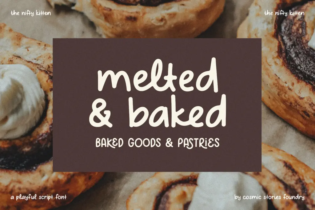
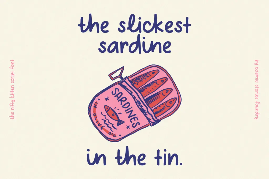
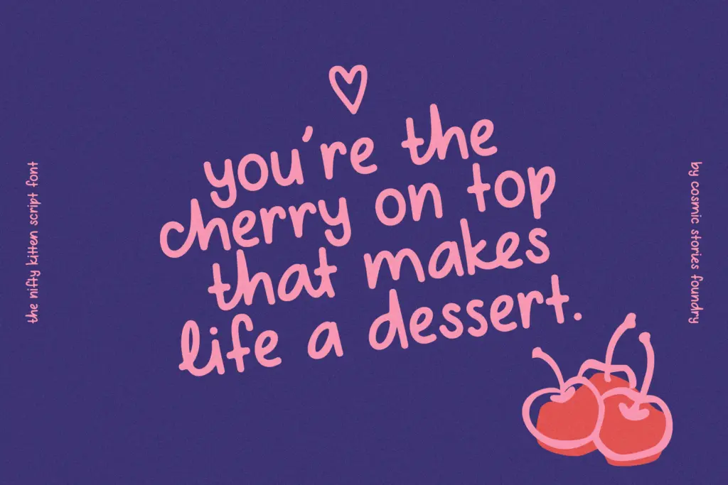
This is a display script, not a text face, and it should be treated that way. At small sizes the uneven baseline and thick strokes start to compete with each other, and legibility drops off quickly below headline or short-phrase use. It belongs in short bursts: a logotype for a bakery or kids’ brand, a hand-lettered quote card, packaging copy for a playful product line, a birthday invite or greeting card where the tone is meant to be casual and fun rather than refined.
It’s less suited to anything asking for restraint — corporate branding, editorial body text, or luxury packaging will all fight against its deliberately messy character. But for brands built around warmth, novelty, or a handmade feel, particularly food, children’s products, or casual event stationery, it does the job it was drawn to do.
What we liked, and what we didn’t
Strengths
- Automatic letter-swapping alternates keep repeated characters from looking mechanical
- Multilingual glyph support extends use beyond English-only projects
- Genuinely distinct handmade character rather than a generic script template
Trade-offs
- Uneven baseline and thick strokes hurt legibility at small sizes or in longer text
- The deliberately wonky style limits it to casual, playful branding rather than broader use
The Nifty Kitten Script commits fully to a rough, handmade charm and backs it up with a genuinely useful alternates system that keeps repeated letters from looking robotic. It's a specialist display font for playful, casual branding, not a general-purpose script, and it loses legibility fast at small sizes.
Verdict

Tantype reviews typefaces in depth — every font is tested in real branding, editorial and screen layouts before a word gets written. 555+ fonts reviewed and counting.