
Editor’s Note: a 16-weight editorial serif for clean, minimal branding
Design style
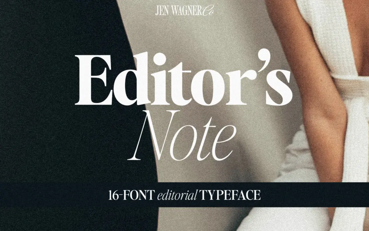
Editor’s Note sits squarely in the clean-editorial serif category that’s been dominating branding mockups for a few years now: tight curves, sharp terminals, low contrast between thick and thin strokes, and a general refusal to look ornamental. There’s nothing baroque here. The bracketing is minimal, the serifs are short and slightly flared rather than bracketed, and the overall impression is of a serif that’s been sanded down to its essentials without tipping into a slab.
The family spans sixteen weights from hairline through bold, each with an italic. That’s a lot of range for what is, at its core, a fairly narrow stylistic idea. The hairline weights are where the design earns its keep — the strokes thin out to something closer to a monoline script than a traditional serif, and that’s the register where the typeface feels distinctive rather than generic. The heavier weights are competent but less interesting; at bold, the letterforms start to lose the delicacy that’s the whole point of the design, and it reads as a slightly stiffer sans-adjacent serif rather than anything special.
Character set and features
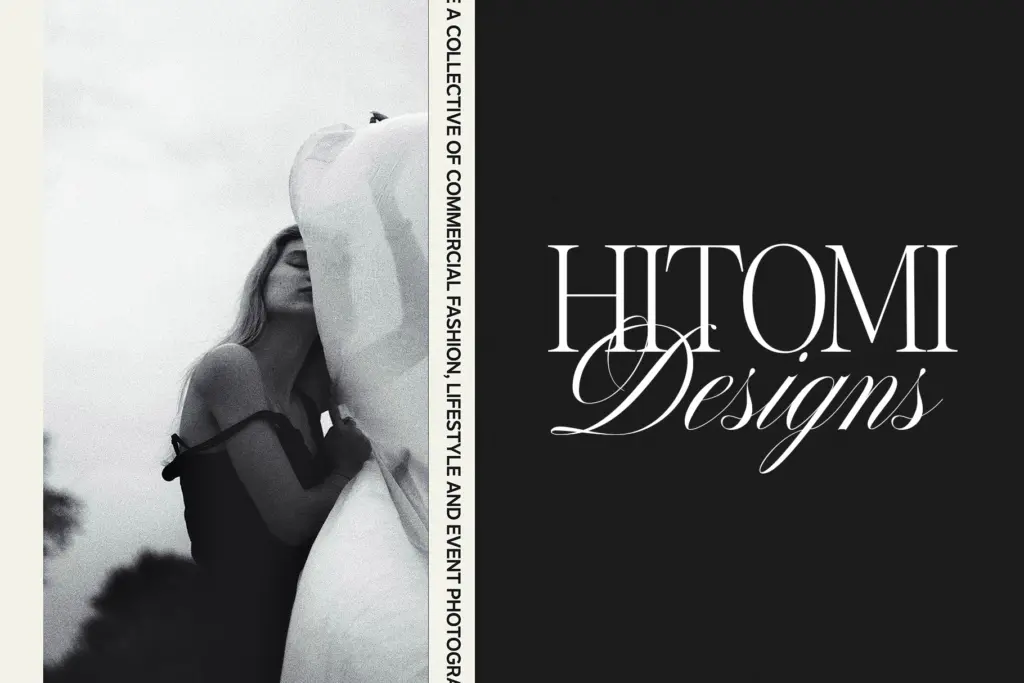
Uppercase and lowercase are both drawn with the same restraint — no swash capitals, no decorative flourishes, just clean forms with alternates for a handful of letters that give some flexibility in headline setting. The italic is genuinely worth using on its own terms rather than as an afterthought; it has a touch more calligraphic flow than the upright, which makes the regular-plus-italic pairing the designer recommends for big pull-quotes actually work in practice.
Spacing is generous by default — built for body-adjacent reading rather than tight display work. That’s a reasonable default, but it means the typeface needs active tightening for the all-caps, tracked-in look that’s so common in the branding mockups this kind of font is sold on. Expect to dial in negative tracking yourself; it won’t arrive looking like the Instagram-ready examples out of the box.
Sixteen weights is a genuine asset for anyone building a full brand system rather than a one-off headline, since it means hierarchy can be built entirely within the family instead of reaching for a second typeface. But with that many steps, some of the middle weights feel a little redundant next to their neighbours — the jump from one to the next isn’t always perceptible at small sizes.
Use cases
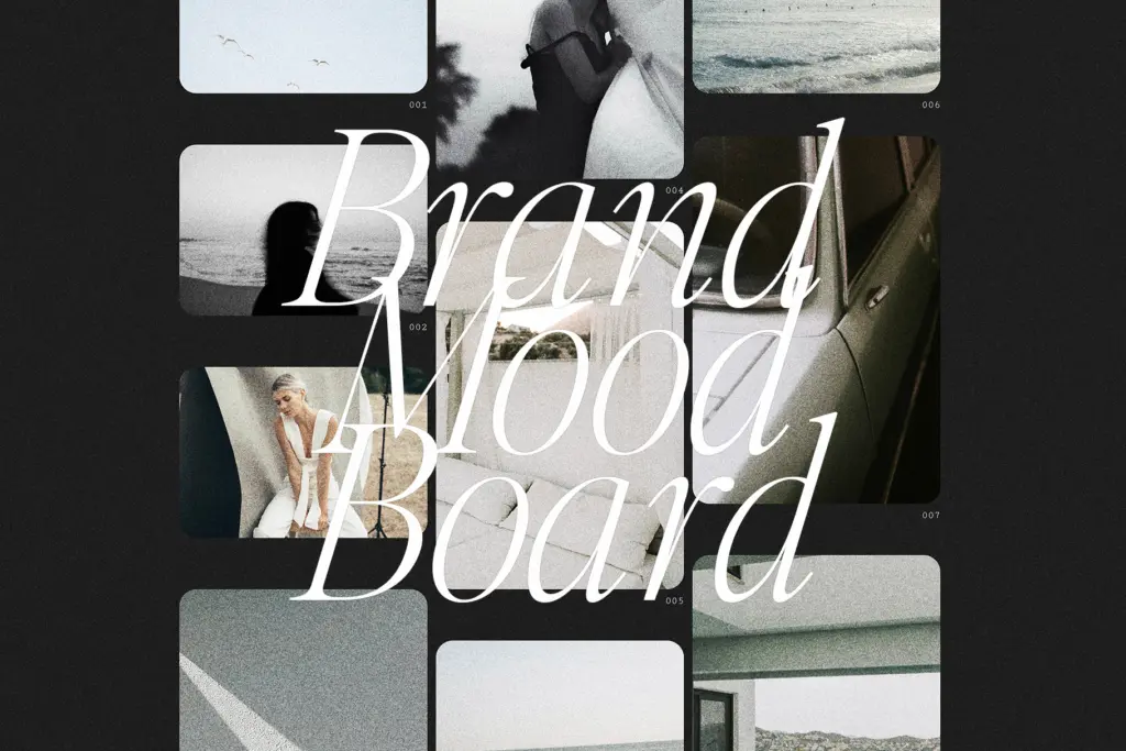
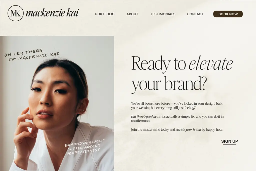
This is a display-first typeface. It’s built for big headers, pull quotes, logotypes, and packaging where the type itself is doing branding work rather than carrying paragraphs of copy. At those sizes the crispness and the tight curves read clearly and feel current without being trendy in a way that will date badly overnight.
It’s less suited to body copy or anything set small — the low contrast and light default weights that make it feel airy at 80pt start to lose definition at 10pt, especially in the hairline to light range. For branding, social graphics, editorial headers, and quote cards, though, it does exactly the job it was drawn for.
What we liked, and what we didn’t
Strengths
- Sixteen weights plus italics give real hierarchy without reaching for a second typeface
- The italic has enough calligraphic lift to pair naturally with the upright in quote settings
- Hairline and light weights have a distinctive, delicate character not found in the heavier cuts
Trade-offs
- Default spacing is loose, so the popular tight all-caps look requires manual tracking adjustments
- Low contrast and light weights lose definition at small sizes, limiting it to display use
Editor's Note delivers exactly what its name promises: a tidy, unfussy editorial serif that's genuinely useful across sixteen weights for branding and headline work. It needs manual tracking adjustments to hit the tight, trendy look it's marketed with, and it isn't built for small-size reading. Best treated as a display and branding tool rather than a general-purpose text face.
Verdict

Tantype reviews typefaces in depth — every font is tested in real branding, editorial and screen layouts before a word gets written. 555+ fonts reviewed and counting.