
TAN – Waverly: A Refined Serif with Ligature-Driven Character
Design style
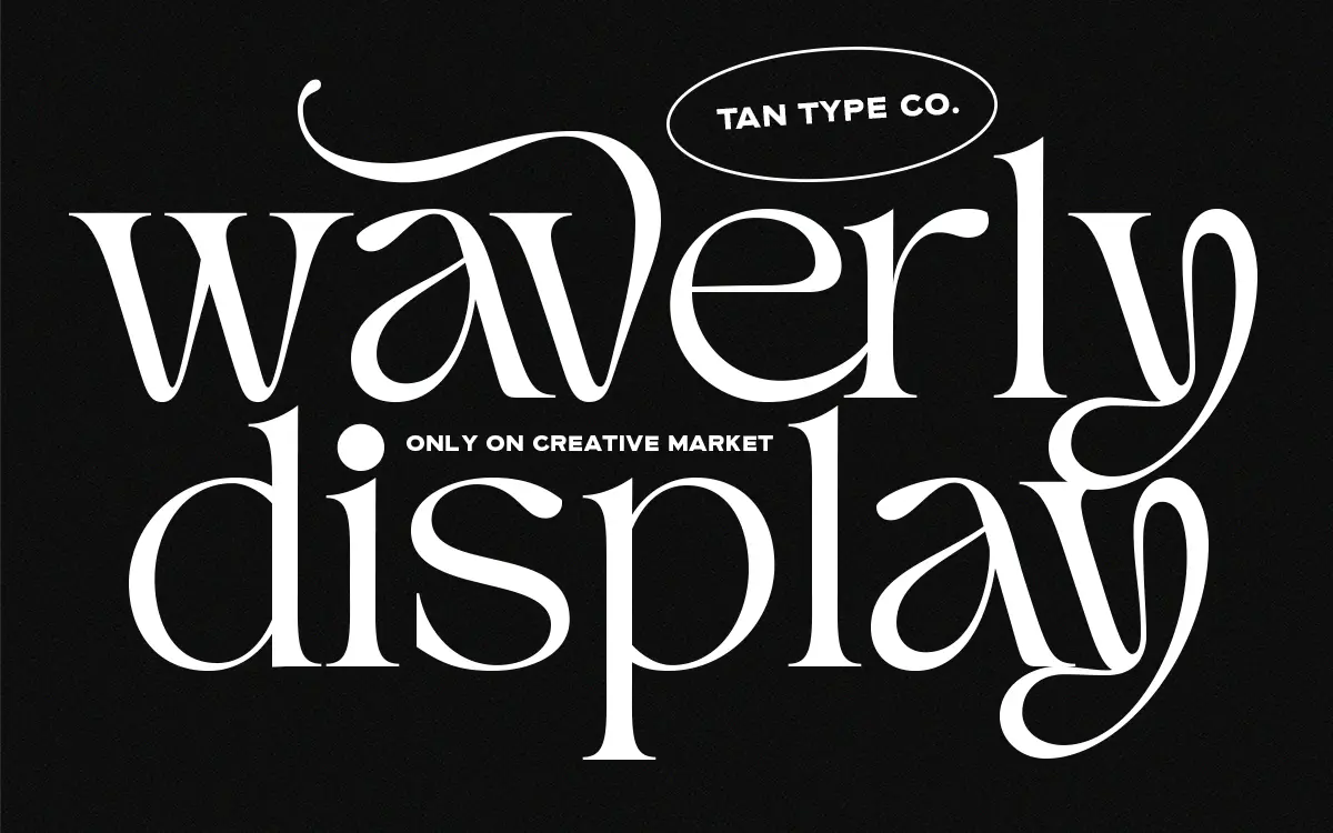
TAN – Waverly sits in that familiar TanType lane of dressed-up, editorial-leaning serifs, but it earns its place with a few genuine quirks rather than just a tall x-height and thin hairlines. The contrast is moderate to high, with bracketed serifs that taper rather than snap, giving the letters a slight softness even where the strokes go thin. It reads as a serif that wants to be noticed in a headline but doesn’t need to shout to do it.
What separates it from a generic ‘classy serif’ is the treatment of terminals and joins. Several lowercase letters carry small flourishes or asymmetric curves that break the otherwise formal rhythm — enough to feel handled, not enough to tip into script territory. The capitals are more restrained, closer to a conventional transitional serif, which keeps the face usable as a workhorse rather than a novelty.
Character set and features
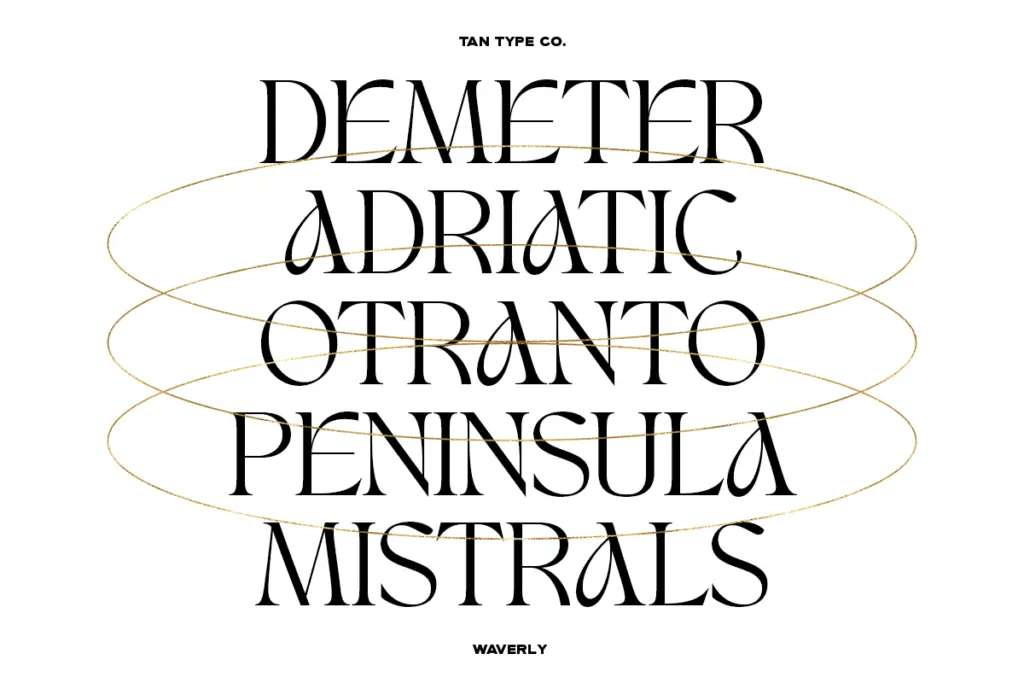
The ligature set is the actual reason to buy this over a plainer alternative. Common pairs are covered, but there are also more decorative, multi-letter combinations that clearly exist to be used deliberately in a wordmark or a title line rather than dropped into body copy. Alongside these, alternate glyphs give you a second or third option for several lowercase letters, so a single word can be reset a few times before you land on a version that balances well.
This is worth flagging honestly: none of that richness comes through unless you’re working in software that reads OpenType features properly. In a program like Canva, the special characters and ligatures the font is built around simply won’t appear, and you’re left with the base letterforms only — still decent, but not what you’re paying attention to the font for. Anyone buying this for a Canva-only workflow should adjust expectations accordingly.
Multilingual support is included, which matters if branding work needs to extend past English-language markets, though the seller doesn’t specify exact language coverage so it’s worth checking your specific diacritic needs before committing to a layout.
Use cases
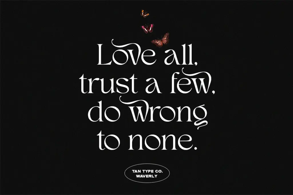
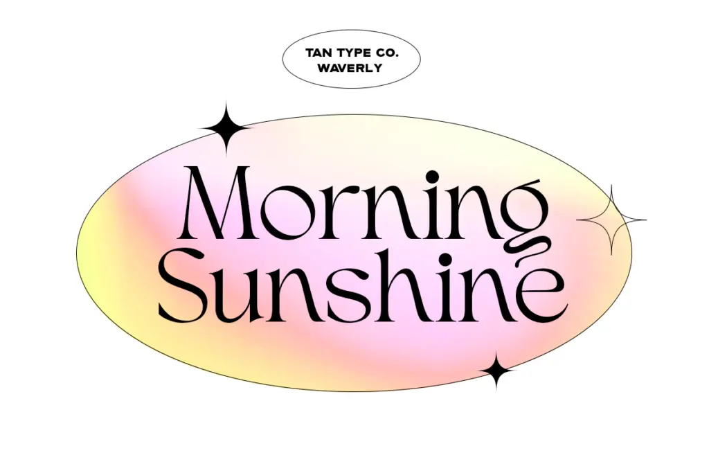
Waverly is built for display use — headlines, logotypes, packaging fronts, invitation lettering, the kind of setting where a handful of words get real attention and the ligatures and alternates can be chosen by eye. It has an obvious home in fashion and lifestyle branding, where the moderate contrast and decorative joins suggest a boutique or editorial tone without going full calligraphic.
It is not a body text face, and nothing about the brief or the letterforms suggests it was drawn to be one. Contrast that would look elegant at 60pt starts to flicker at paragraph sizes, and the alternates that make a headline interesting would just add noise in a paragraph. Keep it to titles, short lines, and set pieces, and let a plainer serif or sans carry the reading text around it.
What we liked, and what we didn’t
Strengths
- Ligature and alternate glyph set gives real variation for headline and logo work
- Terminal treatment adds character without tipping into script territory
- Multilingual support broadens its use for branding beyond English markets
Trade-offs
- OpenType features, the font's main selling point, don't render in Canva
- Moderate-to-high contrast makes it unsuitable for body text or small sizes
TAN – Waverly is a well-drawn display serif with genuine character in its ligatures and alternates, best reserved for headlines, logos, and short decorative lines. It loses much of its appeal in software that doesn't support OpenType features, and it was never meant for body copy. Buy it for what it does well and don't stretch it further.
Verdict

Tantype reviews typefaces in depth — every font is tested in real branding, editorial and screen layouts before a word gets written. 555+ fonts reviewed and counting.