
TAN – Tangkiwood: a fat 70s serif for loud, playful branding
Design style
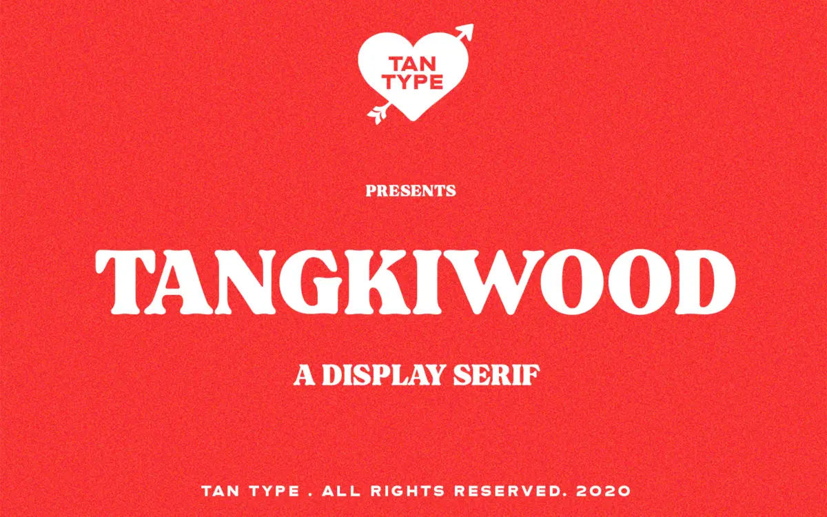
Tangkiwood is a heavyweight display serif built around the thick, rounded slab shapes that signal 1970s print design rather than anything resembling a book face. The strokes carry almost no contrast, the serifs are stubby and blunt, and the overall colour on the page is dense and dark. Curves bulge slightly outward before tapering into terminals, giving letters a slightly inflated, rubbery quality that reads as deliberate rather than accidental.
There’s a groovy, hand-tooled feel to the lowercase in particular, with counters kept open enough that the letters don’t clog up even at this weight. It’s a single-weight font, so there’s no light or regular companion to fall back on — what you see is the whole personality, turned up to one volume.
Character set and features
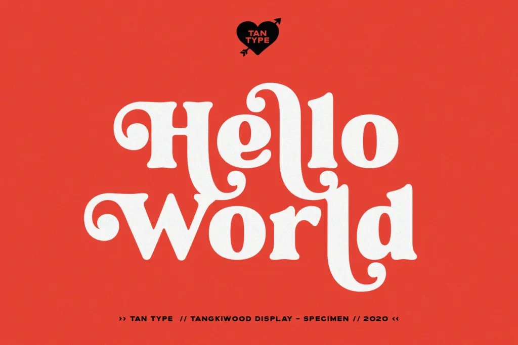
Alternate characters are available for both uppercase and lowercase, which is the detail that keeps Tangkiwood from feeling one-note. Swapping in alternates changes the tenor of a word noticeably — a few swashy or looser-jointed variants break up the geometric regularity of the default set and push it further into retro poster territory. Accessing these requires an app that supports OpenType stylistic features, so anyone setting type in a stripped-down tool or a website builder without OpenType support will be stuck with the base glyphs only, which is worth checking before committing to a layout that depends on the alternates.
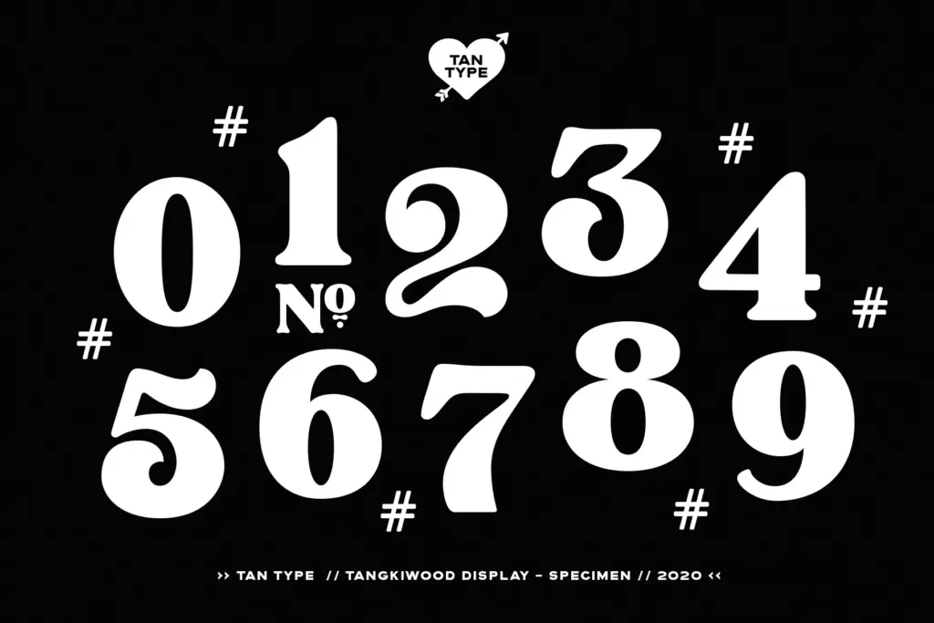
The seller notes multilingual support, though the brief doesn’t specify which language sets are covered, so anyone working outside basic Latin should confirm coverage before locking in copy. The font ships as TTF, OTF and WOFF, covering desktop and web use without extra conversion.
Use cases
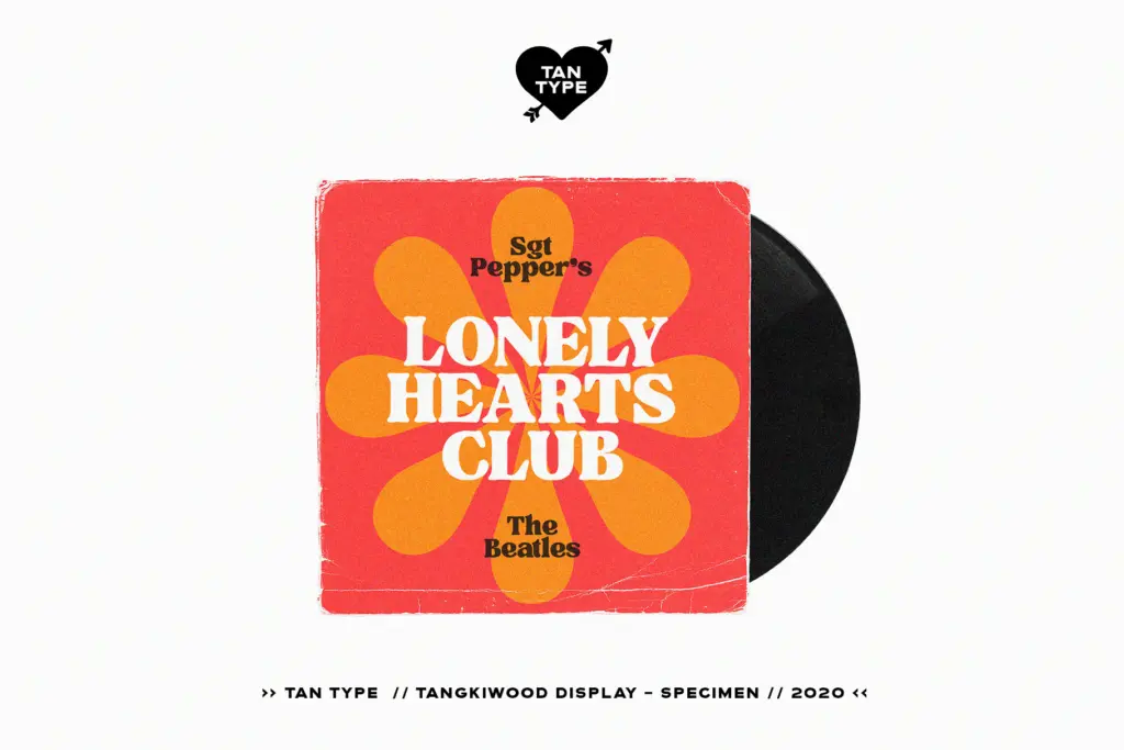
This is a logo and packaging typeface first. The weight and warmth suit food and drink branding that wants a handmade, nostalgic edge — think small-batch condiments, record labels, barber shops, anything trying to borrow the optimism of 70s commercial art without going full psychedelia. It also does well as a short headline on posters or album-style covers, where a handful of large characters can carry the alternates and show off the font’s personality.
It is not built for body copy or anything requiring sustained reading — the weight and lack of contrast would tire the eye fast at small sizes, and there’s no lighter weight to pair it with for that job. For editorial or wedding work it would need a quieter companion for running text, since Tangkiwood itself should stay in a supporting role as the loud, attention-grabbing element rather than the whole system. Used sparingly — a logotype, a product name, a single poster line — it earns its keep; stretched across a paragraph it would just look heavy and tiring.
What we liked, and what we didn’t
Strengths
- Alternate letters genuinely shift the mood rather than just adding decoration
- Heavy slab serif shapes give it strong shelf presence for packaging and logos
- Open counters keep the dense weight from clogging up at display sizes
Trade-offs
- Single weight with no lighter companion limits layout flexibility
- Alternates are locked behind OpenType support, useless in basic design tools
Tangkiwood is a confident, chunky retro serif that does one job — loud, nostalgic display type — very well. It needs OpenType support to unlock its best feature and isn't suited to anything beyond short-form headline work, but within that narrow lane it has real character.
Verdict

Tantype reviews typefaces in depth — every font is tested in real branding, editorial and screen layouts before a word gets written. 555+ fonts reviewed and counting.