
TAN – MEMORIES: A Tight-Kerned Classic Serif for Quiet Editorial Moments
Design style
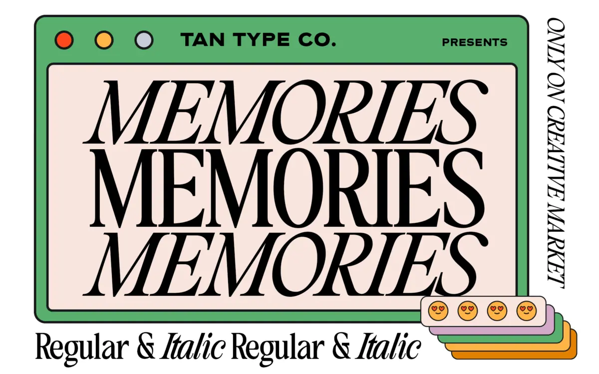
TAN – MEMORIES sits in the well-worn tradition of classic text serifs, but it doesn’t try to reinvent that tradition. The letterforms are restrained: moderate contrast between thick and thin strokes, small bracketed serifs, and a general lack of flourish. What sets it apart in the crowd of similar releases is its kerning, which has been drawn noticeably tighter than most display or editorial serifs on the market. Letters sit close together, almost touching in places, which gives set text a dense, inked-block feel rather than the airy spacing common to contemporary serif revivals.
This tightness is clearly a design decision rather than an oversight. It gives the face a mood of intimacy and quiet formality — the kind of thing you’d want on a page that isn’t trying to shout. There’s nothing showy in the letter construction itself: no exaggerated ball terminals, no swash capitals, no eccentric counters. It reads as a supporting typeface, built to sit underneath something louder, which the seller’s own framing (as a companion to their display fonts) confirms.
Character set and features
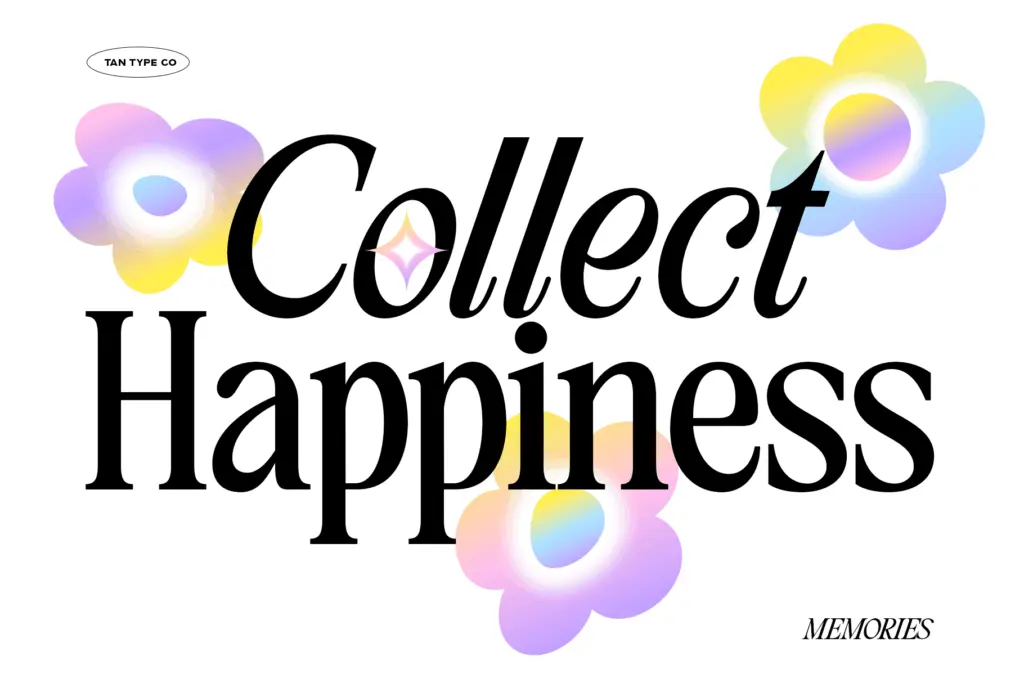
The character set covers standard Latin punctuation and diacritics needed for multilingual setting, so it will hold up across a handful of European languages without falling apart on accented letters. There’s no mention of alternates, ligatures, or a separate italic in the brief, and nothing in the drawing suggests a hidden stylistic set waiting to be unlocked — this is a single-weight, single-style workhorse rather than a font family with variants to explore.
The tight kerning is the feature worth dwelling on again here, because it changes how the font behaves at different sizes. In short lines — a pull quote, a headline, a logotype — the compression reads as intentional and gives words a compact, almost stamped quality. In longer paragraphs it demands more attention: without manual tracking adjustments, dense body copy can start to feel cramped, particularly at smaller point sizes where the serifs have less room to breathe. Designers used to loosening tracking by default will want to test this one at their actual working size rather than trusting default settings.
Use cases
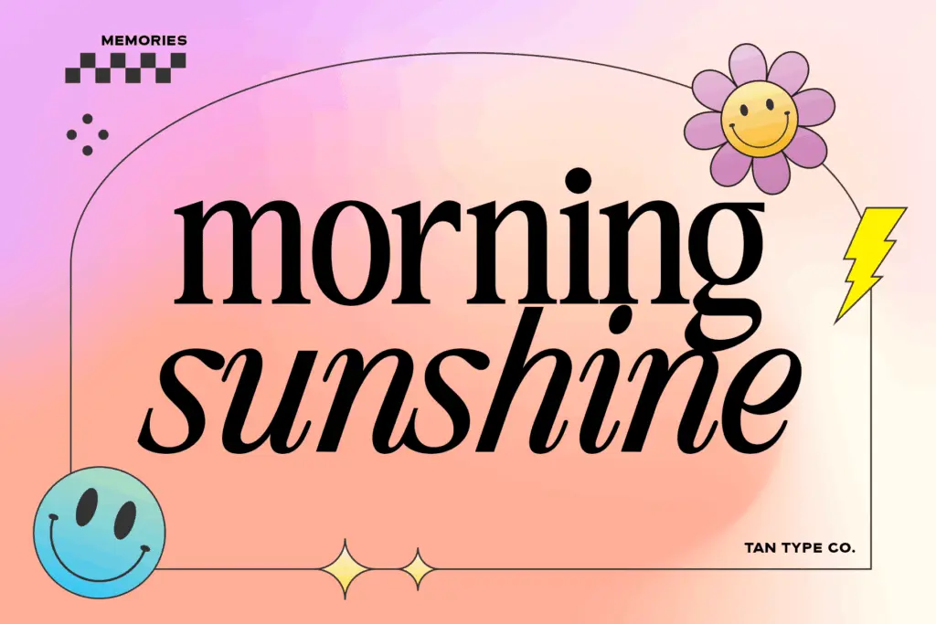
This is a font for quiet moments in a layout rather than the main event. It suits editorial spreads where you want a secondary serif for captions, bylines, or supporting quotes beneath a bolder display headline — which is exactly how the seller pitches it. Its classic bones and lack of ornamentation also make it a reasonable choice for packaging text, product copy, or short branding lockups where you want a sense of established, unfussy craft rather than novelty.
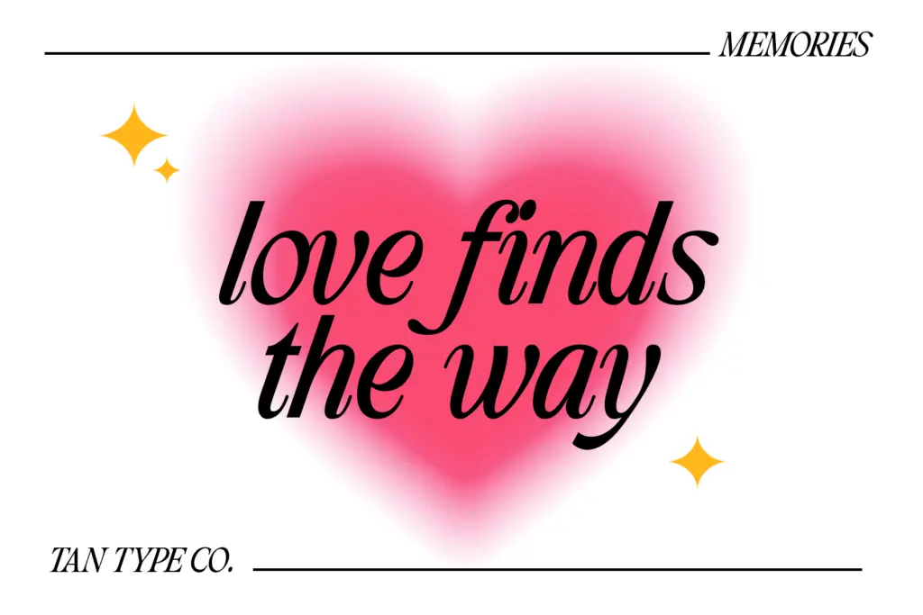
It’s less suited to long-form reading — a novel’s interior, a lengthy article — unless you’re prepared to open up the tracking yourself, since the built-in tightness works against comfortable extended reading. Wedding stationery and invitation work could use it for a secondary line of text, though it’s not the ornamental script or display piece that carries the emotional weight in that kind of layout. Think of TAN – MEMORIES as the quiet second voice in a design, not the one doing the talking.
What we liked, and what we didn’t
Strengths
- Distinctive tight kerning gives short-line settings a compact, stamped character.
- Restrained, well-proportioned serif construction that avoids trendy flourishes.
- Multilingual character support makes it usable across several European languages.
Trade-offs
- Default tightness works against comfortable long-form body text without manual adjustment.
- Single weight and no apparent alternates or italic limit its range within a layout.
TAN – MEMORIES is a competent, understated classic serif whose defining trait — tight kerning — is both its personality and its limitation. It works well as a supporting typeface in editorial and branding contexts but needs manual tracking adjustments for longer text.
Verdict

Tantype reviews typefaces in depth — every font is tested in real branding, editorial and screen layouts before a word gets written. 555+ fonts reviewed and counting.