
TAN – Jambore: a bold retro serif for headlines that want to talk loud
Design style
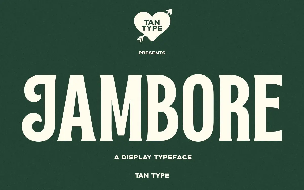
Jambore sits in that familiar territory of bold display serifs built for attention rather than reading. The strokes are thick, the contrast is moderate rather than extreme, and the serifs are slab-leaning without committing fully to slab proportions. There’s a nostalgic cut to the curves, the kind that nods at mid-century signage and packaging rather than any one specific decade. It reads as confident and a little blunt, which is exactly the point of a display face like this.
The letterforms don’t try to be clever. There’s no exaggerated swash or novelty cut-in to distract from the basic shapes. Instead the personality comes from proportion: wide counters, squared-off curves on the bowls, and a general heaviness that makes every word feel stamped rather than written. It won’t surprise you, but it’s drawn with enough care that the weight doesn’t collapse into mush at smaller sizes, which is where a lot of bold retro serifs fall apart.

Character set and features
As a display serif, Jambore covers the expected territory: uppercase, lowercase, numerals, and standard punctuation, with multilingual support extending its reach beyond a single-language brief. There’s nothing here in the way of elaborate alternates or stylistic sets — this is a single-weight workhorse, not a family with a dozen variants to tune. That simplicity is honest about what the font is for. You’re not buying flexibility within the face itself; you’re buying one strong voice and building a layout around it.
The spacing is generous enough that tight headline setting doesn’t immediately start colliding letterforms, though at very large display sizes you’ll want to keep an eye on pairs like round-against-straight combinations, which is typical of any bold serif with this much ink. Numerals sit comfortably with the lowercase, useful for anything with dates or pricing worked into a layout.
Use cases
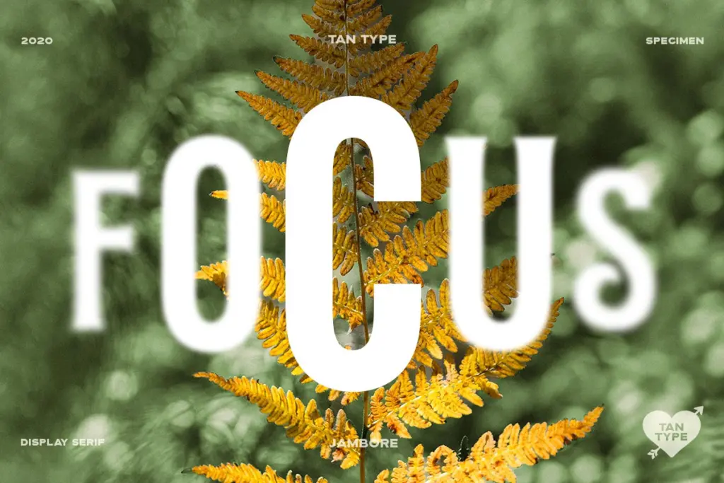
This is a headline font first. It wants big sizes: a cover line, a logotype, a poster title, a product name stamped across packaging. At body text sizes it loses all its reason for existing — the weight that gives it character becomes a liability once you’re asking it to carry paragraphs. Keep it to a handful of words per use and it holds up well.
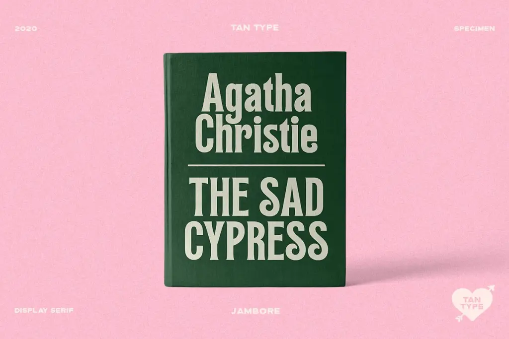
Book covers and editorial headers are a sensible fit given the retro lean, as is packaging work that wants a bit of nostalgic warmth without going fully vintage-kitsch. Branding projects — logotypes, wordmarks, badge-style lockups — will get good mileage out of it too, provided the brand wants to read as warm and a little retro rather than sleek and contemporary. It’s less suited to anything that needs restraint or quiet confidence; Jambore doesn’t really do quiet.
What we liked, and what we didn’t
Strengths
- Thick, confident strokes that read well at large display sizes
- Retro character without leaning into novelty gimmicks
- Generous spacing keeps bold headline setting from clotting
Trade-offs
- Single weight with no stylistic alternates limits design flexibility
- Falls apart quickly if pushed down to body text sizes
Jambore is a solid, unfussy bold retro serif that does one job — big, warm headline type — reliably well. It doesn't try to be a full family or a body-text option, so don't ask it to be one. For logotypes, covers, and packaging that want a bit of mid-century warmth, it's a dependable pick.
Verdict

Tantype reviews typefaces in depth — every font is tested in real branding, editorial and screen layouts before a word gets written. 555+ fonts reviewed and counting.