
Taldose: a four-style script duo for vintage-leaning branding work
Design style
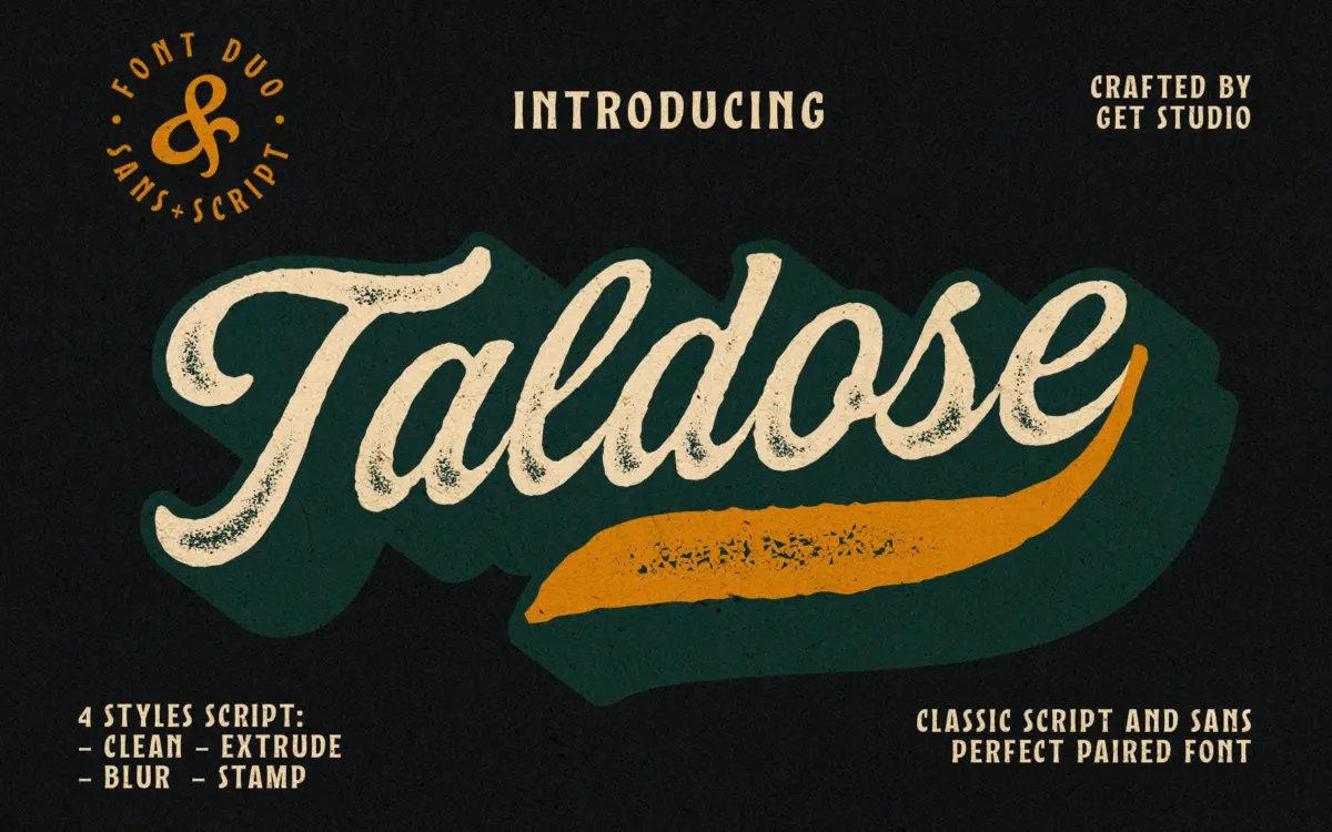
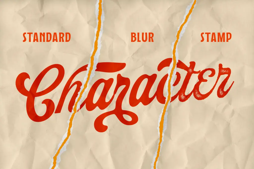
Taldose is a connected script built around a fairly casual brush skeleton, then issued as four separate style files rather than a single weight range. Clean is the baseline: a smooth, unbroken script with moderate slant and a rhythm that leans toward everyday handwriting rather than formal calligraphy. The other three take that same skeleton and rough it up. Blur softens the edges into something closer to a worn stamp or a faded print. Stamp introduces a distressed, ink-on-paper texture with broken strokes and uneven coverage. Extrude adds a dimensional, layered shadow to the letters, giving them a stacked, three-dimensional presence that reads more like a logotype treatment than body script.
The idea of shipping four finishes of one script is reasonable, but it also means the font is doing one job in four costumes rather than four genuinely different jobs. If you don’t need the texture, Clean is a fine but unremarkable script; if you do need texture, Blur and Stamp are the ones worth opening. Extrude is the outlier and the most useful for standalone headline work, since it doesn’t depend on a busy background to read as intentional.
Character set and features
The connecting joins are handled reasonably well in Clean, with letters flowing into each other without obvious patching, though some combinations show the seams once you look closely. The textured variants inherit whatever irregularities were baked into the roughening process, which means kerning and spacing feel less predictable — worth checking word-by-word rather than trusting the default settings. Brookvale, the bundled sans, is plain and unfussy: even stroke weight, open counters, no stylistic quirks to speak of. It’s there to sit underneath the script and stay out of the way, and it does that competently without offering much personality of its own.
None of the four Taldose styles carry much in the way of alternates or ligature sets beyond what’s needed to keep the joins looking natural. This is a font built for a look, not for typographic depth — there isn’t much to explore once you’ve picked a style and size.
Use cases
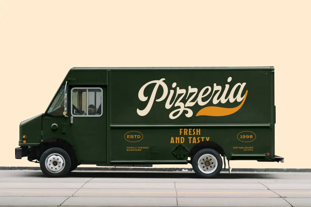
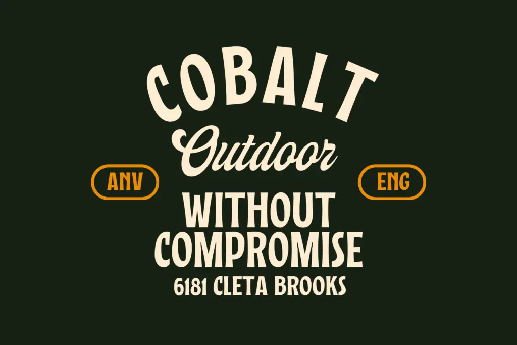
Clean suits short lines of script text where a handwritten feel is wanted without added grit — signatures, subheads, invitation flourishes. Blur and Stamp are aimed squarely at vintage and rustic branding: labels, packaging, badge logos, anything trying to suggest age or craft. Extrude works best as a standalone wordmark or headline where the dimensional effect can be seen clearly, ideally at larger sizes since the layered shadow gets muddy when scaled down too far. Brookvale is the safe pairing partner for body copy, captions, or secondary lines wherever the script needs a quiet sans to lean on. None of the four script variants are built for long-form text — they’re display tools, and the textured ones in particular lose legibility fast below headline size.
What we liked, and what we didn’t
Strengths
- Extrude gives a genuinely different, dimensional look suited to standalone logotypes
- Stamp and Blur deliver convincing worn-label texture without extra editing
- Brookvale is a clean, unobtrusive sans that pairs sensibly for secondary text
Trade-offs
- The four styles share one skeleton, so variety comes from texture rather than real design range
- Textured variants lose legibility quickly at small sizes and need careful spacing checks
Taldose is a workable vintage-script package built on one skeleton dressed four ways, with Extrude and Stamp being the most distinct and useful. Clean is unremarkable on its own, and the textured variants trade legibility for atmosphere, so this is a font for label and badge work rather than general-purpose typesetting.
Verdict

Tantype reviews typefaces in depth — every font is tested in real branding, editorial and screen layouts before a word gets written. 555+ fonts reviewed and counting.