
Handwritten Resort Vintage Font Pack: a loose, sun-bleached hand for beach branding
Design style
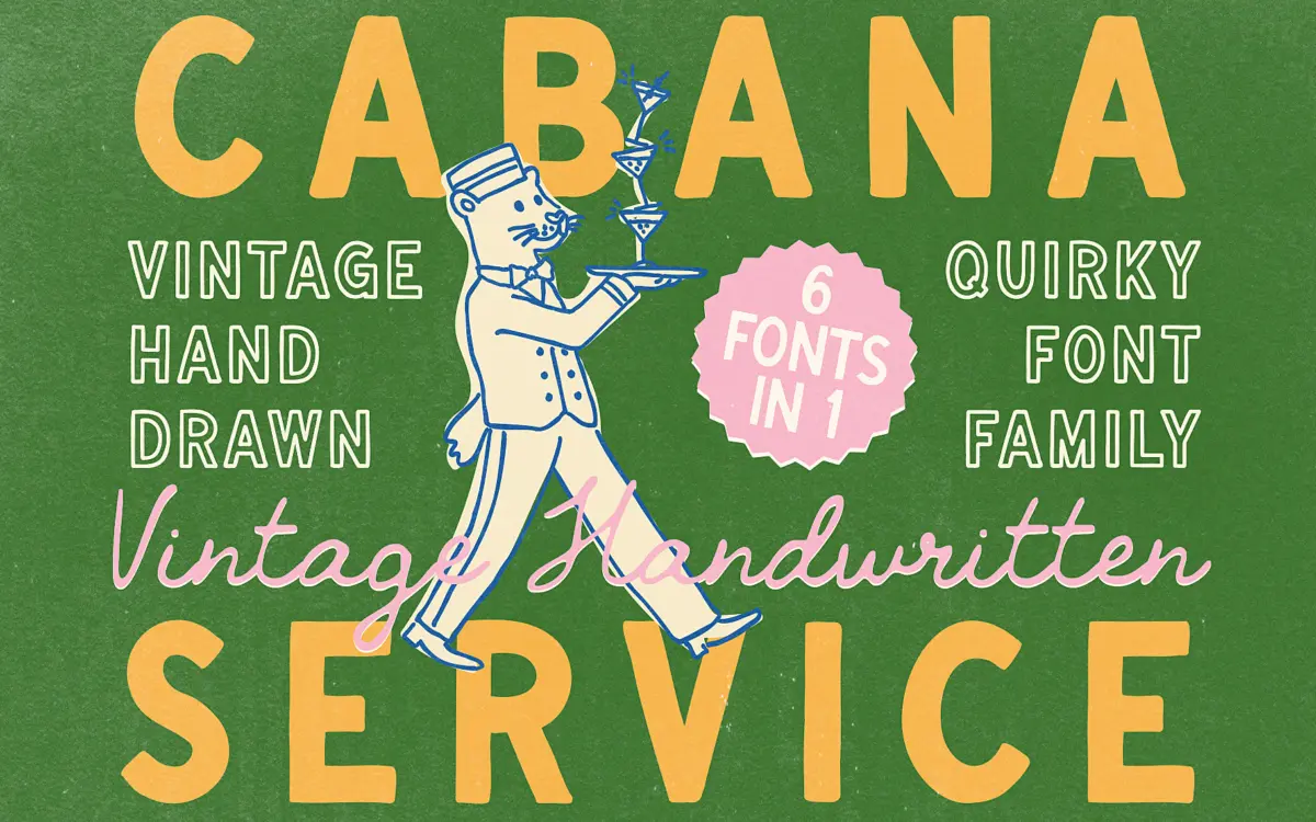
This is a hand-drawn sans with the deliberate wobble of someone lettering a menu board rather than setting type. Strokes vary in weight within the same letter, baselines drift slightly, and terminals are left blunt rather than tapered. The effect reads as casual and unfussy — closer to a hand-painted sign at a beach hotel than to a font trying to imitate calligraphy. There’s a mild vintage undertone here too, the kind you get from slightly irregular counters and letters that don’t quite sit on a grid, but it’s restrained. Nothing about it leans hard into retro signage clichés or heavy distress texture. It’s more suggestion than costume.
The pack builds out from a Regular and Bold into Outline versions of both, plus a Script and a Script Slanted style. That’s a reasonable spread for a single hand-drawn concept — you get a workhorse weight, a heavier one for emphasis, line versions for layering over texture or colour, and a connected script for a softer companion voice. The scripts lean more traditionally ‘handwriting’ than the sans styles, with joined strokes and more flourish in the terminals, so the family covers two distinct registers of informality rather than six variations on one idea.
Character set and features
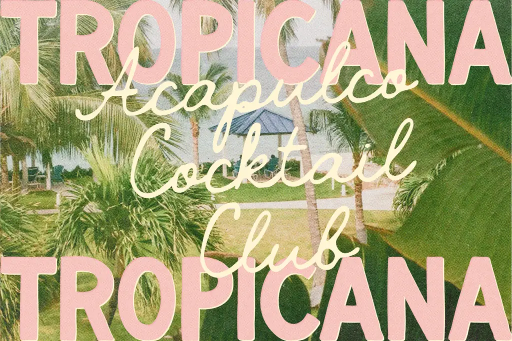
As a hand-drawn display face, the letterforms carry personality at the expense of total consistency — some of the imperfection is baked into individual glyphs rather than generated through contextual alternates, so repeated letters in a word will look identical rather than naturally varied. That’s worth knowing if you’re setting longer phrases and want the hand-lettered illusion to hold; shorter words and single lines will sell it better than paragraphs will. The outline weights are useful for adding depth without introducing another typeface into a layout — stack an outline word behind a solid one and you get a cheap, effective shadow effect that suits the beach-poster mood.
Because this is a display and lettering font rather than a text face, don’t expect it to behave at small sizes or in dense body copy. The irregular baseline and varying stroke weight that make it charming in a headline will start to look messy once you’re setting more than a line or two.
Use cases
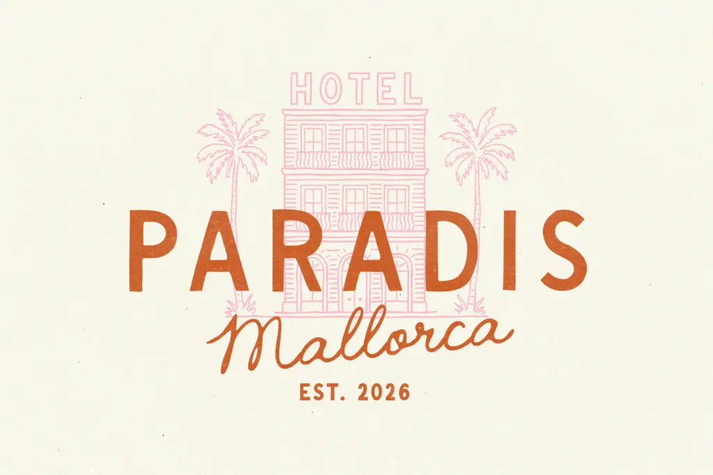
This suits branding work with a specific mood: beach clubs, boutique hotels, cabana-and-cocktail menus, summer pop-ups, travel journals, postcard-style graphics. The bold weight works for logotypes and packaging labels where you want something hand-touched but still legible from a few feet away. The script pairs naturally with the sans for a two-tier hierarchy — sans for a header, script for a tagline or signature line underneath. It’s also well suited to the kind of social content the seller’s tags gesture at — thumbnail text, quote graphics, Instagram captions — where a short burst of warm, informal lettering does the job in a single glance.
It’s not a font for anything that needs to feel neutral or corporate, and it won’t carry long-form text. Treat it as a mood-setting display choice for a narrow but well-defined lane: sun, salt air, and a hint of nostalgia, applied in short doses.
What we liked, and what we didn’t
Strengths
- Six coordinated styles including outline and script give real layering options for one concept
- The imperfection feels restrained rather than over-styled, so it avoids looking like a costume font
- Outline weights are genuinely useful for shadow and depth effects in poster and packaging layouts
Trade-offs
- Repeated letters look identical rather than naturally varied, so the hand-lettered illusion weakens in longer text
- Only suited to display use — baseline drift and stroke variation make it unreadable at body-copy sizes
A well-judged mood font for coastal and resort branding, with enough weights and outline options to build a small identity around. It won't do body copy or serious work outside its lane, and the hand-drawn imperfection is static rather than varied, but for short-burst summery lettering it does exactly what it promises.
Verdict

Tantype reviews typefaces in depth — every font is tested in real branding, editorial and screen layouts before a word gets written. 555+ fonts reviewed and counting.