
Strange Muse: a rough-inked script for branding that wants some grit
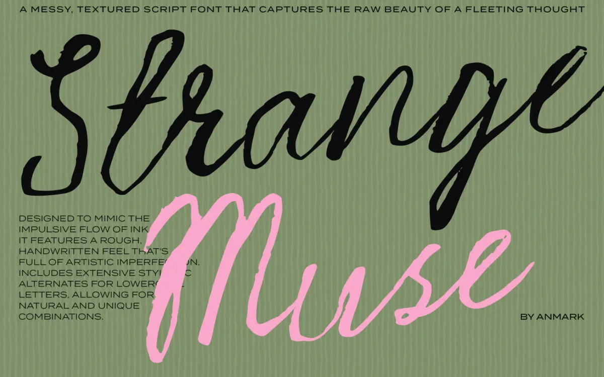
Design style
Strange Muse reads as fast handwriting slowed down just enough to make out. The strokes are inky rather than smooth, with edges that break up and pool the way a dry-ish brush or worn felt tip behaves on textured paper. Letters lean and wobble slightly from one to the next, so the baseline never sits perfectly flat. That’s the point: this isn’t a script chasing calligraphic polish, it’s chasing the look of someone writing quickly and not caring about neatness.
The contrast between thick and thin strokes is uneven on purpose, which gives individual words a sense of pressure and speed. Ascenders and descenders swing out with some drama, and a handful of letters carry extended flourishes that push well past the x-height. It’s a font with a mood rather than a rigid structure, and that mood is closer to a scrawled note than a wedding invitation script, even though it gets marketed toward both.
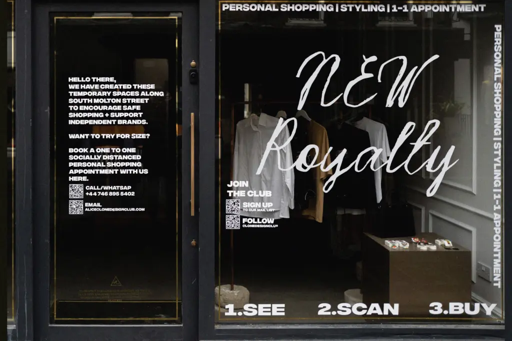
Character set and features
Lowercase stylistic alternates are the main functional feature here, letting you swap repeated letters within a word so it doesn’t look like it was stamped from a single mould. That’s a genuinely useful inclusion for a script this irregular — without alternates, the messiness would start to look mechanical the moment the same letter repeats twice in a headline. Swapping alternates in and out does mean this isn’t a typeface you can trust to set correctly straight out of the box; expect to sit with the OpenType panel or glyph palette for a few minutes on anything longer than a word or two.
Because the roughness lives in the letterforms themselves rather than in a separate texture layer, kerning takes some manual attention at larger sizes — a few pairs sit either too tight or too loose given how wide the flourishes swing. This is normal for scripts built this expressively, but it’s worth budgeting the time rather than expecting a drop-in set.
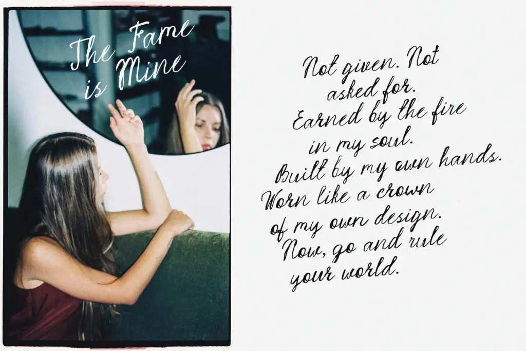
Use cases
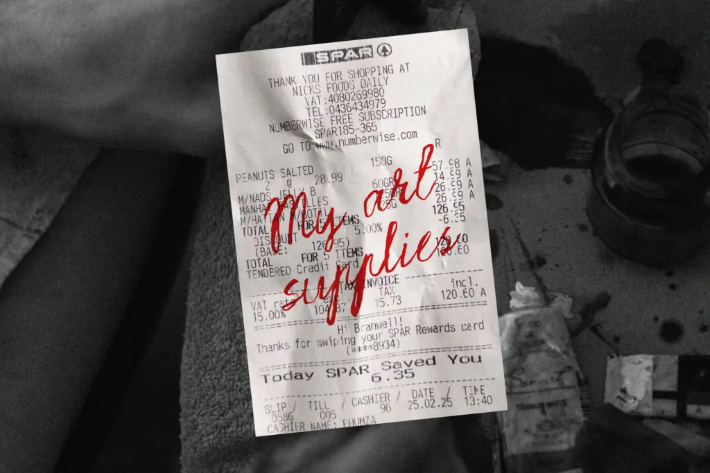
Strange Muse earns its keep in short bursts: a logotype, a monogram, a single line on a poster, a quote card, a product label. At that scale the ink breaks and uneven weight read as intentional character rather than noise. Push it into a paragraph of body text and it falls apart — the irregularity that makes a headline feel alive makes running text exhausting to read.
It suits fashion and beauty branding, editorial pull-quotes, and social graphics where a little visual friction is welcome. It’s a rougher fit for traditional wedding stationery than the seller’s tag list suggests — the mess reads more edgy than romantic, so it’ll work better for couples wanting something unconventional than for a formal invitation suite. Pair it sparingly with a plain sans or serif for supporting text; asking it to do all the typographic work on a layout is asking too much of any script this loose.
What we liked, and what we didn’t
Strengths
- Genuinely inky, uneven strokes that avoid looking like a generic 'handwriting' template
- Stylistic alternates let repeated letters vary within a word
- Strong presence at logo and headline scale where a little roughness reads as intentional
Trade-offs
- Legibility drops fast in longer lines or smaller sizes
- Kerning needs manual adjustment given how wide some flourishes swing
Strange Muse delivers real handwritten grit rather than a polished script pretending to be casual. It works well in short, punchy applications but needs manual attention to alternates and kerning, and it isn't suited to anything requiring sustained reading.
Verdict

Tantype reviews typefaces in depth — every font is tested in real branding, editorial and screen layouts before a word gets written. 555+ fonts reviewed and counting.