
Speed Brush: a gritty sign-painter script for posters and packaging
Design style
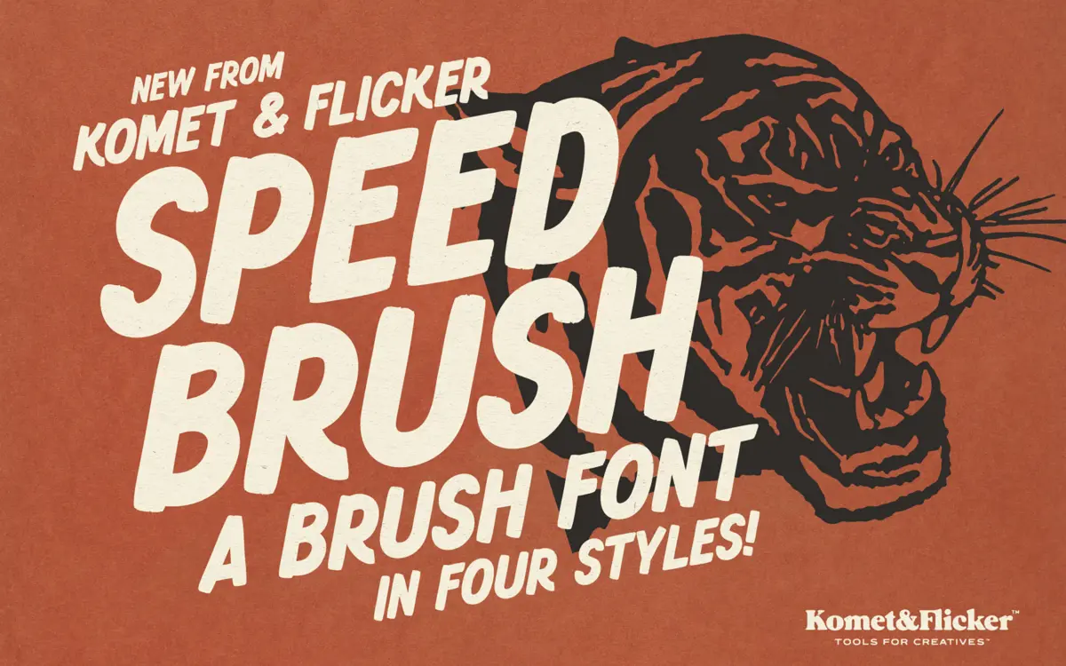
Speed Brush works from the same well as old hand-lettered shop signage and speed-shop lettering: a bold single-weight brush stroke with uneven pressure, blunt terminals and a lean toward the italic that suggests forward motion rather than careful penmanship. The uppercase-only letterforms lean on wide brush marks with visible bristle breaks at the rough end of the spectrum, and cleaner, more controlled edges in the solid styles. It reads as confident and a little loud, which is the point — this isn’t a font trying to look considered.
The four style variants — regular and italic, each in solid and rough versions — are really the same skeleton with different surface treatment. That’s a sensible way to build a brush font, because it means you can swap textures without changing the rhythm of your setting. The rough versions have enough grain to suggest paint dragged over a rough surface, but the grain is consistent letter to letter rather than randomised, so it holds together as a typeface rather than reading as a pile of separate scans.
Character set and features
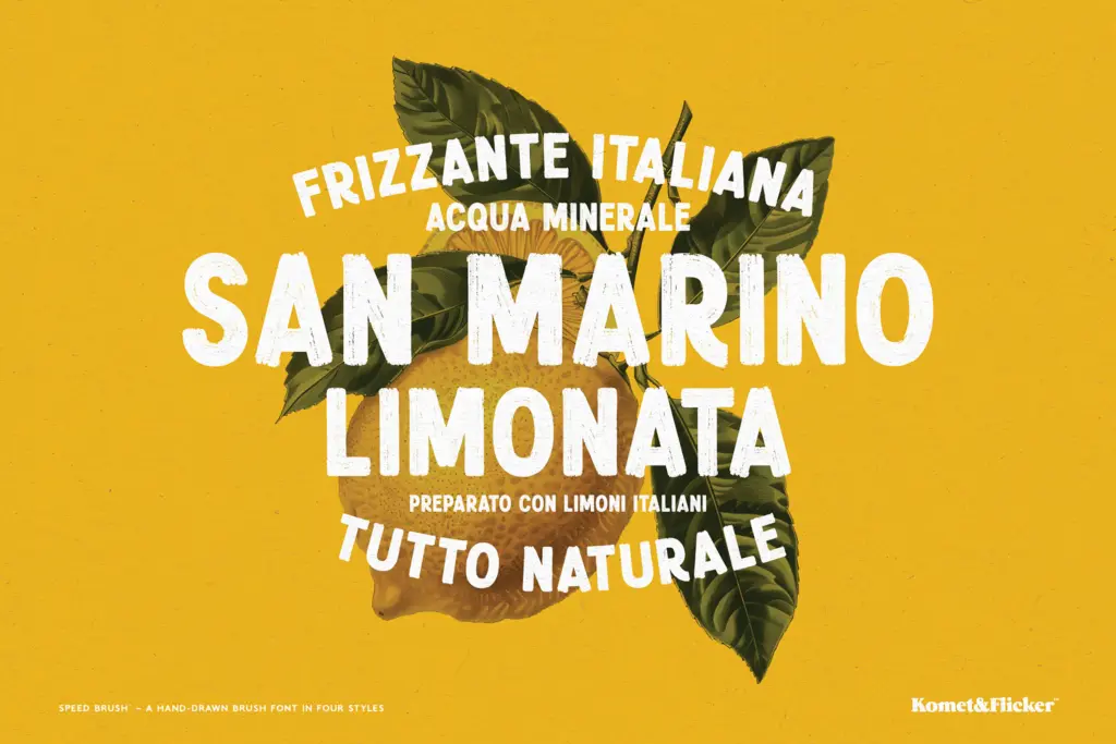
This is a capitals-only script — there’s no lowercase to speak of, which matters for how you use it. The set covers A–Z, a run of European accented characters, numbers, punctuation and a handful of symbols, plus pre-made fraction glyphs, which is a nice touch for pricing or measurement work but a minor one. The genuinely useful addition is the set of twelve pre-built connector words — AND, THE, WITH and similar — drawn as single ligature-style units rather than assembled from individual letters. Brush scripts usually fall apart on short filler words because the letters don’t join convincingly at that scale; baking in the common ones sidesteps the problem entirely, provided your copy actually needs one of the twelve on offer. Anything outside that list still has to be hand-kerned or accepted as loose lettering, which is worth knowing before you commit a layout to it.
Use cases
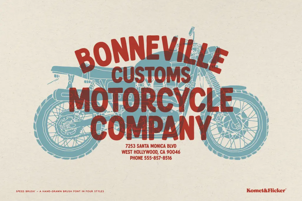
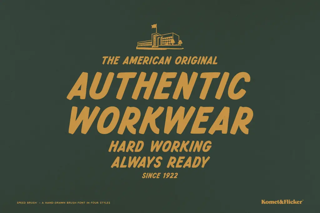
Speed Brush is built for short, punchy lines: headlines, badges, posters, apparel, packaging, anything where a word or two needs to carry attitude rather than convey a paragraph. It has an obvious home in motorsport, garage, and workwear branding, and in retro-leaning poster and label design more generally — the brief’s own reference points, hand-painted signage and vintage speed culture, are honestly reflected in the drawing. Because it’s uppercase-only and fairly heavy, it’s a poor choice for body text or anything requiring sustained reading; keep it to a handful of words per line and let the weight do the work. Mixing the solid and rough styles within one composition — solid for a clean word, rough for an accent word — is where the four-style structure earns its keep, giving you texture contrast without needing a second typeface. For anything requiring true multilingual body copy or long-form setting, look elsewhere; this one is a display specialist and should be treated as such.
What we liked, and what we didn’t
Strengths
- Four coordinated styles (solid/rough, upright/italic) let you mix texture without switching typefaces
- Twelve pre-built connector words solve the usual brush-script problem of short filler words falling apart
- Consistent grain in the rough styles keeps the texture readable rather than chaotic
Trade-offs
- Uppercase-only character set with no lowercase limits it strictly to short display settings
- Any connector word outside the built-in twelve still requires manual kerning or hand-fitting
Speed Brush does one job — loud, hand-painted energy for short display lines — and does it with real texture and a smart connector-word workaround. It's not built for body copy or lowercase-dependent layouts, and outside its twelve preset connectors you're back to manual kerning, but for garage, retro and packaging headlines it delivers exactly what it promises.
Verdict

Tantype reviews typefaces in depth — every font is tested in real branding, editorial and screen layouts before a word gets written. 555+ fonts reviewed and counting.