
Ocean Delight: a flowing calligraphy script for premium branding
Design style
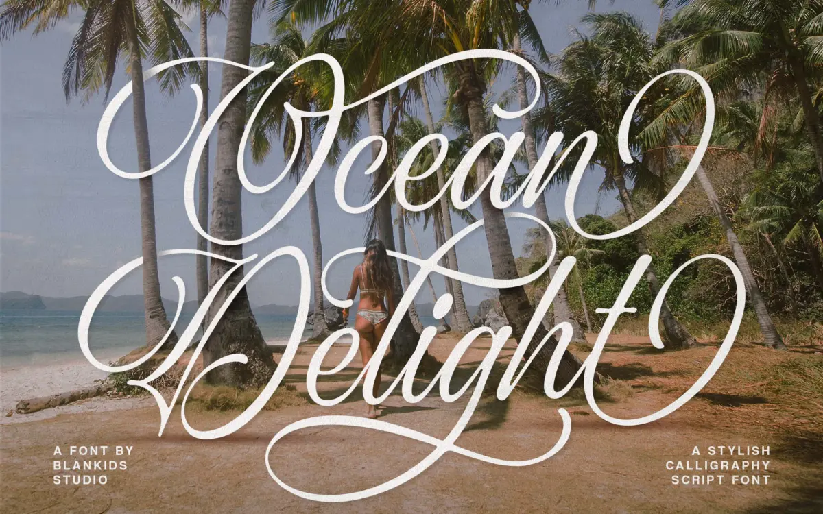
Ocean Delight sits in the well-populated field of connected calligraphy scripts, the kind built around a brush-pen or pointed-nib model where strokes swing wide before tapering to a fine point. The contrast between thick downstrokes and thin hairlines is pronounced, giving the letters a sense of hand pressure rather than a mechanical stroke of uniform weight. Ascenders and descenders loop generously, and several lowercase letters carry long entry strokes that lean into the letter before them, which is what makes the connections read as continuous handwriting rather than stitched-together glyphs.
What separates it from a plain script is the amount of decorative apparatus layered on top: swash capitals designed to stand alone at the start of a word, and alternate lowercase forms that swap in for variety across repeated letters. The overall mood is soft and romantic rather than aggressive or brush-scratchy — closer to a wedding invitation than a streetwear logo. It won’t surprise anyone who has looked at scripts in this genre before, but the drawing is even and the curves are confident, without the wobble or uneven taper that gives away a rushed script build.
Character set and features
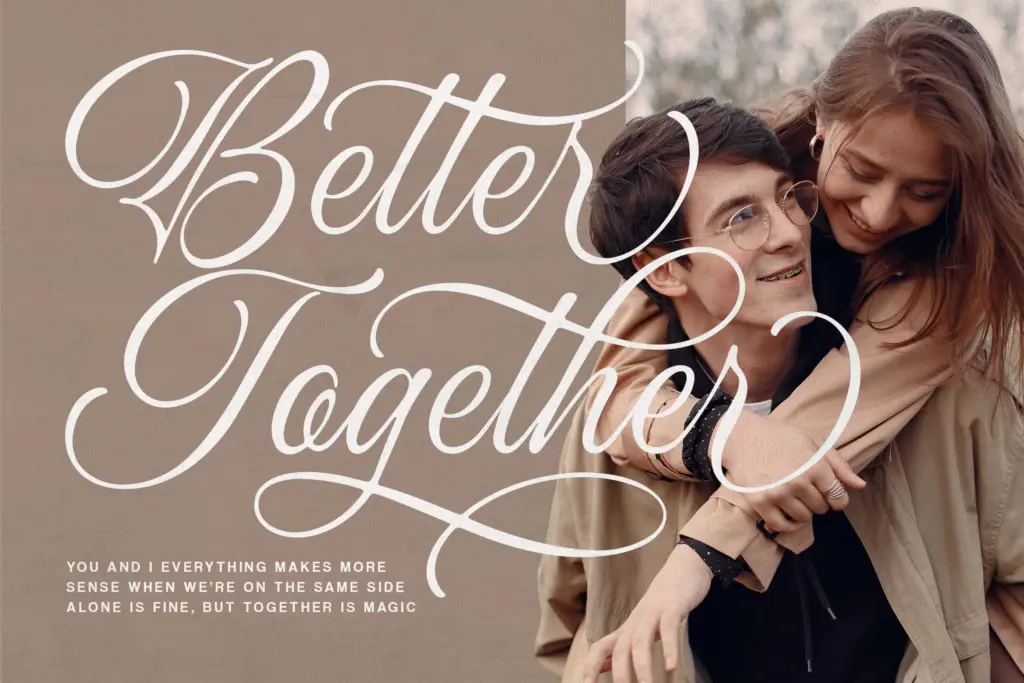
The core offer is upper and lowercase letters, figures and standard punctuation, supported by the swash capitals and alternate characters mentioned above. Ligatures are built in to handle the trickier letter pairs — the combinations that would otherwise collide or leave an awkward gap — so double letters and certain consonant clusters knit together properly instead of looking bolted on. This matters more in scripts than in most other categories: a connected face with poor ligature coverage falls apart the moment you type a real sentence instead of a single showcase word.
Because the design leans on swash and alternate glyphs for its personality, getting the best out of it means working in an application that exposes OpenType features, so you can swap in the decorative capitals and alternates by hand rather than relying on whatever the software picks by default. Used flat, without touching any of that, it still reads as a competent script — just a plainer one than the marketing images suggest.
Use cases
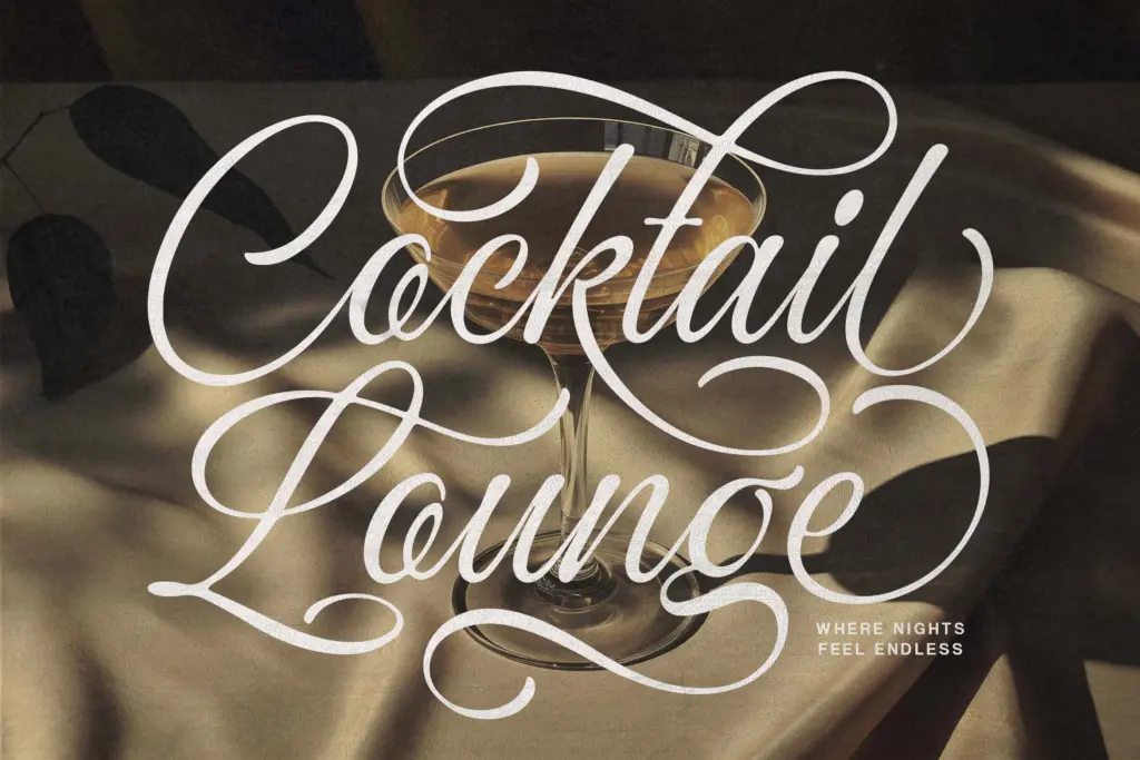
This is a display font, and it should be treated as one. At headline sizes — a logotype, a title on packaging, the opening line of an invitation — the strokes have room to swing and the contrast reads clearly. Push it down to body-copy sizes and the fine hairlines thin out to nothing on screen and the connective strokes start to clot together, which is true of nearly every script this ornate and isn’t a defect unique to this file, just a limit worth knowing before you spec it somewhere it can’t work.
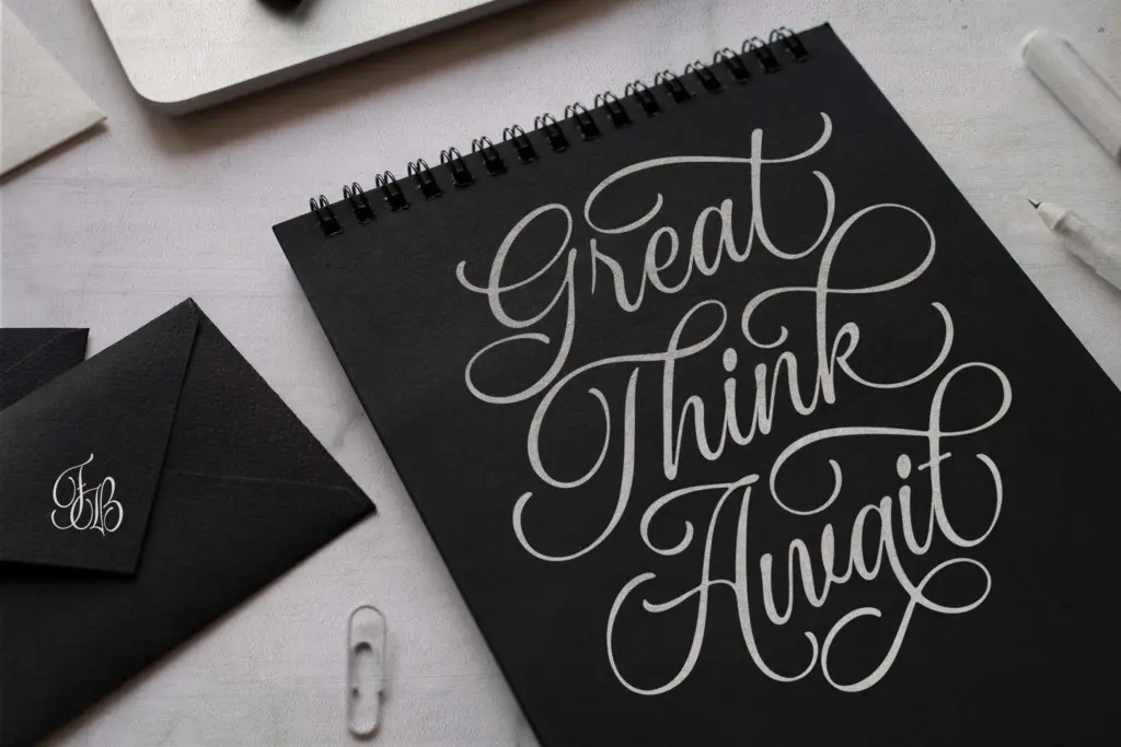
It suits branding for beauty, fashion, and lifestyle products looking for a soft, upmarket feel, as well as wedding stationery and greeting cards where a single elegant line of type is the whole job. Pair it with a plain sans or serif for supporting text; asking the script to do the paragraph work as well as the headline work is asking too much of it.
What we liked, and what we didn’t
Strengths
- Even, confident stroke contrast without the wobble common in cheaper script builds
- Ligatures handle awkward letter pairs so connected words don't collide or gap
- Swash capitals and alternates give real variety across repeated headline words
Trade-offs
- Hairline strokes thin out and lose clarity below display sizes
- The ornate, romantic mood limits it mostly to lifestyle, beauty and wedding contexts
Ocean Delight is a well-drawn, romantic calligraphy script that does its best work in a single large headline. The swash and alternate system gives it flexibility for branding and stationery work, but it's firmly a display face — don't ask it to carry body text.
Verdict

Tantype reviews typefaces in depth — every font is tested in real branding, editorial and screen layouts before a word gets written. 555+ fonts reviewed and counting.