
Marilyn Wilde: a neat, friendly handwriting script for quotes and quick branding
Design style
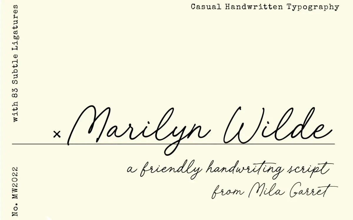
Marilyn Wilde sits in the well-populated corner of handwriting scripts that trade drama for approachability. The letterforms lean on a consistent slant and a light, even stroke weight rather than the thick-thin contrast of a pointed-pen calligraphic script. Curves are rounded rather than swashy, and the baseline stays fairly steady, which gives the face a legible, list-friendly rhythm instead of the bouncing, connected feel of some handwriting fonts.
The font ships with a rough version alongside the clean master, and this is really where the personality lives. The clean version reads as tidy, slightly generic cursive; the rough version breaks up the stroke edges just enough to suggest pen texture and ink variance, without going full grunge. If you only use the clean weight, the font can feel a bit safe. Paired with the rough alternate, it earns more of a handmade credibility.
Character set and features
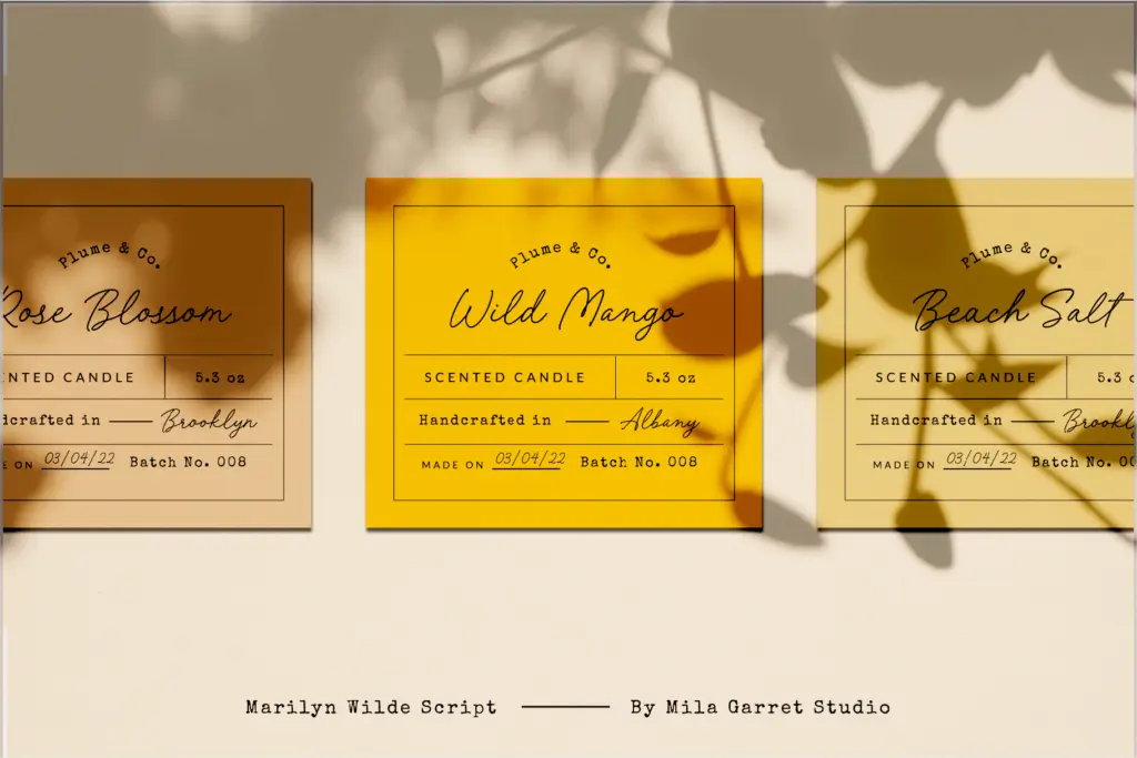
Ligatures are present but kept subtle — the brief describes them as such, and that matches how they behave in practice: a handful of joining forms for common letter pairs rather than an exhaustive alternate system. This keeps the font simpler to set than scripts that demand constant manual substitution, but it also means you won’t get the elaborate flourished connections some competing scripts offer for hero headlines.
The overall structure favours short lines of text: a name, a quote, a product tagline. Tracking needs a light hand — script fonts like this tend to look better with slightly loosened letter-spacing at small sizes, and Marilyn Wilde is no exception, since its stroke connections can start to look cramped if set too tight.
Use cases
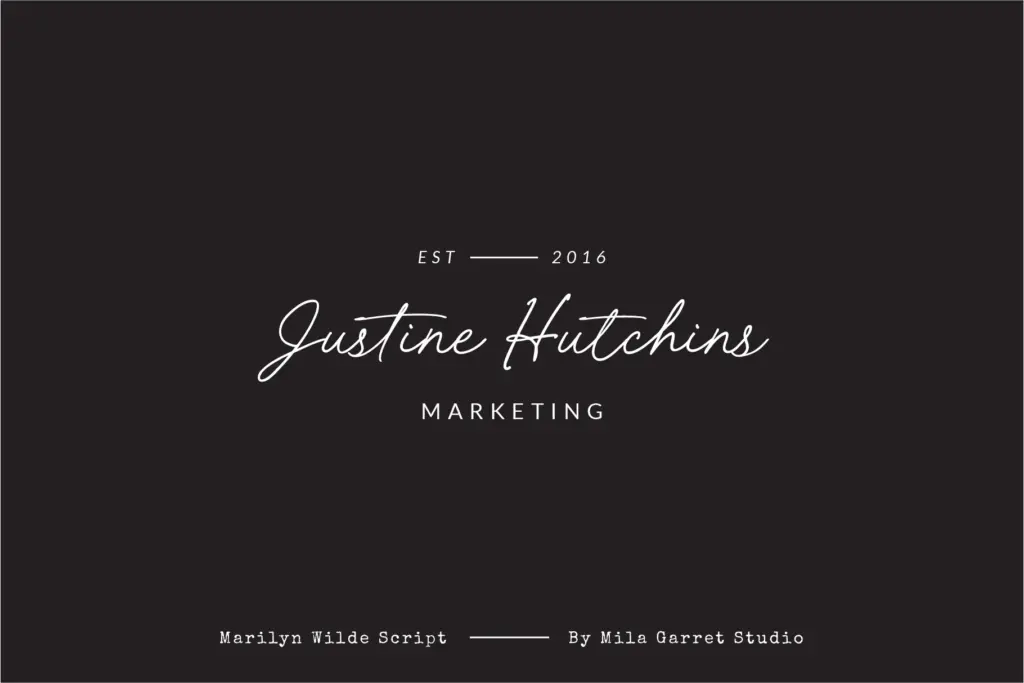
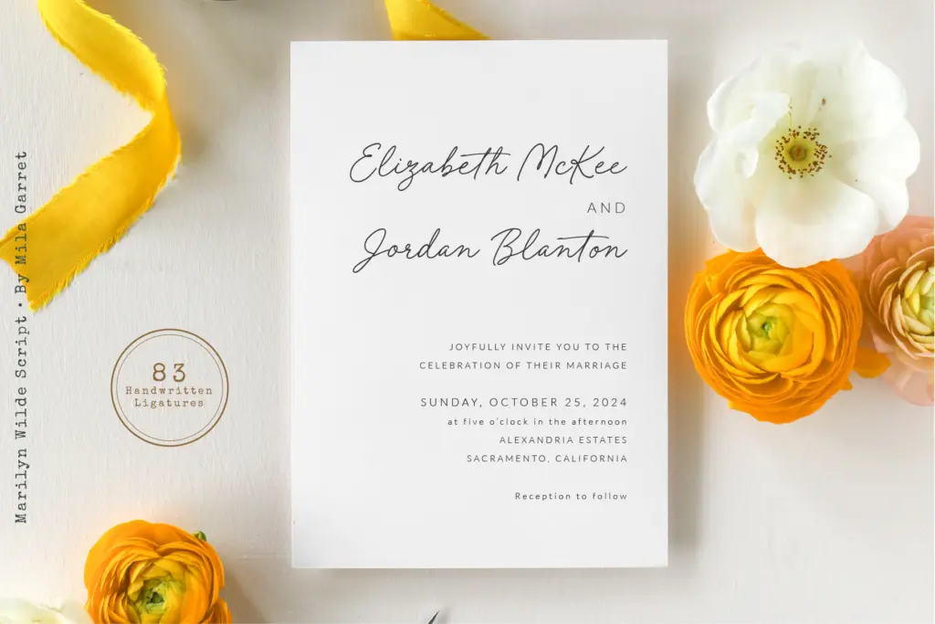
This is a font built for the jobs the seller lists, and it does them competently: Instagram captions, quote graphics, wedding stationery, small branding moments like a signature-style logotype or a monogram. The rough version in particular suits printed collateral — invitation suites, packaging labels, anything that benefits from a touch of analog texture rather than a vector-perfect line.
It’s less suited to long-form body text or anything that needs to be read quickly at small sizes across paragraphs; like most handwriting scripts, it tires the eye past a sentence or two. And because its personality is gentle rather than distinctive, it won’t carry a design on its own the way a more idiosyncratic script would — it works best as one voice in a pairing, set against a plain sans or serif for contrast. Designers looking for a script with real editorial punch or heavy calligraphic flourish should look elsewhere; this one is for softer, quieter jobs.
What we liked, and what we didn’t
Strengths
- The rough alternate version adds genuine handmade texture missing from the clean master
- Even stroke weight and steady baseline keep short lines legible at small sizes
- Subtle ligatures join naturally without requiring manual glyph substitution
Trade-offs
- The clean version alone can read as generic cursive without much personality
- Not built for long-form text or extended paragraphs, like most handwriting scripts
Marilyn Wilde is a competent, gentle handwriting script that does its intended jobs well without pushing any boundaries. The rough alternate adds welcome texture that the clean version lacks on its own. It's a solid pick for quote graphics and small branding moments, but not a font that will carry a design by itself.
Verdict

Tantype reviews typefaces in depth — every font is tested in real branding, editorial and screen layouts before a word gets written. 555+ fonts reviewed and counting.