
Silk Serif: a high-contrast display serif for fashion and editorial branding
Design style
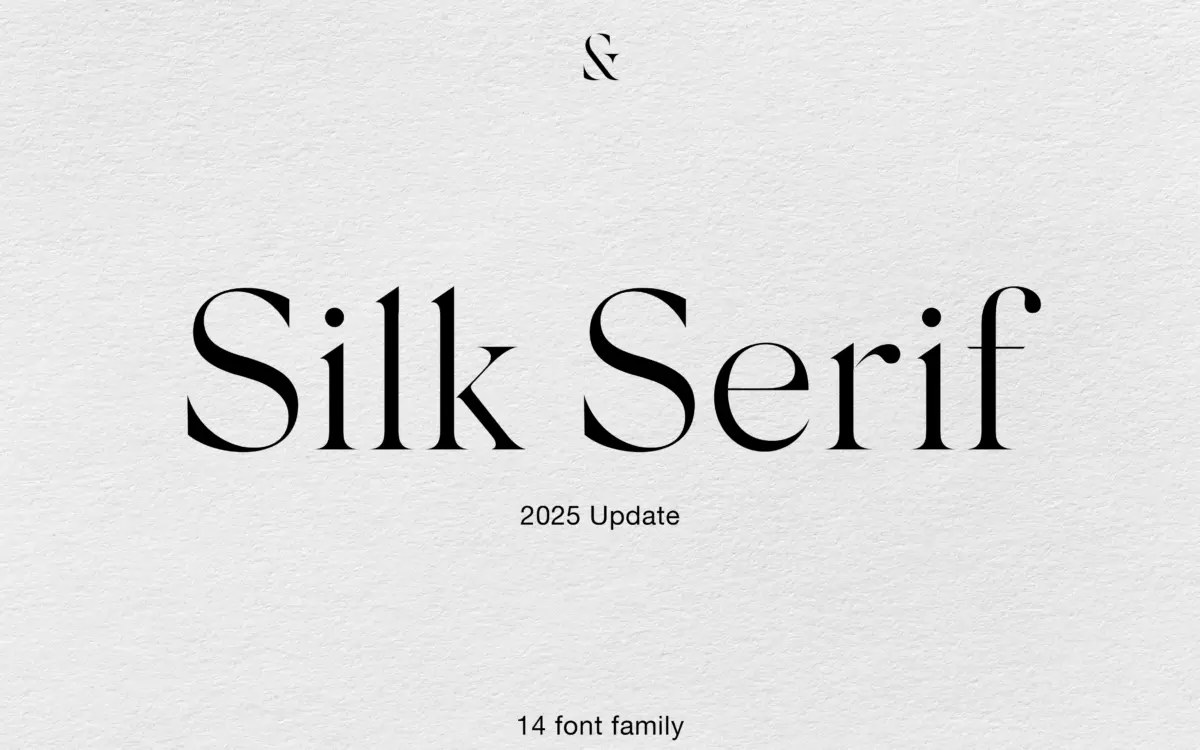
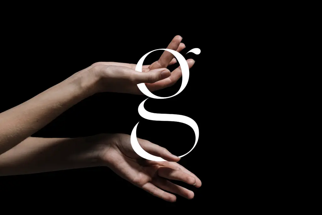
Silk Serif belongs to the family of high-contrast serifs that have become shorthand for fashion and luxury branding — thin hairlines, pointed and heavily bracketed serifs, ball terminals dropped in at the right junctures. What sets it apart from the crowd of similar faces is a quieter structural trick: in several letters the bowls sit close to the stems without actually joining them. From a distance it reads as a connection, but zoom in and there’s a gap. It’s a small detail, but it gives the typeface a slightly airier, more drawn feel than faces where everything is soldered together.
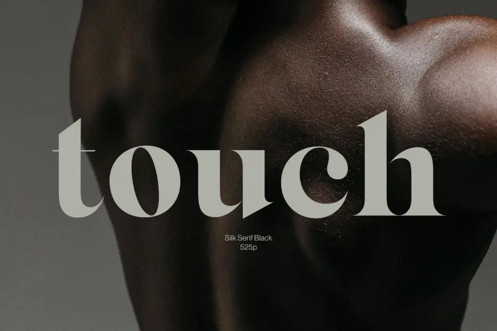
The contrast is steep enough that this is clearly a display-first design, even though the seller frames it as legible at smaller sizes too. At the lighter weights the hairlines get genuinely thin, which is where the drama comes from but also where the risk lives — print it small on uncoated stock and those strokes will start to disappear. At the heavier end, the Black weight holds its personality well; the contrast doesn’t collapse into a slab, it stays properly serif.
Character set and features
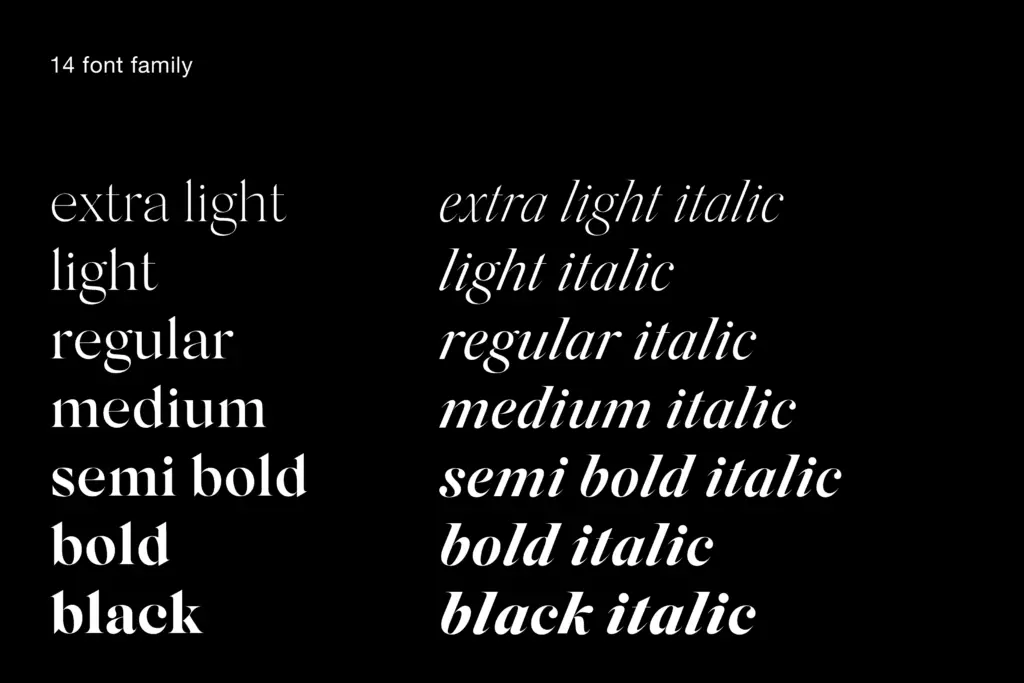
The family runs fourteen styles, from Extra Light to Black, each with a matching italic — so you get a genuine range of weight rather than one or two cuts with a synthetic slant applied. The 2025 update reworked spacing and smoothed the italics, and added standard ligatures and a set of decorative shapes, which push it a bit further into the ornamental territory that this style of serif often wants to occupy anyway. The italics are true cursive forms rather than obliqued romans, with the kind of calligraphic flow that separates a considered italic from an afterthought — worth checking if your layout leans on italics for emphasis or captions, since they carry more character than the romans in places.
Spacing has apparently been a specific point of revision, which matters more than it sounds for a font this thin: hairline serifs are unforgiving of tight tracking, and loose tracking can make the disconnected bowls read as broken rather than deliberate. Anyone setting body copy in the lighter weights should still test at their actual point size before committing — the design intent reads at headline scale, and that’s where I’d trust it.
Use cases
This is a font for the front cover, not the inside pages. Fashion branding, packaging, editorial mastheads, wordmarks for anything selling itself as premium or refined — Silk Serif does that job with more nuance than the average high-contrast display serif, mostly thanks to that bowl-and-stem detail and the depth of the weight range. Fourteen styles means you can build a whole identity system off it: Extra Light for a subhead, Black for a logotype, italics for a signature line, without reaching for a second typeface.
I’d be cautious about long-form use, packaging fine print, or anything that will be reproduced small or on rough substrates — that’s where the delicacy that makes it distinctive starts working against it. Used at scale, on clean backgrounds, it earns the sophistication the seller keeps promising.
What we liked, and what we didn’t
Strengths
- The near-disconnected bowl-and-stem detail gives it a distinctive, airier feel than typical high-contrast serifs
- Fourteen weights with true italics at every stage offer real range for building a layered identity system
- The 2025 spacing and ligature update addresses the common weak points of thin-serif families
Trade-offs
- Hairline strokes at the lighter weights get fragile at small sizes or on uncoated stock
- Its display-serif drama limits it for anything beyond headlines, packaging and short-form branding
Silk Serif is a well-drawn addition to the high-contrast fashion-serif genre, distinguished by a subtle disconnection between bowls and stems that gives it more air than its peers. It's a display typeface first, with real limits at small sizes, but across fourteen weights and matching italics it offers enough range to carry a full brand identity.
Verdict

Tantype reviews typefaces in depth — every font is tested in real branding, editorial and screen layouts before a word gets written. 555+ fonts reviewed and counting.