
Bold Money: a heavy, melted display face for loud headlines and merch
Design style
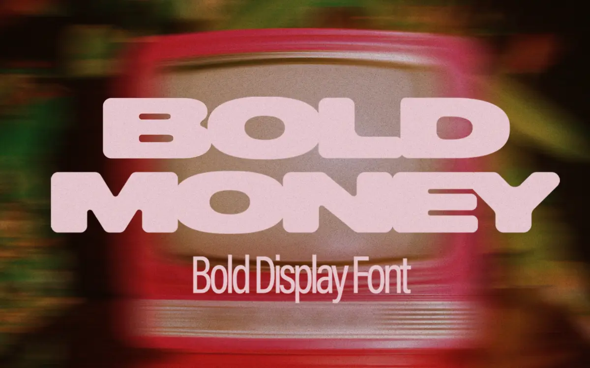
Bold Money is a display-only, all-caps typeface built around one idea: letters that appear to be dripping or fusing into each other. The strokes are thick and blocky, with rounded joins at the baseline that pull neighbouring characters together, giving the impression of melted plastic or soft wax. It’s a novelty concept, but it’s executed with a consistent hand — the connections repeat in a predictable rhythm rather than looking random, which keeps a full word from turning into visual noise.
The letterforms themselves are simple geometric shapes underneath the effect: wide counters, minimal contrast, no flourishes. Strip away the melt and you’d have a fairly generic chunky slab-sans skeleton. The melt is the entire personality, so how you feel about that one gimmick will decide how you feel about the whole font.
Character set and features
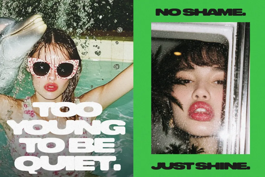
There are no lowercase letters — this is uppercase only, so every word is set as a single register whether you want that or not. That’s a real constraint, not a style choice you can opt out of. Numerals and basic punctuation appear to be included, and the connected strokes carry through into figures, though anything with tight bowls (like a numeral 8 or a percent sign) will read as blobbier than the letters.
Because the sides of each letter are built to merge into the next, spacing is not neutral in this font. Default tracking will look right for some word lengths and wrong for others — short words melt together nicely, longer ones can start to look like a single congealed shape rather than readable text. Getting good results means manually adjusting kerning and tracking per line, which the seller acknowledges. This isn’t a font you drop in and forget; it needs babysitting in the layout stage.
Use cases
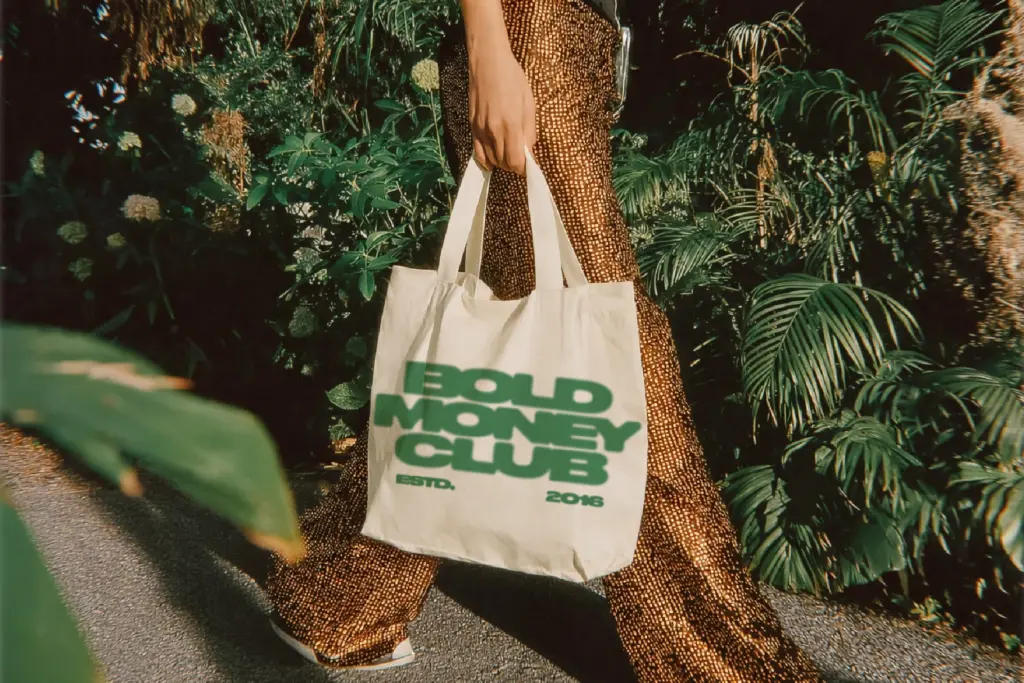
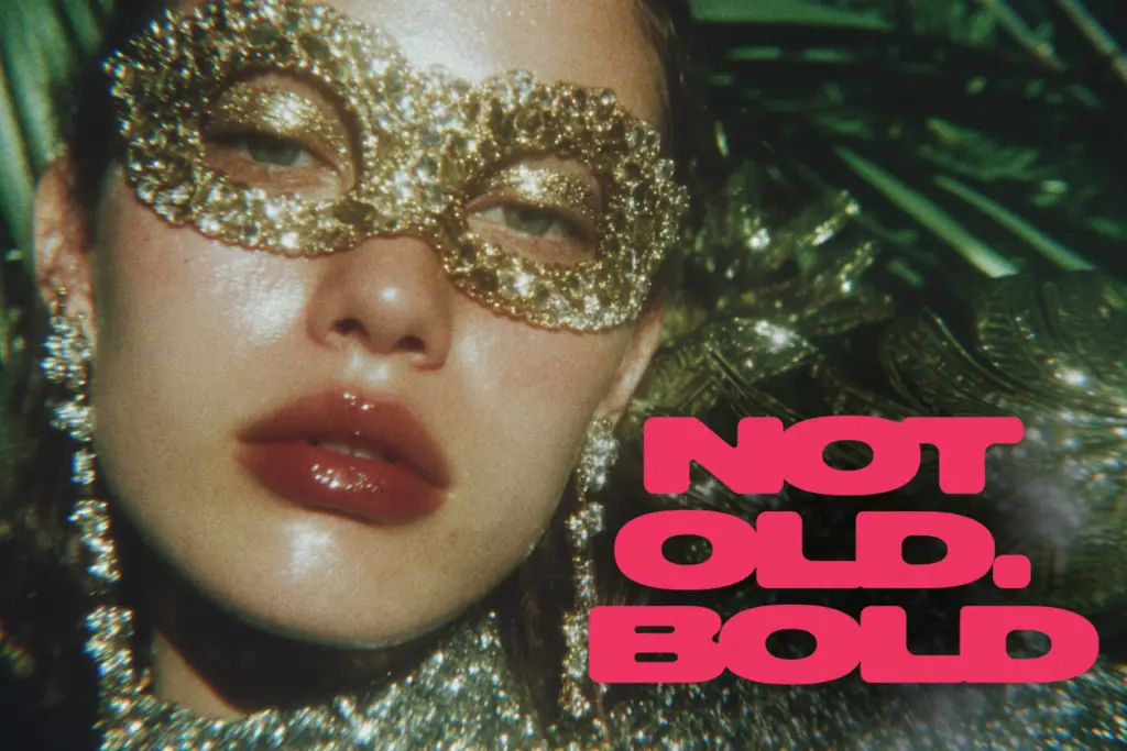
This is a font for a single loud word or a short phrase, not for sentences. A logotype, a merch print, a poster headline, a YouTube thumbnail title, an album cover word — anywhere the job is to grab attention for a second and then get out of the way. The melted connection reads clearly at large sizes, which is where display faces like this live anyway; nobody is setting body copy in it.
It suits streetwear graphics, gaming and tech branding with an aggressive edge, and social posts that want a chunky, slightly unsettling stamp of text rather than clean corporate lettering. It will look out of place anywhere a design calls for restraint — professional services, editorial layouts, anything that needs lowercase or long-form text. Given the narrow character set and the tracking work required, this is best treated as a specialty header font kept in reserve for the right project, not a default headline typeface for daily use.
What we liked, and what we didn’t
Strengths
- The melted connection effect is consistent and doesn't look accidental
- Reads clearly and stays punchy at large display sizes
- Well suited to merch, posters and thumbnail-style single words
Trade-offs
- Uppercase only, with no lowercase set for longer text
- Default spacing needs manual kerning adjustment to avoid letters clumping into a blob
Bold Money commits fully to its melted, connected concept and pulls it off at large display sizes. But the uppercase-only set and spacing quirks mean it needs manual tracking work to look right, and it only really has one job: short, loud headline words.
Verdict

Tantype reviews typefaces in depth — every font is tested in real branding, editorial and screen layouts before a word gets written. 555+ fonts reviewed and counting.