
Honeymoon Hand Script & Doodles: a loose, casual script for wedding stationery
Design style
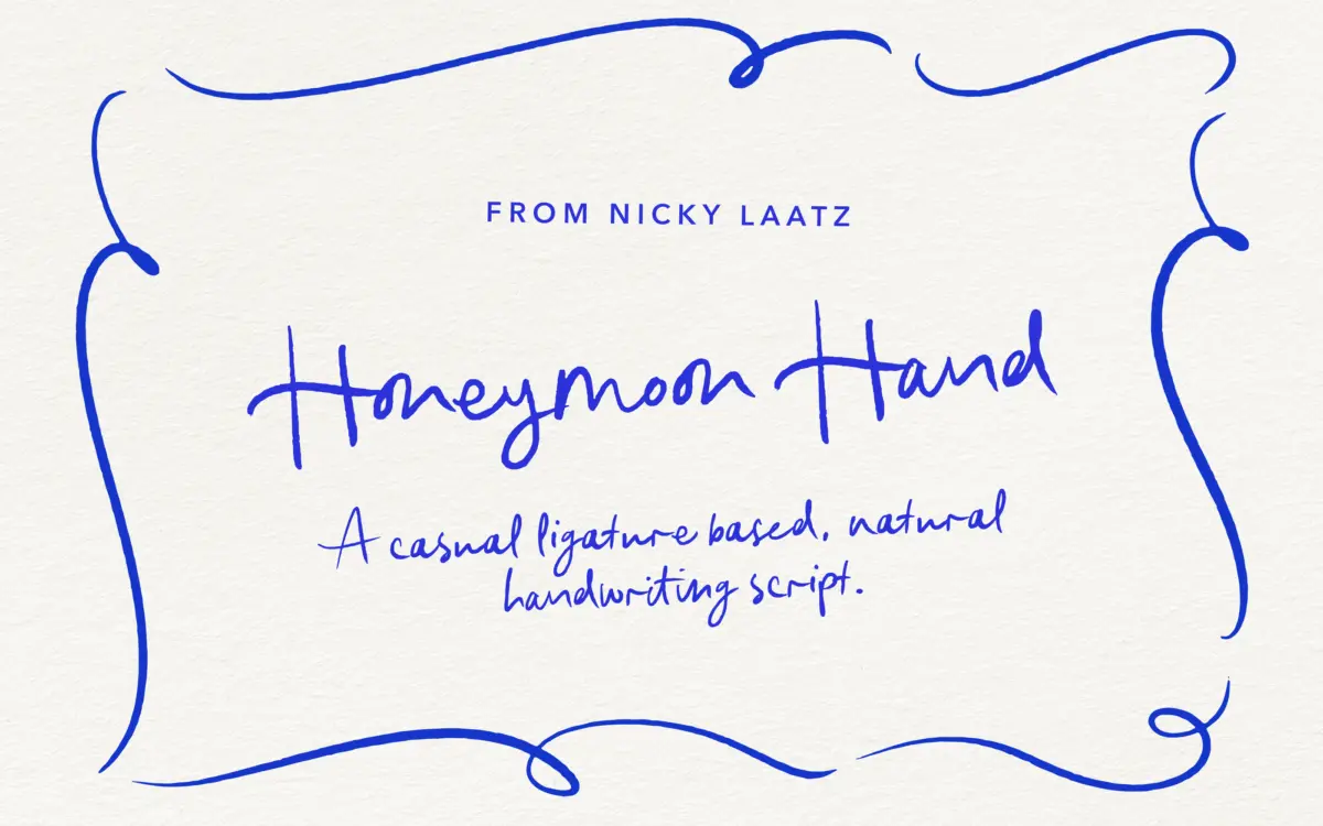
Honeymoon Hand Script is built on an unhurried, slightly wobbly handwriting model rather than a formal calligraphic one. The baseline drifts, letters lean at inconsistent angles, and stroke weight stays fairly even throughout rather than swelling and thinning the way a pointed-nib script would. That evenness gives it a felt-tip or ballpoint feel — closer to a note scrawled at a kitchen table than an invitation copied out by a professional calligrapher. It reads as friendly rather than elegant, and that’s clearly the intent.
The doodles bundled alongside the script are simple line illustrations — small floral sprigs, hearts, arrows, that sort of thing — drawn with the same loose hand as the letters. They’re not detailed enough to carry a design on their own, but as connective tissue between blocks of script text on an invitation suite they do their job.
Character set and features
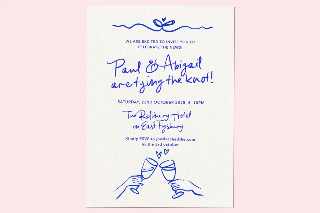
The letterforms lean on OpenType ligatures to stitch adjacent characters together and avoid the repetitive, stamped-out look that plagues lesser script fonts — the same letter combination showing up twice on a page as an identical glyph is the fastest way to break the illusion of handwriting, and this is where a font like this earns its keep or doesn’t. Here, the ligature set is doing real work: common pairs and word-final flourishes swap in automatically, which softens repetition without requiring the user to hunt through a glyph panel.
That said, this is a font that rewards a design app with proper OpenType support. Drop it into something that doesn’t honour ligatures and contextual alternates, and the personality flattens out considerably — you’re left with a plainer, more mechanical script. Anyone using it should check their software supports OpenType features before committing a design to it.
Language support extends beyond English to French, Spanish, Irish, and several Nordic and Germanic variants, which is a genuine practical plus if a project needs accented characters — many script fonts quietly drop this and leave designers stranded on the first é or ñ.
Use cases
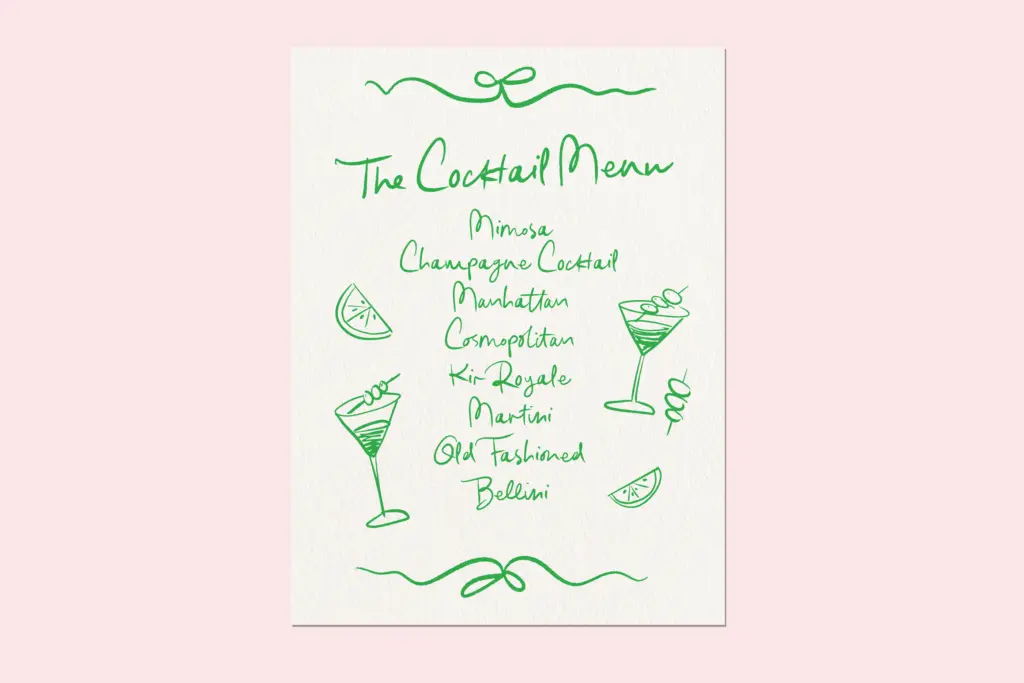
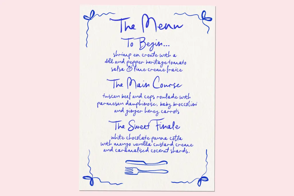
This is a script for occasions that want warmth over polish: wedding invitations with a casual or rustic bent, save-the-dates, place cards, greeting cards, and short lines of copy on packaging or social graphics where a handwritten touch is the point. It’s not built for long passages — the irregularity that makes it charming in a headline or a name becomes fatiguing across paragraphs of body text.
It also isn’t the right choice for a client who wants refined or luxury-leaning wedding stationery; the wobble and casualness work against that brief. Where it earns its place is on the informal end of the wedding and greeting-card spectrum, paired with a plain sans or serif for supporting text so the script can stay the one loud voice in the layout.
What we liked, and what we didn’t
Strengths
- Ligature set genuinely reduces the repeated-letter problem common in script fonts
- Bundled doodle illustrations give designers usable supporting elements without sourcing extras
- Broad accented-character support across several European languages
Trade-offs
- Loses much of its personality in apps without full OpenType feature support
- Irregular baseline and even stroke weight make it tiring to read in anything longer than a line or two
Honeymoon Hand Script does one thing well: casual, natural-looking handwriting for short bursts of text, helped along by a solid ligature set. It's not a font for long copy or formal occasions, and its charm depends on software that actually supports OpenType features.
Verdict

Tantype reviews typefaces in depth — every font is tested in real branding, editorial and screen layouts before a word gets written. 555+ fonts reviewed and counting.