
Bakersfield Font Trio: a rustic handwritten set for storybook and invitation work
Design style
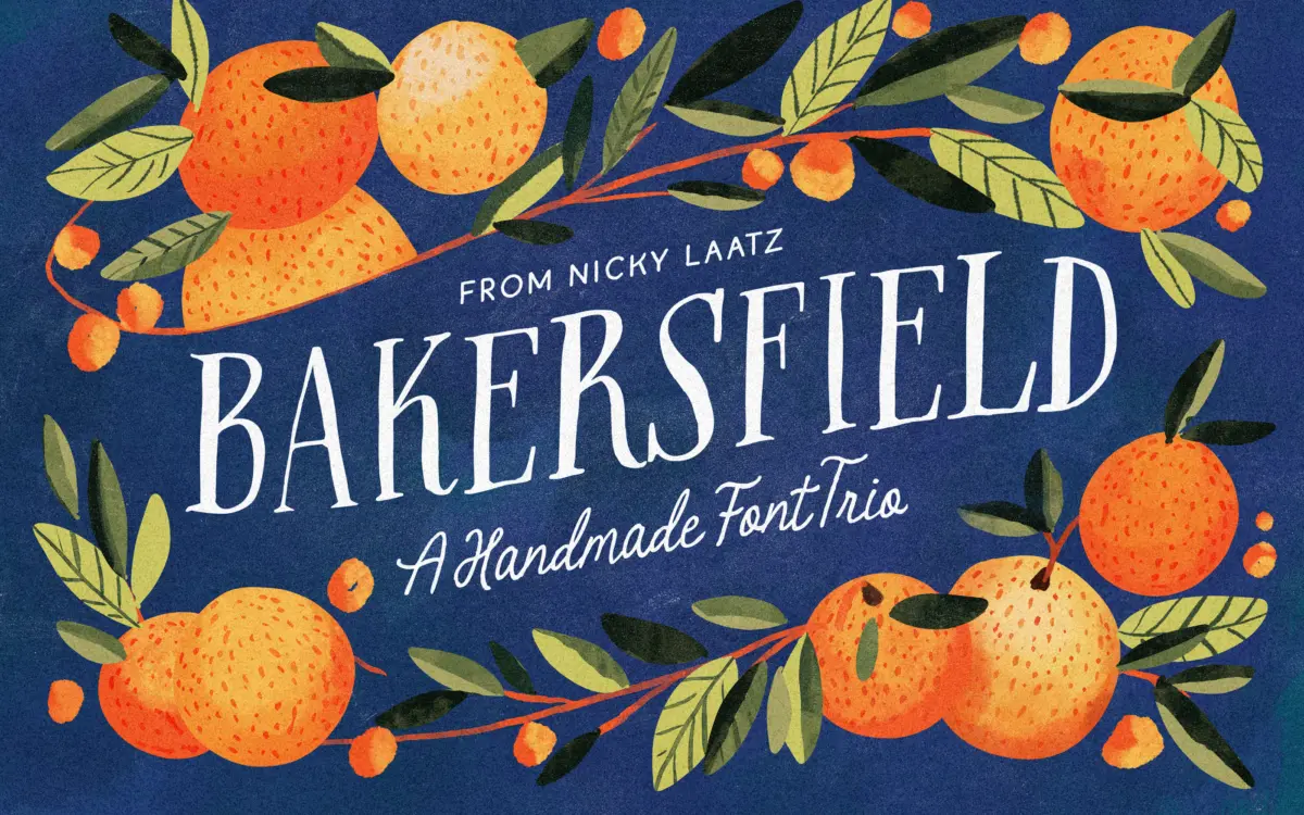
The Bakersfield Font Trio is a set of three related handwritten faces built to be mixed rather than used alone. The pitch is rustic and whimsical, and the drawing backs that up: nothing here is trying to look polished or corporate. The serif has a scratchy, inked quality with uneven strokes that read as genuinely hand-drawn rather than digitally smoothed. The script is the more expressive member of the trio, with an inky, slightly frayed edge to its strokes that gives it a worn, storybook feel rather than the swooping formality of a bridal script. The sans is the plainest of the three, rough-edged and a little wobbly, clearly intended to sit quietly underneath the other two rather than lead a layout on its own.
None of the three fonts is a display powerhouse in isolation. The design logic is additive: serif for a heading, script for a flourish or a name, sans for the small print underneath. Used that way, the set has a coherent, homemade personality that would be hard to fake by pairing unrelated fonts from different foundries.
Character set and features
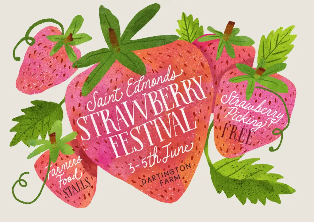
The handwritten serif has distinct uppercase and lowercase forms rather than a single alphabet duplicated in two cases, which gives it more texture across a paragraph than most rustic scripts manage — repeated letters don’t line up identically every time they appear. The script font carries OpenType alternates and ligatures, but these only surface in software that supports OpenType features properly; drop it into an app that doesn’t, and you get the plain default letterforms, which are noticeably less interesting than the marketing previews suggest. That’s worth knowing before you commit a layout to the fancier connected forms. The sans serif is the workhorse of the set — no frills, just a rough, slightly uneven letterform built for body copy, ingredient lists, or captions where the script would be unreadable.
Together the four fonts (three families, one with a stylistic variant) give a designer a reasonably complete rustic-handwritten toolkit without having to shop three different foundries for parts that don’t quite match in weight or mood.
Use cases
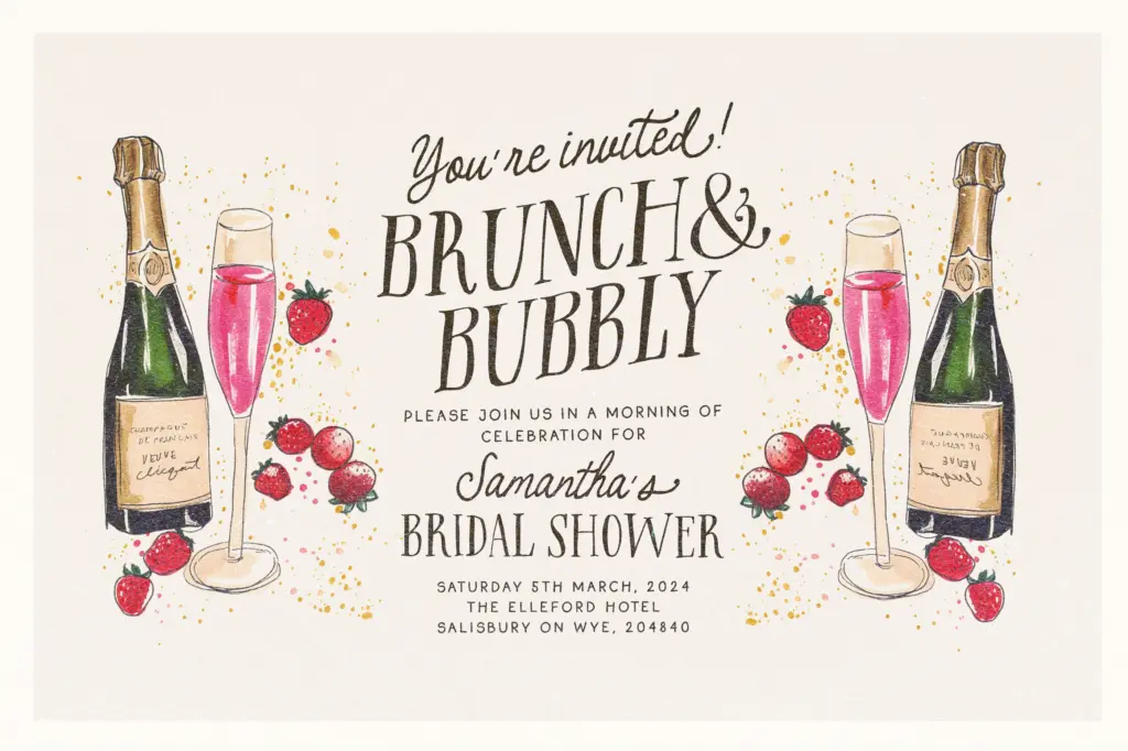
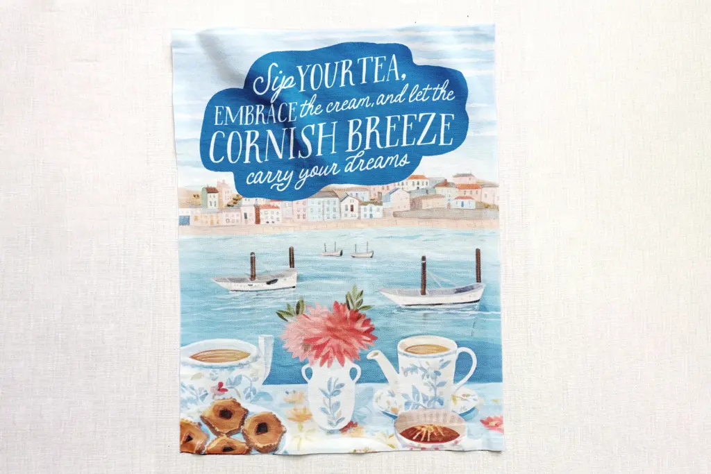
This is a natural fit for children’s book covers, birth announcements, birthday invitations, and the kind of packaging that wants to look like it came from a small kitchen rather than a factory — recipe cards, jam labels, farmers’ market signage. The script suits a first name or a short greeting; the serif works for a title or headline; the sans carries addresses, dates, and disclaimers. It is less suited to anything that needs to look contemporary or restrained — weddings that want elegance over charm, or branding that needs to scale to a billboard, will find the rough edges work against them at large sizes. Set the script too big and the inked imperfections start to look like rendering artefacts rather than character. This trio earns its keep in small-to-medium invitation and packaging work where a bit of visible handwork is the point, not in situations calling for crisp, neutral type.
What we liked, and what we didn’t
Strengths
- Three coordinated styles let you build a layout without hunting for a matching font elsewhere
- The handwritten serif keeps distinct upper and lowercase forms, adding natural variation across text
- The plain rough sans gives the set a legible option for body copy and fine print
Trade-offs
- The script's alternates and ligatures only appear in OpenType-aware software, so results vary by app
- The rough, inked character of all three fonts limits their use at large display sizes or in formal contexts
The Bakersfield Font Trio is a coherent rustic-handwritten kit rather than a single standout face — the three fonts are designed to lean on each other. It suits children's books, invitations and homemade-style packaging well, but the script's best features depend on OpenType support, and none of the three scale up to polished or formal work.
Verdict

Tantype reviews typefaces in depth — every font is tested in real branding, editorial and screen layouts before a word gets written. 555+ fonts reviewed and counting.