
Paloma: a hand-painted brush script for artist-adjacent branding
Design style
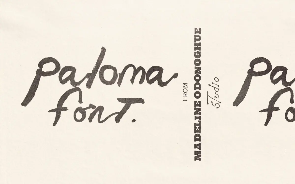
Paloma reads like a signature made with a nearly dry brush, then scanned and left alone. The strokes taper unevenly, edges break up where the bristles ran out of paint, and joins between letters have the slight hesitation of a hand moving at speed. This is not a script built from clean vector curves dressed up to look handmade — it has the actual irregularity of paint on paper, which is its whole reason for existing.
That irregularity is also its personality. Letters lean at slightly different angles, x-heights drift a touch from glyph to glyph, and stroke weight is never fully consistent. If you want a script that behaves like a machine, this isn’t it. If you want something that looks like a person actually wrote it in one take, Paloma delivers convincingly.
Character set and features
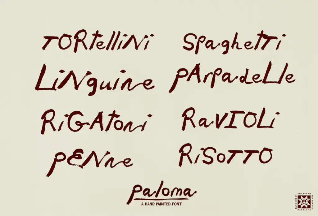
The set is deliberately basic: uppercase, lowercase, numbers, and basic punctuation, delivered as an OTF. There’s no extended language support, no ligature set, no alternate glyphs to swap in when a repeated letter starts looking too samey — and in a brush script, repetition is where the illusion of spontaneity is most likely to crack. Set the same word twice in a headline and you may notice the letters recur exactly, which undercuts the loose, one-off quality the font is going for.
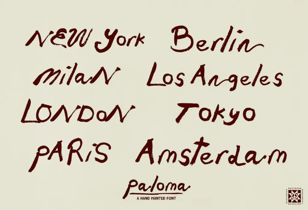
Because it’s a single style with no companion sans or serif, you’re on your own for pairing body copy — Paloma is strictly a display voice, not a family with a text partner built in. The seller is upfront that it’s built for smaller to medium sizes, and that matters: the brush texture that reads as charming at three inches can look chunky and pixelated-feeling blown up across a banner, since the imperfections were drawn at a specific scale and don’t rescale gracefully to poster-size applications.
Use cases
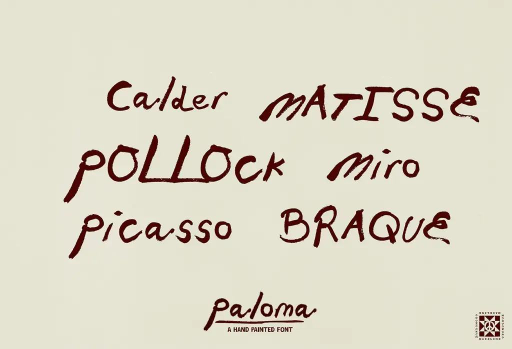
This is a font for the moment when a brand wants to look handmade rather than manufactured — an artist’s own signature line, a gallery show title, a menu heading, a candle label, a wedding invitation that wants warmth over polish. It works well as a short accent: a name, a headline, a single evocative word set large enough to see the brush texture but not so large the strokes start looking like scanning artefacts.
It is less suited to body text, dense paragraphs, or anything that needs to stay legible at a glance from across a room. Long lines will fight the letter’s uneven baseline, and readers will slow down parsing the variable stroke weight, so keep it to short, deliberate uses. Packaging and social graphics suit it particularly well, where a few painterly words can sit against clean product photography or a plain background and do the emotional lifting a sans-serif label font can’t.
Pair it with a quiet, restrained typeface for anything else on the page — Paloma wants room to be the loud, human mark in an otherwise calm composition, not one voice among several expressive ones.
What we liked, and what we didn’t
Strengths
- Genuine painted texture with uneven edges and tapering strokes that read as authentically handmade
- Strong fit for artist, gallery, and craft-brand contexts where a signature-like mark adds warmth
- Works well as a short accent against clean, restrained layouts or product photography
Trade-offs
- No alternate glyphs, so repeated letters in the same word or headline can look noticeably identical
- Not built for large-scale use — brush texture becomes exaggerated and less convincing at poster or signage size
Paloma captures the feel of a genuine brush signature convincingly, with real painterly imperfection rather than a faked vector version of it. It's best kept short, kept small-to-medium, and kept as the one expressive element on an otherwise quiet layout — push it further than that and its limited character set and scale sensitivity start to show.
Verdict

Tantype reviews typefaces in depth — every font is tested in real branding, editorial and screen layouts before a word gets written. 555+ fonts reviewed and counting.