
Amelie Fierce: a high-contrast display serif with pixelated attitude
Design style
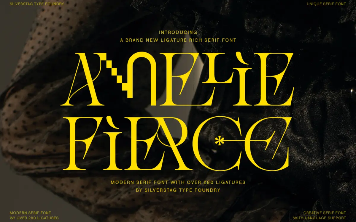
Amelie Fierce sits in familiar high-contrast editorial serif territory — thin hairlines against thick stems, tapered terminals, the kind of structure you’d expect from a fashion masthead — and then breaks its own rules with pixelated interruptions on select letters. Where a standard serif face would resolve a curve cleanly, this one occasionally lets a corner stair-step, as if the letter briefly forgot it was analogue. It’s a deliberate friction between old-world elegance and digital glitch, and it mostly works because the pixelation is used sparingly rather than across every glyph.
The skeleton underneath is competent editorial serif drawing: generous x-height for a display face, moderate width, and enough restraint in the regular letterforms that the pixelated moments actually read as intentional rather than accidental. The contrast is steep enough that this reads as a display face first, text face never.
Character set and features
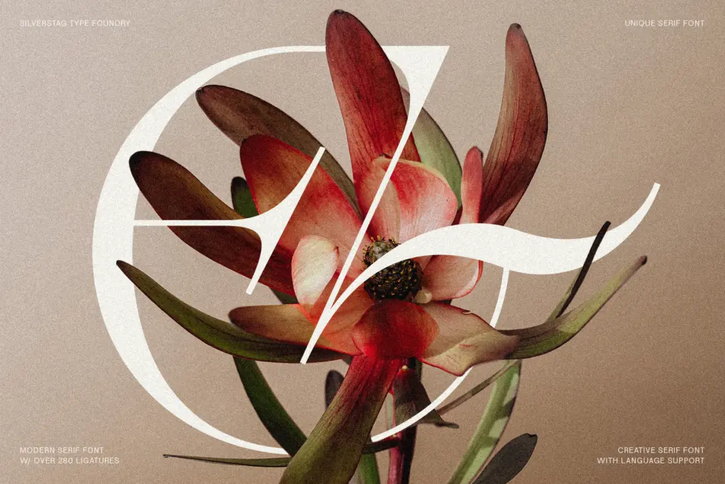
The headline feature is the ligature set — reportedly over 280 of them. That’s a lot of alternate pairings to draw well, and the ambition here is clear: rather than the usual handful of fi/fl swaps, Amelie Fierce is trying to give every word its own bespoke moment. In practice this means the font rewards careful, unhurried setting. You pick your ligatures, check how they sit against the pixelated details, and adjust spacing by hand. It is not a font you drop into a paragraph and walk away from.
The pixelated treatment appears as a recurring texture rather than a one-off gimmick, which is good for consistency but means you can’t dial it out selectively — if you want the glitch, you take it everywhere it appears in the character set. Language support is broad, which matters for anyone setting international campaigns, though as with any heavily featured display face, extended diacritic coverage is worth checking directly against the specific characters you need rather than assuming.
Use cases
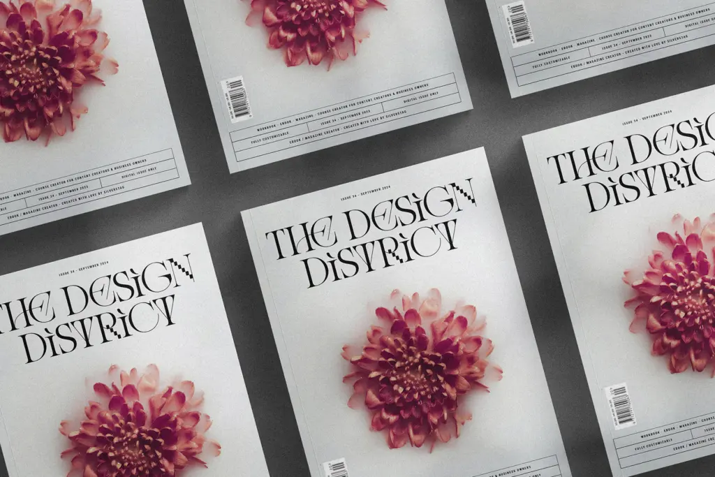
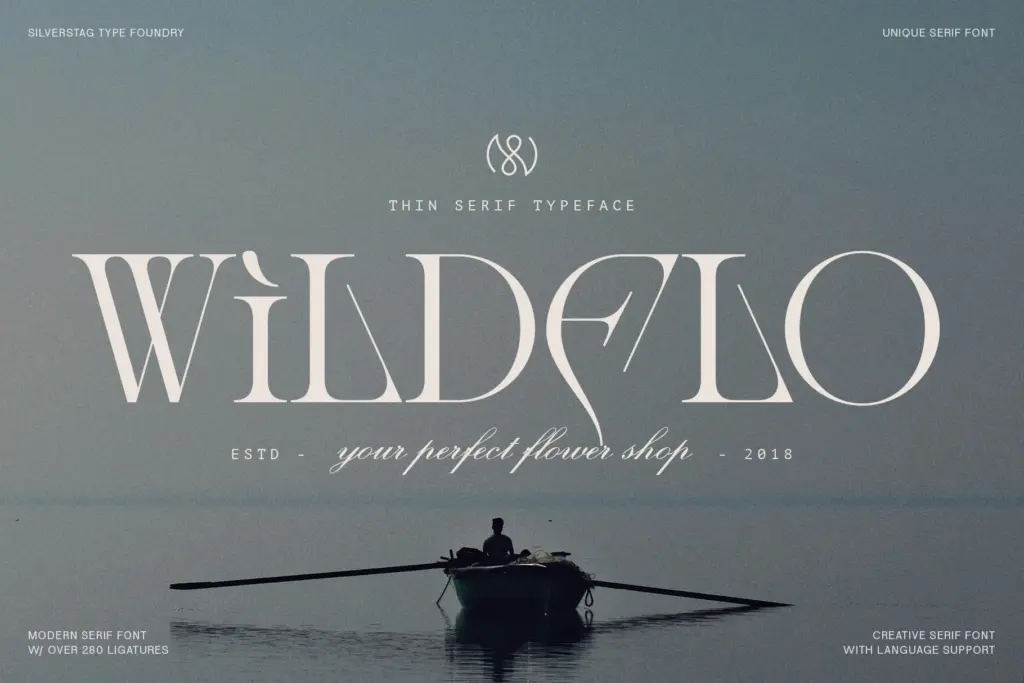
This is a headline and logotype font, not a paragraph font. It belongs on covers, posters, packaging faces, and short lockups where there’s room to let a few characters breathe and where the ligatures can actually be seen rather than skimmed. Fashion and luxury branding is the obvious home, given the strokes and the pixelated wink — this is a font for brands that want to look expensive and slightly disobedient at the same time.
It will struggle anywhere text needs to move fast: subheads at small sizes, UI labels, anything set in a paragraph. The high contrast thins out at small point sizes, and the ligatures need pixel-level attention to look deliberate rather than broken. Treat it as a display specialist — one or two words per use, generous kerning, and a designer willing to proof the ligature choices rather than trust the defaults.
What we liked, and what we didn’t
Strengths
- The pixelated details feel like a deliberate design choice rather than a decorative add-on
- 280+ ligatures give genuine typographic range for bespoke headline treatments
- Broad language support makes it usable for international campaign work
Trade-offs
- Legibility drops fast below display sizes, ruling out any body text use
- The extensive ligature set requires manual setting and proofing rather than default use
Amelie Fierce is a confident display serif that earns its attention through a genuine point of view — the pixelated interruptions against classic contrast are more considered than gimmicky. It demands hand-set attention to work well and has no ambitions beyond headline duty, which is fine as long as buyers don't expect it to double as a text face.
Verdict

Tantype reviews typefaces in depth — every font is tested in real branding, editorial and screen layouts before a word gets written. 555+ fonts reviewed and counting.