
Amber Dawn: a hand-painted brush script for rough-edged, playful branding
Design style
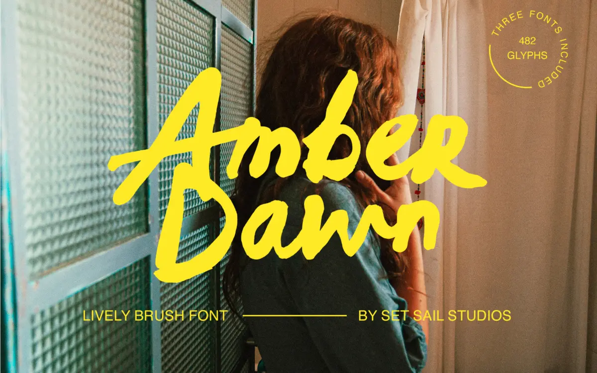
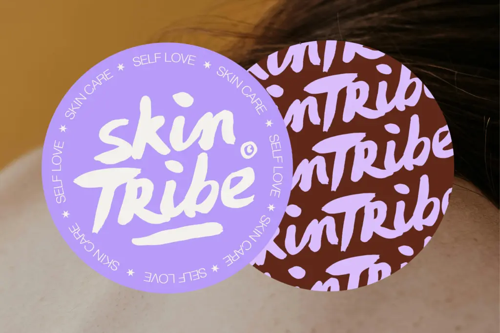
Amber Dawn is a brush script painted with real acrylic ink rather than drawn digitally to fake the effect, and it shows. The strokes carry genuine paint texture: uneven edges, thin patches where the bristles ran dry, small pooling at the terminals. There’s no attempt to smooth this over. Where a lot of brush fonts settle into a tidy, repeatable rhythm once you’ve typed a few words, Amber Dawn keeps surprising you with a stroke that goes slightly rogue. That’s the point of it — it reads as a font someone actually made with their hand, not one that was engineered to look that way.
The letterforms lean casual and a little wild. Baselines drift, x-heights vary, and the connections between letters are loose rather than locked into a single joining logic. This is a font built around imperfection as a feature, and it commits to that fully rather than hedging with a cleaner alternate set for when things need to calm down. If you want a brush script with more consistency and less noise, this isn’t it — but that inconsistency is exactly what gives it its energy.
Character set and features
The package is built from three separate fonts, each carrying its own upper and lowercase set, so you get three distinct passes of every letter rather than one alphabet with alternates bolted on. Combined with 29 ligatures, this gives you real room to vary a word’s texture — swap the font, swap a few letters, and the same word can look like it was painted twice by two different hands. Two sets of numerals are split across the first two fonts, and punctuation coverage is generous enough for headline and short-copy work.
Language support runs wide, covering most Western and Central European languages along with several less common inclusions like Turkish, Croatian and the Baltic set. Ligatures come through Standard Ligatures or the Glyphs panel, and PUA encoding means the extended character set isn’t locked out of software that doesn’t support OpenType features — a practical detail that keeps this usable in tools like Canva or older layout programs.
At 482 glyphs total across the three fonts, this isn’t a font you learn in five minutes. Getting natural-looking results means dipping into the alternates and ligatures rather than typing and walking away, but the payoff is a hand-lettered look that doesn’t repeat itself obviously across a headline or a paragraph of short lines.
Use cases
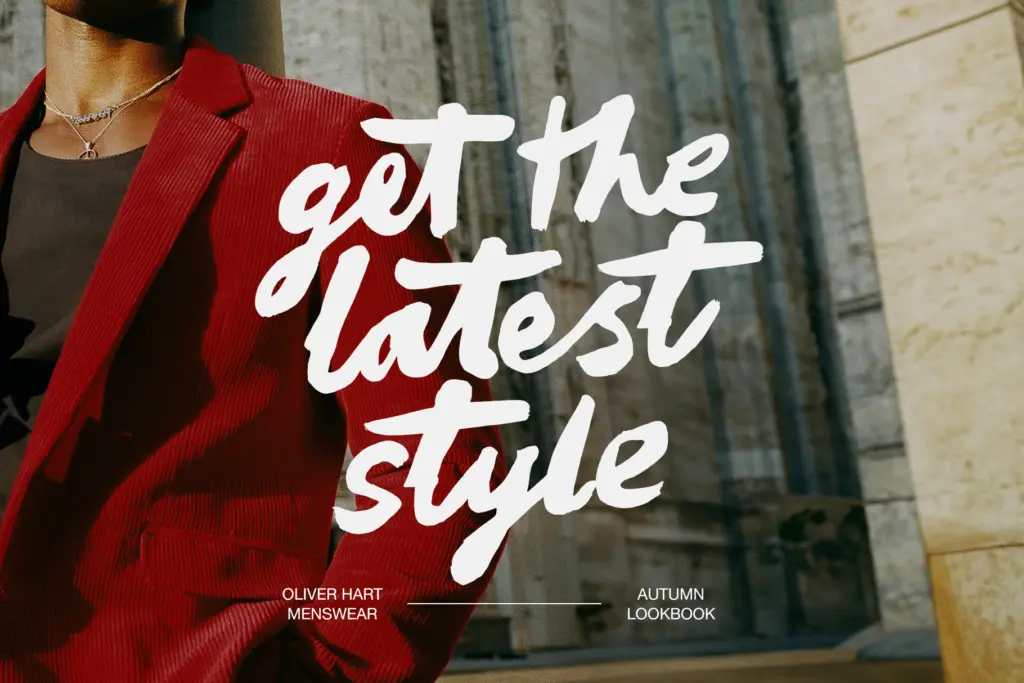
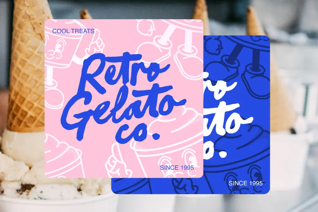
Amber Dawn suits branding and packaging work that wants a hand-crafted, slightly rough edge — think small-batch food and drink labels, artisanal product lines, retro-leaning logotypes, or any project trying to avoid the polished-vector look. It works well as a display or accent element paired with a plain sans or serif for body text, since its texture and irregularity make it unsuitable for long passages of reading. Wedding stationery is plausible too, particularly for couples wanting something looser and less formal than a traditional calligraphic script. Keep it to short words, headlines, and logotypes; that’s where the paint texture and letter variation actually read, rather than turning into visual clutter at small sizes.
What we liked, and what we didn’t
Strengths
- Real paint texture with visible bristle marks and pooling, not a digital approximation
- Three separate alphabets plus 29 ligatures give genuine word-to-word variation
- PUA encoding keeps the extended glyph set usable in non-OpenType software
Trade-offs
- The irregularity that gives it character also limits it to short text — it tires the eye at paragraph length
- Getting the most natural results requires manually working with alternates and ligatures rather than typing and walking away
Amber Dawn delivers genuine hand-painted texture and enough variation across its three fonts to avoid the repetitive look many brush scripts fall into. It's built for short, punchy uses — logos, packaging, headlines — and starts to strain the moment you ask it to sit quietly in a paragraph.
Verdict

Tantype reviews typefaces in depth — every font is tested in real branding, editorial and screen layouts before a word gets written. 555+ fonts reviewed and counting.