
Mozart II Basic: a Spencerian-Copperplate script for DIY wedding work
Design style
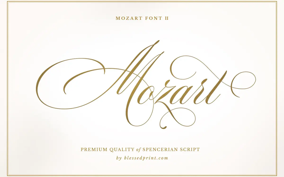
Mozart Script II Basic belongs to the formal American penmanship tradition — the shaded, rhythmic hand that sits between Spencerian looseness and Copperplate discipline. The lowercase keeps a consistent slant and a steady, narrow oval structure, with thick-thin contrast that reads as pressure on a nib rather than a drawn effect. Entry and exit strokes are long enough to imply connection between letters without forcing a single continuous baseline, which keeps the setting legible rather than purely decorative.
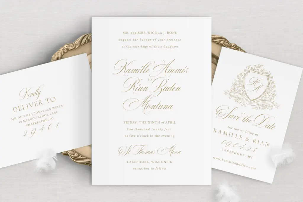
The uppercase is where the calligraphic ambition shows most. Two uppercase sets give you a choice between a plainer capital for restrained headers and a looped, more ornate version for monograms or opening initials. Neither strays into novelty; the flourishes stay inside the classic vocabulary of the genre rather than inventing new shapes, which is the right call for a font built around a recognisable historical style.
Character set and features
This is the Basic edition, and it reads like one: it covers the fundamentals of a working script rather than the exhaustive alternate libraries scripts in this category sometimes ship with. You get the two uppercase sets, a refined lowercase, a set of ligatures for common letter pairs, some symbols, and a standard run of swashes, plus multilingual character support for setting names and text beyond basic English diacritics. There’s enough here to vary repeated letters across a short line — a name, a date, a monogram — without everything looking stamped from the same mould.
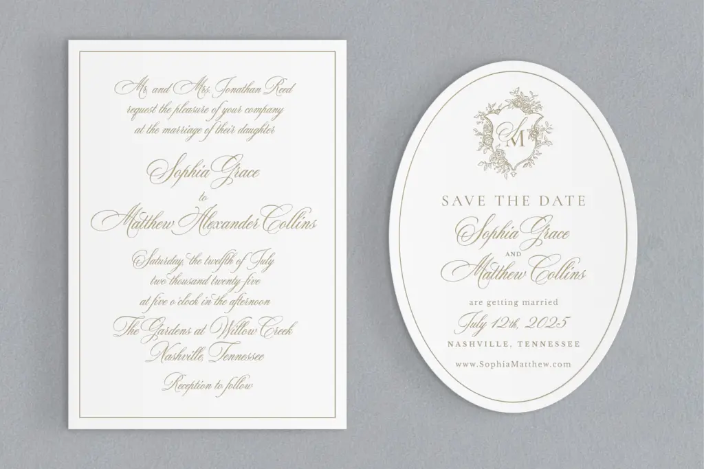
What it doesn’t have, by the seller’s own account, is the deeper layer: the extended alternates, additional ligatures, heavier swash sets and Roman numerals live in a separate Pro edition. That’s a reasonable way to tier a script font, but it means buyers doing dense calligraphic compositions — full invitation suites with long flowing lines, elaborate crests, multi-word flourished headers — will hit the ceiling of this character set faster than they would with a fuller script. For a save-the-date, a monogram, or a short line of copy, the Basic set is sufficient; for a six-line invitation with varied rhythm throughout, it will start to repeat.
Use cases
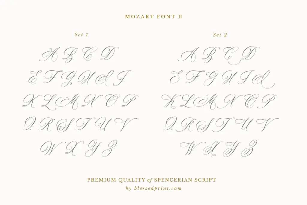
Mozart Script II Basic is built for exactly the brief it states: DIY wedding stationery and everyday decorative script use. It suits save-the-dates, envelope addressing, place cards, short menu lines, and signature-style logotypes where a name or short phrase needs warmth and formality without heaviness. The Spencerian-Copperplate pedigree also makes it a sensible choice for crest-style or monogram branding where a single word or initial carries the whole composition — the swash set is generous enough to dress up a short line convincingly.
It’s less suited to body copy or anything set small; like most scripts in this tradition, the fine contrast and connecting strokes need size and space to hold their shape, so keep it to headline or accent roles. Designers who need a script to carry a full, layered invitation suite with extensive variation letter-to-letter will likely find the character set thin for that job and should look at the fuller edition instead.
What we liked, and what we didn’t
Strengths
- Consistent, confident Spencerian-Copperplate letterforms with genuine shading rhythm
- Two uppercase sets give real flexibility for monograms and headers without leaving the style's vocabulary
- Multilingual support and ligatures make it usable beyond basic English names
Trade-offs
- Swash and alternate coverage is noticeably thinner than a full script library, so repeated letters in longer lines can look same-y
- Not built for dense, multi-line invitation layouts — those features sit behind the separate Pro edition
Mozart Script II Basic is a well-drawn, traditional formal script that does its stated job — short wedding-stationery lines, monograms, signature-style branding — competently and without gimmicks. Its character set is intentionally limited next to the Pro edition, so it suits simple compositions better than layered, flourish-heavy suites. A dependable choice if your brief is modest; a constraint if it isn't.
Verdict

Tantype reviews typefaces in depth — every font is tested in real branding, editorial and screen layouts before a word gets written. 555+ fonts reviewed and counting.