
Marigold Grand Font Duo: a romantic script paired with a rough-edged press serif
Design style
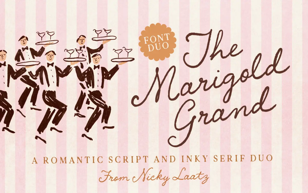
Marigold Grand is a two-part family: a flowing handwritten script and a companion serif built to look like it came off a worn letterpress plate. The script leans toward the romantic end of handwriting fonts, with a moderate slant and connecting strokes that favour warmth over precision. It reads as intimate rather than formal, closer to a hand-lettered note than a formal calligraphic hand. The serif is the more interesting half of the pairing. Its edges are deliberately irregular, mimicking the ink spread and uneven pressure you get from old printing plates. That texture gives it a lived-in, slightly imperfect character that a clean vector serif can’t fake.
Nicky Laatz has clearly designed the two faces to talk to each other rather than sit side by side by coincidence. The script carries the emotional weight — the greeting, the name, the headline — while the press serif handles supporting text without competing for attention. It’s a sensible division of labour, and one that suggests the duo was built with layout in mind from the start, not assembled after the fact.
Character set and features
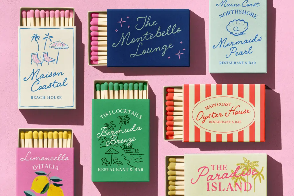
The script includes multiple minor variants, letting you swap in alternates to adjust weight, slant or width without switching to a whole separate style. That’s useful in practice: handwritten scripts often look repetitive across a paragraph, and having built-in variation cuts down on the need to hand-fake it with tracking tricks or manual kerning. The press serif’s rough edges are baked into the letterforms rather than applied as a texture overlay, so they hold up consistently across sizes rather than looking like a filter someone forgot to turn off.
Language support covers a reasonable spread of Western European languages, including French, German, Spanish, Portuguese and several Scandinavian tongues, plus a few less commonly covered ones like Basque and Scottish Gaelic. That’s a meaningful range for the European invitation and stationery market this duo is clearly aimed at. The seller notes it works without special software and is Canva compatible, which matters more here than usual — this is a duo pitched squarely at small studios and hobbyist users, not agencies running dedicated type tools.
Use cases
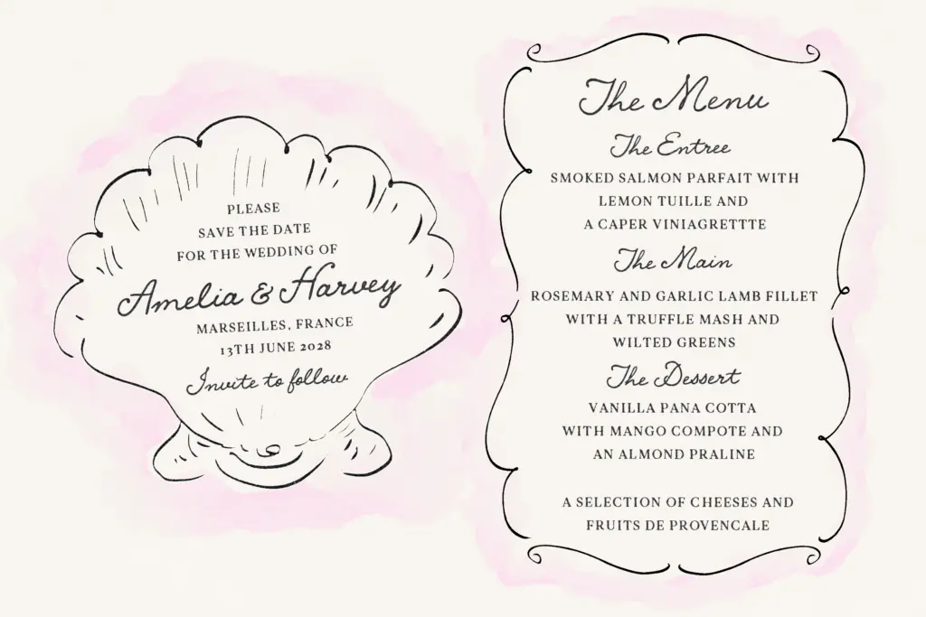
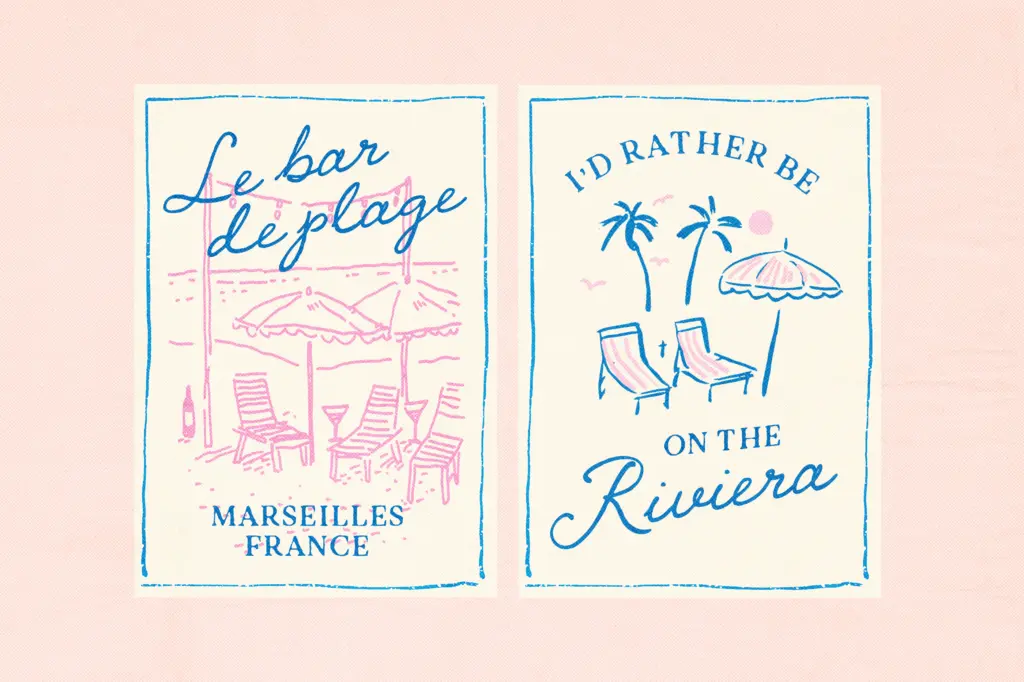
This pairing is built for paper goods: wedding invitations, greeting cards, product labels and packaging where a handmade, boutique feel is the goal. The script works well as a headline or signature element — a couple’s names, a card greeting, a brand’s primary mark. The press serif is pitched as legible at smaller sizes, and its texture reads best in print rather than on screen, where the ink-bleed effect can look muddy if rendered too small or at low resolution.
It’s not a typeface for corporate branding or long-form editorial work — the script’s charm depends on scale and generous spacing, and the serif’s rough edges will fight with dense body copy. Treat it as a decorative pairing for short bursts of text: names, dates, product names, short taglines. Used that way, in the packaging or stationery context it’s designed for, it does its job without needing much dressing up.
What we liked, and what we didn’t
Strengths
- Built-in script variants add natural variation without extra tracking work
- Press serif's ink-bled edges are baked into the letterforms, so they hold up across sizes
- Solid multilingual coverage for the European stationery market it targets
Trade-offs
- The press serif's texture can turn muddy at very small sizes or low resolution
- Not suited to long-form or corporate use — it's a display pairing, not a workhorse family
Marigold Grand is a well-matched script-and-serif pairing built for paper goods rather than screens or long copy. The press serif's rough-edged texture is its most distinctive feature, but it limits the duo to display and short-text roles. Good for invitations, labels and boutique packaging; not a general-purpose family.
Verdict

Tantype reviews typefaces in depth — every font is tested in real branding, editorial and screen layouts before a word gets written. 555+ fonts reviewed and counting.